London-based agency Free The Birds unifies Sanofi cough brands’ visual identities
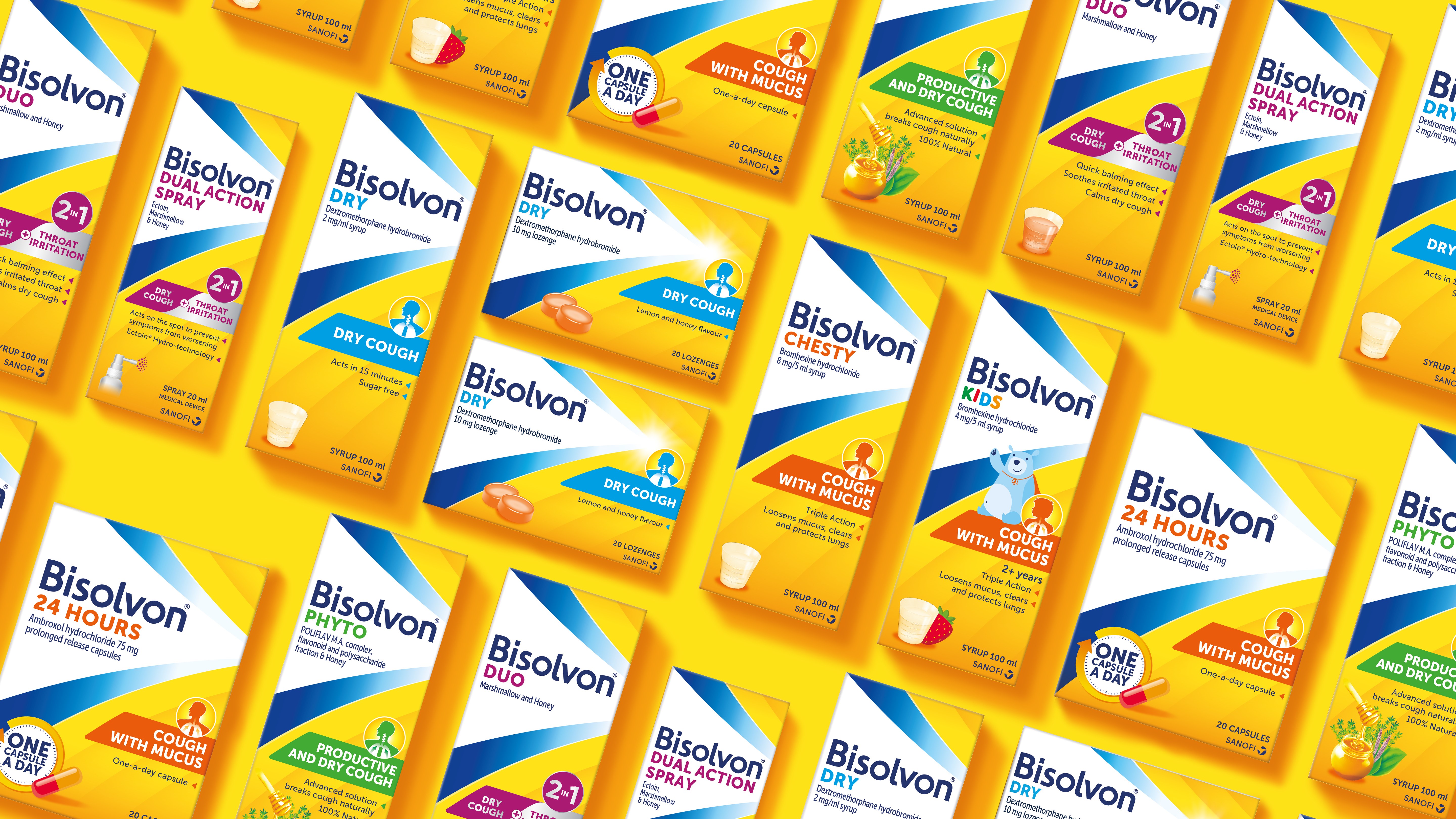
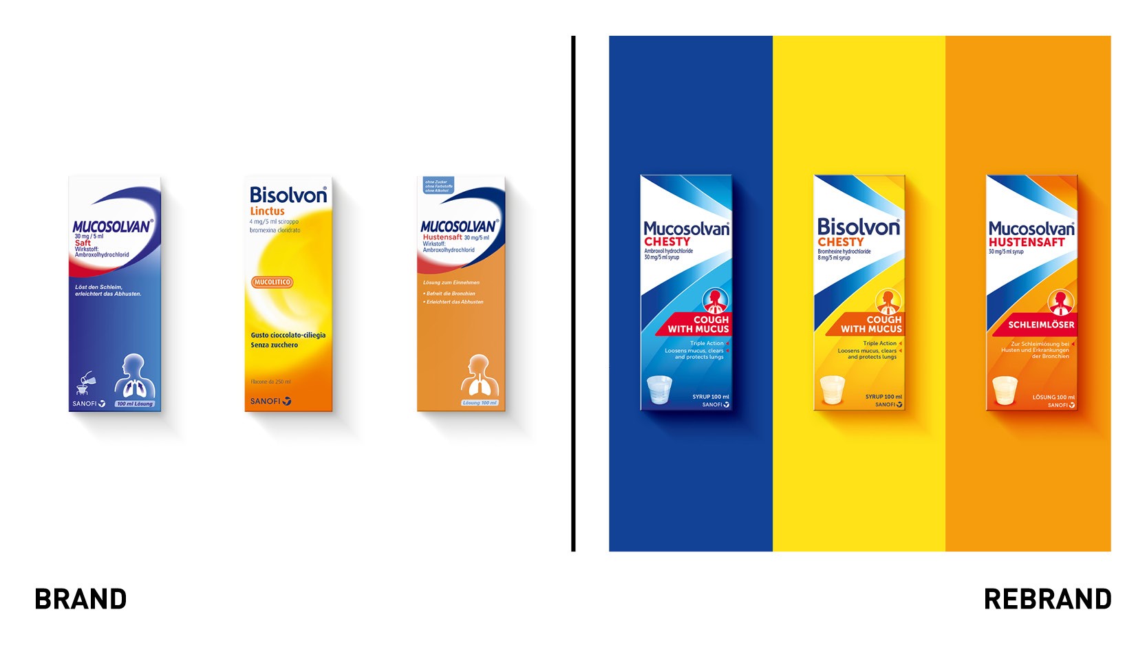
The recently rebranded multinational healthcare company has united the visual identity and packaging of its cough brands, Mucosolvan and Bisolvon. By updating the typography, iconography and layout, the aim is to ensure the product ranges are instantly recognisable on pharmacy shelves.
With the cough brands currently distributed across five markets in Europe, Asia and Oceania – and another two continents to follow – Sanofi wanted its products to become universally recognisable all over the world.
Nick Vaus, partner and creative director at Free The Birds, says, “We wanted to create a commonality in the packaging across all the regions, in order to ensure people identified them as Sanofi brands straight away, no matter the location.”
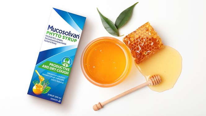
Further alterations include the use of Sanofi’s heritage colours of blue and yellow across all packaging, utilised within a ‘multi-layered arrow’ which has replaced decorative curvatures. In a bid to enhance the packaging’s messaging, visual icons like a cup, tablet and spray are now used to indicate the form of the medicine, with pieces of fruit indicating flavour.
Appealing to a younger audience sees Bearsolvan, a friendly-looking cartoon bear, debut on the brand’s children packs. The reimagined identity has now been included as part of the broader marketing mix, highlighted by ‘Don’t Hide The Cough, Fight It’ – Sanofi’s 2022 TV advertising campaign.
Vaus adds, “The trend for healthcare brands is to retain a clinical exterior. But Sanofi is an established caregiver known for easing suffering from colds and coughs, which is what we aimed to encapsulate through Bearsolvan.”
The brand identity and packaging will be added to Sanofi’s website and social media communications in due course.