FutureBrand Paris designs new corporate brand for Sanofi

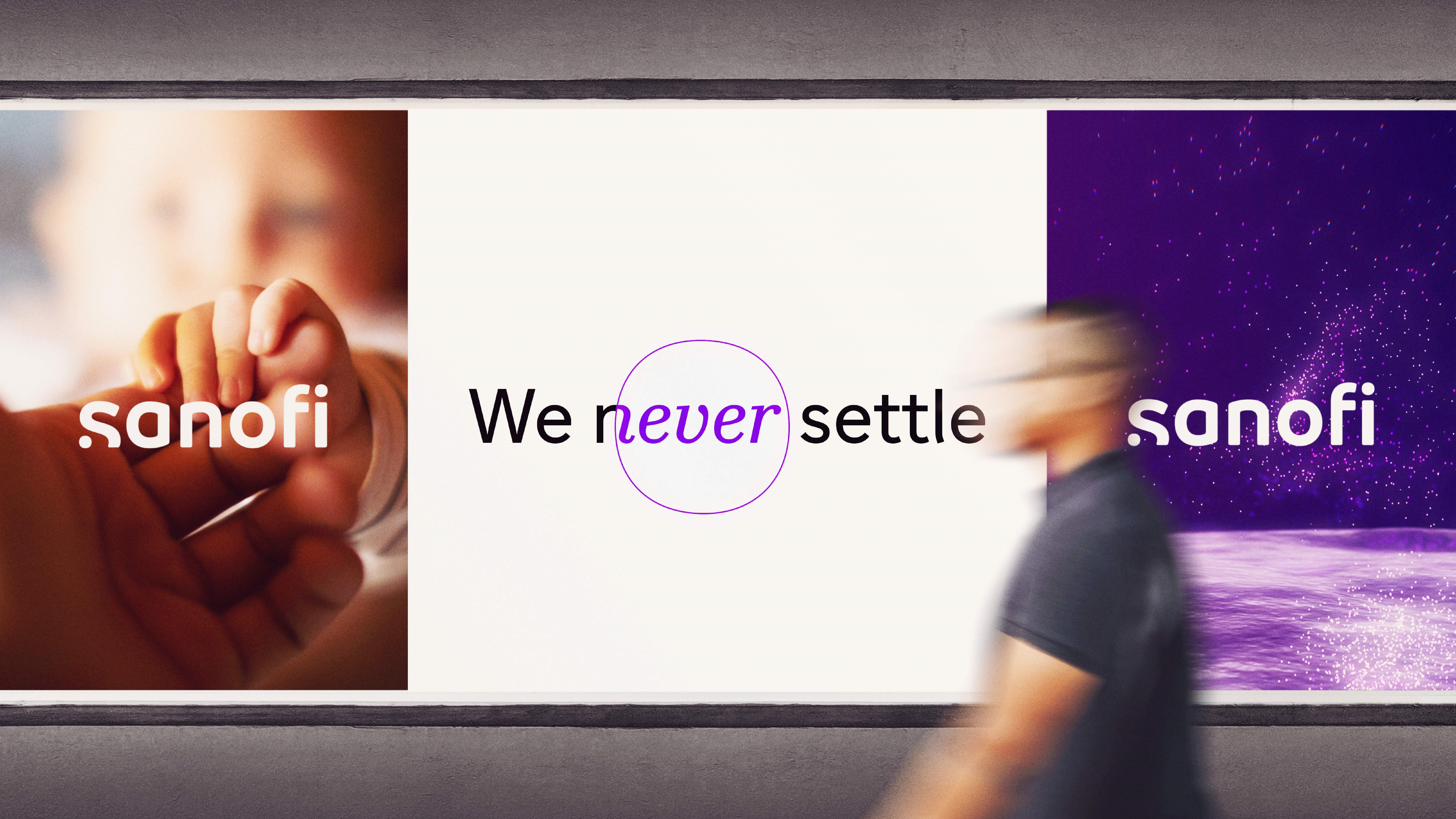
Sanofi, the global healthcare company, has undergone a complete brand renewal. The aim is to adapt Sanofi’s brand perception of ‘big pharma’ to a modern healthcare company, seeking to “chase the miracles of science to improve people’s lives.”
The changes made by FutureBrand Paris include a refreshed visual identity, inspired by the simple and motion-orientated codes of the tech industry. It is designed with purple dots to help Sanofi stand out in a market where the colours red and blue are most frequently used, as with GSK and Pfizer.
The two dots incorporated into the new logo represent the journey between a starting point of scientific curiosity and the ‘eureka moment’ where innovative solutions are found. Meanwhile, lowercase letters are a new addition to Sanofi’s marque, with the intention of allowing greater readability.
Jerome Lhermenier, managing director at FutureBrand Paris, says, “Sanofi has a rich heritage of scientific discovery and patient focus. But they also have a complex history, which had led to a proliferation of different brand identities and stood in the way of creating a single clear vision which could guide the business into the future.
“This rebrand is an effort to help the company reconnect with the ‘why’ of being in the business of healthcare, while uniting the people behind it and showcasing Sanofi as the modern healthcare company it strives to become.”
For the first time in Sanofi’s 50-year history, the changes will see different business units consolidated under a single entity.
Josep Catlla, head of corporate affairs at Sanofi, adds, “We believe that our new brand and logo carve out a unique space in the healthcare industry that perfectly represents our new purpose to chase the miracles of science to improve people’s lives.”


