Chicago-based agency VSA Partners reimagines entire brand identity of FuelCell Energy
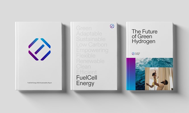
The American firm, which is a global leader in the designing, manufacturing and operation of fuel cell power plants, had its marque, typography, colour palette completely redesigned. VSA’s work also introduces a new brand expression system.
FuelCell’s production of decarbonisation and hydrogen technologies has been impacting the clean energy sector since 1969. FuelCell Energy hired VSA Partners to underline the firm’s desired leadership in combating climate change.
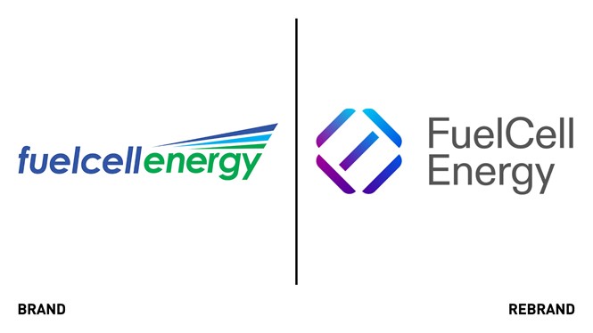
Kris Newgren, associate partner and executive creative director at VSA Partners, says, “The new FuelCell logo visualizes the company's mission of leading the journey towards zero carbon emissions.
“The icon is constructed by overlaying the letter forms F,U,E,L, and C, with the segment in the upper-right completing the ‘zero’. The segments of the icon also nod back to the chemical bonds that are made and broken during the fuel cell process to create energy.”
FuelCell Energy’s old marque made use of darker blues and greens, while the new marque incorporates blues and purples following a ‘bright and progressive’ colour palette update. The firm’s typography also sees a big makeover.
Newgren adds, “We used ABC Diatype because it's clean yet warm, and re-enforces the overall brand commitment to being minimal and without waste.”
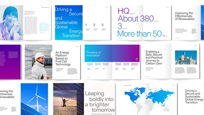
Meanwhile, the new brand expression system aims to bring consistency to FuelCell Energy’s communication platforms, assets and advertising.


