Block party
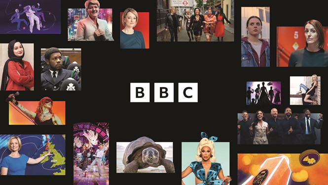
For the first time in over two decades, the BBC has refreshed its iconic blocks, repurposing them for a more modern audience with the implementation of a new custom typeface. Elettra Scrivo reports
Typeface, whether it is obvious or subtle, lies at the heart of visual identity, acting as the primary link between a brand and its audience. However, even, or especially, when a brand’s typeface goes unnoticed, it can still have a powerful impact on the overall visual identity. It can subtly convey a brand’s character, its tone of voice and what it stands for. Applying the new BBC typeface, Reith, to the public broadcaster’s wordmark aimed to do just that.
Reith, named after the organisation’s founder, John Reith, was first created in 2017, in collaboration with type foundry Dalton Maag. Reith replaced the previous typeface, Gill Sans, which had been used since 1997, and no longer reflected the BBC’s brand values. Its aim was threefold: to enhance distinctiveness, improve accessibility and reduce the BBC’s dependency on a third party-owned typeface.
Since 2017, Reith has been slowly rolled out through a soft launch on different BBC sub-brands. However, it was only through ‘Chameleon,’ the latest rebrand led by BBC’s in-house team and global brand consultancy, Wolff Olins, that Reith was implemented into the iconic BBC blocks.
Laurence Honderick, head of design at the BBC, describes Chameleon as not so much a rebrand but “a complete modernisation of the BBC’s products and services.” Before Chameleon, the BBC lacked a degree of centralisation. This caused the audience to engage with different platforms, from BBC Three content to movies on iPlayer, without making the immediate connection that they all belonged to a single BBC masterbrand.
“Obviously, the audience recognised the blocks, but there wasn't any sort of expanded brand language beyond that which they could meaningfully engage with. The new hierarchy, the new structure and the new brand system, instead, are designed in a way so that all roads lead to the BBC, at least on an attributional level,” Honderick says.
Reith played an important role in weaving all the aspects of the new brand system together and pointing the audience towards a single BBC brand. “All the building blocks of our communications should be pulling in the same direction. The more coherent the brand, the easier it is for our audience to understand, navigate and appreciate it,” Honderick says.
Steffan Cummins, associate creative director at Wolff Olins, agrees. “Creating a cohesive experience across web, apps, social, TV and marketing can only be achieved by adopting a single type family and a tight typographic system. We used this opportunity to embed BBC Reith in all key design elements, which helps dramatically improve accessibility for users and in turn makes BBC’s portfolio of services much easier to navigate and use,” he says
Whilst Gill Sans signalled heritage and familiarity, it belonged to another era, designed with storefront displays and print in mind, rather than digital screens. The typeface hindered legibility, particularly for visually impaired people, and didn’t reflect the contemporary look the BBC was aiming for. Honderick believes that switching to Reith was the right thing to do to give a modern, distinctive and continuous quality to the BBC in the “here and now.”
“While Gill is beautiful and deservedly iconic, it’s not a modern typeface. To my eye at least it’s relatively traditional and institutional. The BBC of today is incredibly dynamic, multi-dimensional and modern. I’d like to think that Reith will signal that,” Honderick says.
To fulfil the accessibility and legibility goal, the blocks were created following a highly detailed and conscientiousness process. They were built within a pixel grid at various scales to allow for maximum visibility on different platforms, especially digital ones. The Reith blocks also had to be future-proofed against the organisation’s expectations that technology and digitalisation will continue to develop beyond imagination, Honderick says.
He adds, “The three blocks are fundamentally iconic, and the audience has a deep connection to them. It wouldn’t have made sense to lose them altogether, but we wanted to make sure they were fit for purpose for the next generation from an accessibility standpoint.”
Though subtle in its change, the BBC has used the new Reith logomark to signal to its audience that the brand is modern, durable, ready to embrace digital advances and engage with a younger, more tech-savvy generation.


