Ricola rebrand reflects growing consumer base
London-based design agency Lewis Moberly undertook a strategic review which resulted in a refined brand positioning for its global audience. The rejuvenated look for the Swiss cough drops and breath mints manufacturer aims to show off a confident contemporary stance.
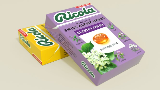
The design agency’s work, which builds on the Ricola’s roots, is seen throughout the brand’s design, advertising and social media. The brand’s USP of being ‘made with Swiss Alpine Herbs’ is utilised in the new, modernised logo.
Lewis Moberly’s creative director Mary Lewis says, “The challenge for Ricola was to ensure continuity of a heritage brand and define it as a brand of today. Ricola ticks many boxes of a successful brand; love, need, tension, and distinction. Visual communication has to project a cohesive summary.”
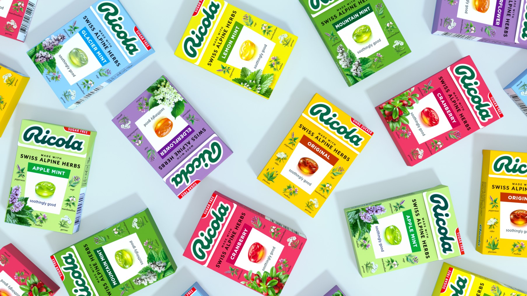
Illustrated by a botanical artist, the amber drop framed by the herbs which form the blend of Ricola is heroed in the core design. The historical Ricola trapezoid, reminiscent of a plant marker, also features heavily in the design.
Thomas P. Meier, CEO of Ricola says, “We needed to showcase our natural attributes and delightful taste properties and at the same time ensure consumers can navigate an extensive range with ease.
“Our strategy is seamless with the new design direction, which quite simply makes Ricola more of what it is, and always has been. Staying true to the essence of the brand was very important. Ricola prompts pleasure through its affinity and commitment to nature - a brand for everyone, everyday everywhere”


