#TransformTuesday: 19 November
From conference hubs to business clubs, here is our pick of the latest rebrands. For more from #TransformTuesday, follow @Transformsays
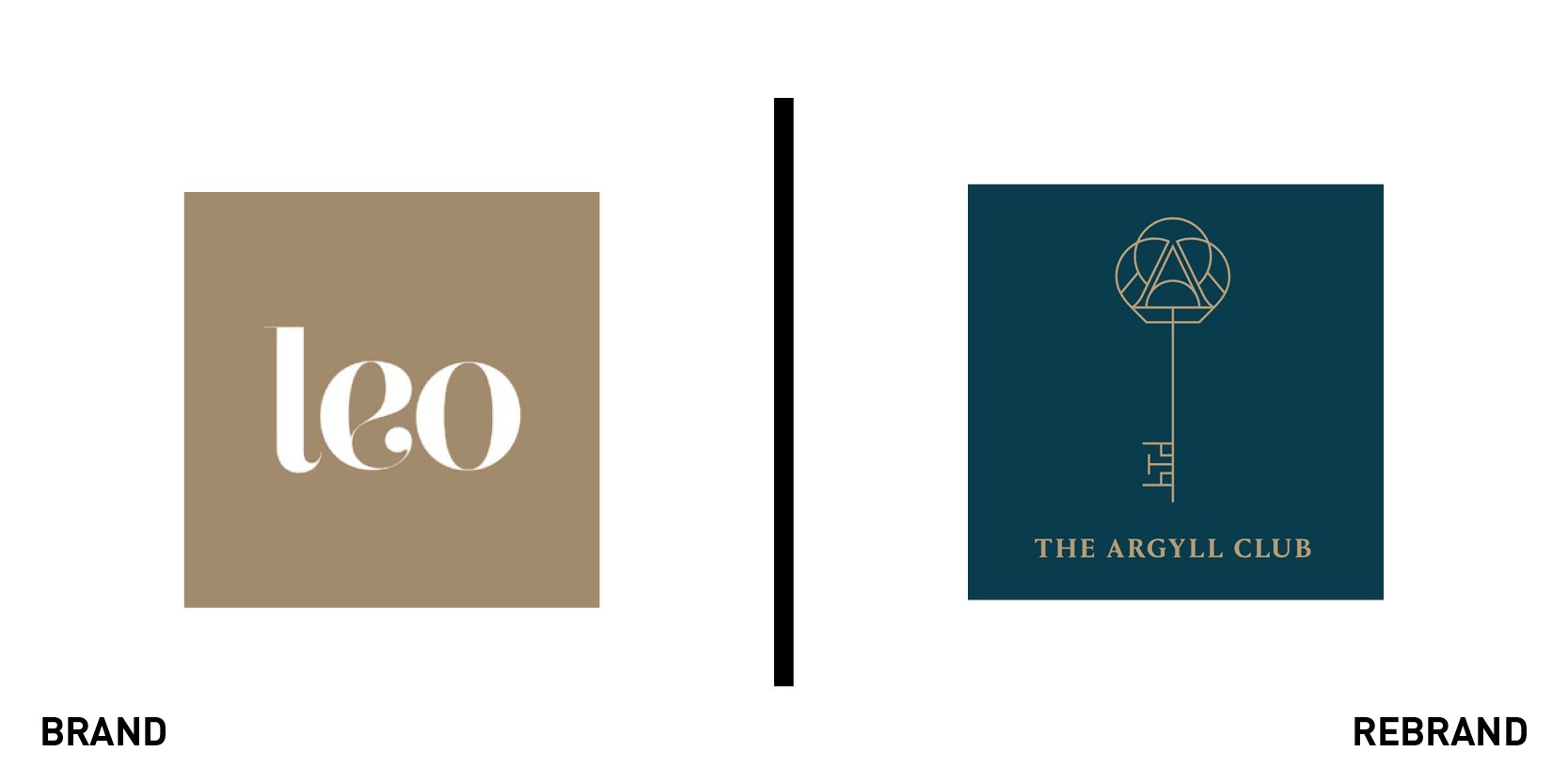
Argyll Club
In a specific effort to position itself against the concept of open workspaces and serviced offices, business club London Executive Offices targets professionals who require a more secluded and private space. However, according to brand agency SomeOne, it suffered from a low profile and poor positioning. The agency rebranded the organisation to the Argyll Club, aiming for a premium feel and a new brand icon. The key icon hides a table and a set of chairs on the blade, while the handle carries the letter ‘A.’ The new brand establishes a clear tone of voice with premium photography.

The Atlantic
The era of traditional publishing has long gone, with publications forced to seek a revenue model outside of advertising. The Atlantic is one of the latest in the tide of US magazines launching a digital subscription service, and it required a new brand to reflect the change. Beginning with its December issue, the Atlantic has launched a redesign of the print magazine with a new logo and visual identity, designed in house by an internal creative team. The Atlantic nameplate, symbol of the magazine for over a century, has been changed to a single letter 'A,' which leaves more space on print covers and guarantees clarity and readability on mobile and desktop. The design of the monogram was inspired by the magazine’s original typeface dating to 1857. The same typeface was then employed to inspire the magazine’s first custom font, Atlantic Condensed.
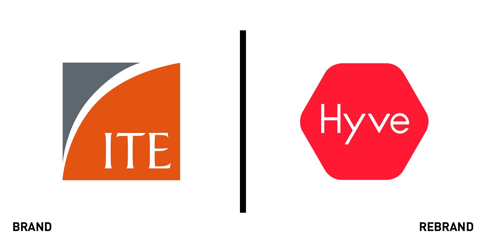
Hyve group
Conference and event organiser ITE Group has undergone a business transformation over three years, mutating from a decentralised portfolio to a unified global one. It says its new business will be more centralised, streamlined and focused on human connections. This led to the creation of the new Hyve brand by Venturethree. According to the agency, the new name is a nod to beehives; organised living organisms powered by thriving communities. “The brand system positions Hyve at the centre of that community, with compelling imagery drawn from the industries it works with and world-class content to create a sense of energy and buzz,” Venturethree’s creative director, Stuart Jane, says.
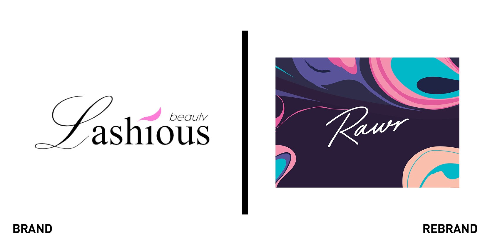
Rawr
To support the business’ expansion in upcoming months, Lashious Beauty has rebranded to Rawr with design by creative agency Imagination. The agency worked on a new brand strategy and positioning for the UK chain of beauty salons, with an identity crafted to reflect nail polish patterns in a flexible colour palette. According to Imagination, the resulting brand is bold and unique, and it was created to position Rawr as a leader for money-savvy urban consumers, fitting seamlessly in busy lives. The brand also reflects the company’s belief in personal empowerment, with a bold attitude designed to target a specific segment of consumers. The new urban identity was applied to the flagship store set to open in London this week, and will then extend across most Rawr locations nationwide.
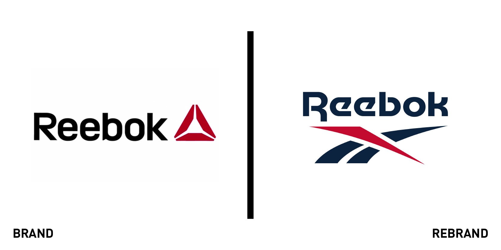
Reebok
Beginning in 2020, Reebok will return to its origins and reintroduce its vector logo, abandoning the delta symbol it adopted in 2014 in support of its focus on CrossFit. The original vector logo was first introduced in 1992 and has been used in various forms ever since, each time going through minor adjustments and adopting new features. The reworked version is a modern evolution of the original vector, with a flattened top and base and wider spaces to improve legibility in small sizes. The new brand reconnects Reebok to its heritage, propelling its legacy into the future. The wordmark and logo will roll out across all Reebok sport and lifestyle products, including footwear and apparel. The design was created in house and in collaboration with NY-based designer Darrin Crescenzi.


