Spotlight on Hollis

Reinventing its brand for a broader business remit, international expansion and digital-readiness, Hollis introduced an adaptable, illustrative and very orange rebrand
With a 50% increase in web visitors of 50% month-on-month the proof was clear for the Hollis rebrand. And it was no small change for the real estate consultant. Updating not just its name or its visual identity, but the way in which it describes itself, Hollis has met a changed business environment with a renewed strength.
To adapt to a broader remit, a digitally enabled audience and an international presence, Hollis had to shed its somewhat quirky, analogue identity for one capable of helping it expand. To do so, it turned to a familiar duo in the form of Frank, Bright & Abel’s founder Rebecca Price and creative director Janet Edwards. The pair had, when working for Radley Yeldar, led the prior rebrand of the then-named Malcolm Hollis, 13 years ago.
But, it was time to reappraise and move forward with an ethos of ‘Growing up gracefully.’ Price and Edwards used that as a working mantra, gearing their brand redevelopment toward that objective. “If you grow up gracefully, you’re not afraid to be yourself,” Price says, likening it to a person ageing. “You don’t lose a sense of yourself, but you dial down the bits that are no longer appropriate. It’s okay to have the loud glasses and designer jacket, but you might want to put the crop tops away.”
To make sure Hollis retained the right parts of its identity in its redevelopment, it convened a consultation panel of a dozen representatives from across the business alongside a steering committee of the brand and marketing professionals responsible for shaping the new brand.
One of the first things to be shed in the process of growing up was part of the brand’s name. Called Malcolm Hollis, the brand was loved by its passionate employees, but mispronounced and misspelled everywhere outside of the UK. After a trademark review, the decision was easy. Malcolm Hollis would become simply Hollis. The change has been supported, but somewhat tricky to embed, as the reflex of saying the company’s full name has been a hard one for employees to drop. The branding team has since implemented an office fine jar for anyone who says the word ‘Malcolm.’ The accumulated pound coins are donated to charity.
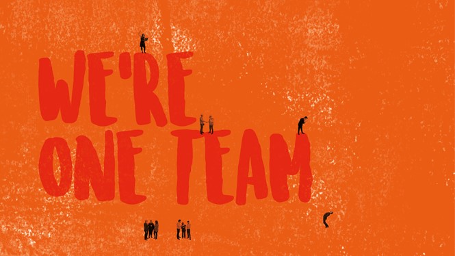
Between renaming and implementation, Frank, Bright & Abel developed the brand strapline, ‘All together different.’ Price adds, “It says, ‘We respect individuality.’ It says, ‘We believe doing things together means doing them better.’ And inherent in that is doing things together means bringing together a blend of different skillsets, a blend of dispositions and characteristics, and a blend of Hollis people and clients in absolute partnership and harmony.” Alongside that, it updated the description of Hollis as a business from ‘building consultants’ to ‘international, independent real estate consultants,’ Hollis’ brand could reflect what its business operations already did: a broad scale of services across a number of regions.
“If you grow up gracefully, you’re not afraid to be yourself. You don’t lose a sense of yourself, but you dial down the bits that are no longer appropriate. It’s okay to have the loud glasses and designer jacket, but you might want to put the crop tops away.”
With the overarching strategy in place, the focus turned to tone of voice guidelines, image usage and creative direction.
“We had to be careful about not being overly corporate,” says Rachel Stackhouse, brand and communications manager at Hollis. Because the approach put Hollis’ distinct culture and people-focus first, it retained a sense of professionalism without sacrificing the fun.
That’s what the previous brand did as well. Its starburst-inspired design mixed the professional with the personal. But the shift to digital communications strained the pre-social media-era brand. The new brand had to adapt to this environment, retaining a sense of the company’s unique personality without following trends.
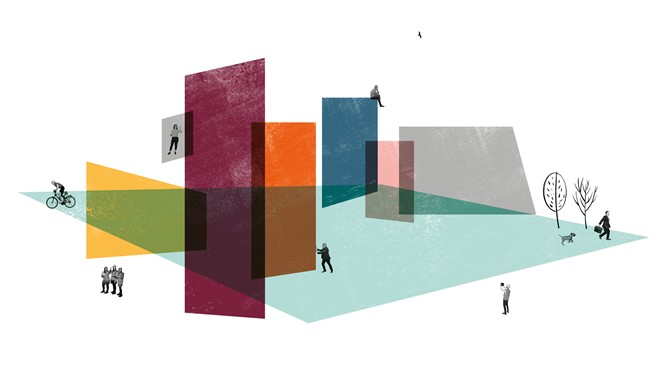
Edwards focused her creative strategy on people and on a sense of humanity. “So often you end up with a corporate approach to people. It was just trying to find a different way to do that,” she says about the most distinctive element of the new visual identity: a collection of miniature silhouettes based on Hollis’ own employees. That formed the basis of a graphic world that would be fleshed out with colourful illustrations, black line drawings, illustrative bespoke typefaces and a consistent photographic treatment. “Yes, it’s about buildings and the environment,” Edwards says. “But it’s deliberately representational and abstract from different points. It’s about people, but working with their clients and partners.”
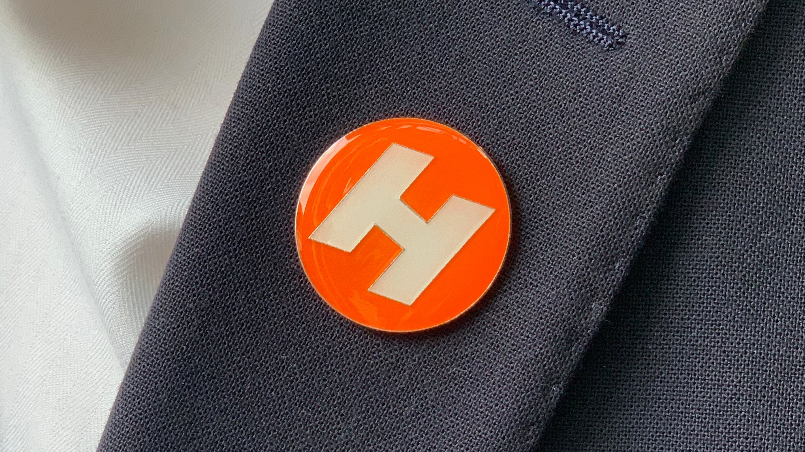
Colour was another point of consideration. Orange has long been closely tied to the Hollis brand, and is a facet employees are deeply passionate about. Edwards refined the main orange colour, but added a colour palette that allows for variety, multiple graphic styles and a more dynamic web and print style.
“There was a very amusing moment early on in the project where we were doing one of the early sessions of the consultation panel. Rachel had just joined Hollis and we were having a discussion about the creative approach. Rachel, as somebody new, asked the perfectly reasonable question, ‘Do we need to hold on to orange?’ And it was absolutely hilarious because from this really lovely, friendly, warm group of people, there was this wave around the room of a gasp. We realised at that point that orange was the one thing that was immovable,” Price says.
Bringing flexibility into the brand allowed for the brand’s adaptation to a wider variety of communications. Everything could be linked back to the same family – including a bespoke wordmark, the human-first approach and the orange core colour – but everything could also be different in terms of application.
The resulting visual style works nicely when multiple elements are displayed together, as online or in print applications. In terms of photography, the approach is novel, as well. The property sector is often plagued by static smartphone shots of building facades or interiors. To ensure consistency, Frank, Bright & Abel developed guidelines to ensure photos are either monochrome or deployed with desaturated colours.
For a company as people-focused as Hollis, the reception to the rebrand was as important as the statistics. Launched internally at a company-wide away day and externally at a client drinks event, the feedback was positive. Stackhouse quotes one person who said, “Smart move, it always took too long to say ‘Malcolm Hollis’ anyway.” Clear proof, indeed.


