Positioning and brand architecture of Disney+
Three days ago, Disney+ – the much-anticipated streaming service offered by the entertainment powerhouse – launched in the US, Canada and the Netherlands. With rollouts still to come across Australia, New Zealand and Europe, the new service has already made headlines worldwide.
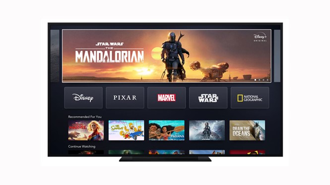
The branding for the platform is a simple take on the Disney wordmark, with the iconic shooting star arc and the addition of a plus sign. The plus sign is then used across the architecture to link the Walt Disney Company’s disparate properties, from Disney’s own-brand content to the Marvel universe to Star Wars and even National Geographic.
The platform is home to all of the Walt Disney Company’s properties, but it avoids that lengthy moniker, opting for the simpler Disney+. That, however, has meant the company has had to ensure people are well aware that its sub-brands, like Pixar and Marvel, are part of the new platform. Much of its communications about the platform have said clearly, something along the lines of the following lines from a 13 November press release: “Disney+ is the dedicated streaming home for movies and shows from Disney, Pixar, Marvel, Star Wars, National Geographic, and more, together, for the first time.”
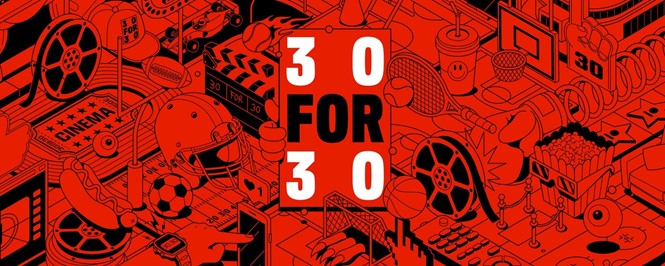
Alongside the platform launch was the inclusion of add-ons of Hulu and ESPN+. Where the branding has been really shaken up is in one of ESPN’s flagship properties, 30 for 30. The documentary series has been running since 2009, when it was launched to commemorate the 30th anniversary of the sports network. Thirty documentaries focusing on major sporting moments, teams and individuals, and trends debuted that year. The series has carried on since.
But its original branding, of a red ticket and a simple wordmark in a sports-inspired type, screamed ‘pre-digital era.’ Earlier this year it was relaunched with a new brand. New York-based brand agency Collins gave it the cinematic treatment while updating the brand for a digital future. The new wordmark is simple, yet lives in animation and offers a variety of key sub-brands to expand the universe. A mix of illustrations, emojis, symbols, graphics and photos flesh out the visual identity, offering flexibility across the brand.
The Collins project page reads, “To imagine the future of the brand, we started by looking at the past to distill what makes 30 for 30 so meaningful. Through research and conversations with the ESPN Films team and with viewers, what we found was surprising. While each 30 for 30 film revolves around a human element, what leaves a mark in people’s minds isn’t only interesting events in sports history or newfound appreciation of an athlete’s life. It’s a deeper understanding of a unique moment in time, in culture and society—and what it all meant.” That was the starting point for the new brand.
Brand
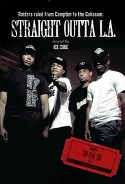
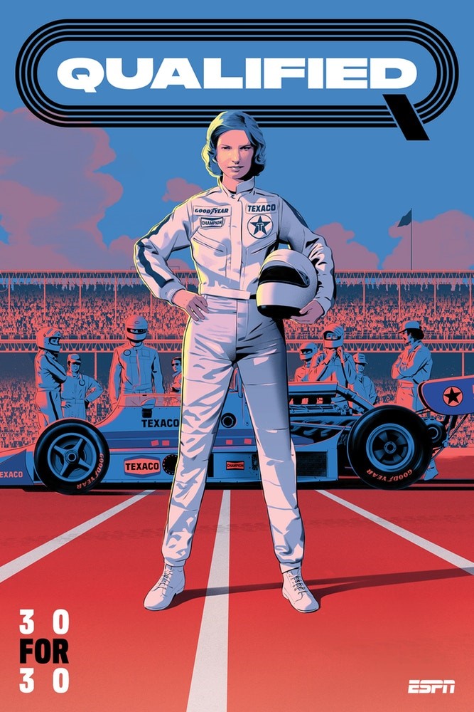
Whereas in the past, each movie poster was stamped with the 30 for 30 ticket logo, Collins' simplification of the typeface and structure of the brand means the films may be presented in a more consistent way, particularly when shown across digital platforms like Disney+.
Rebrand
National Geographic has seen a similar treatment over the past few years as the TV channel has aligned more closely with the magazine brand, all of which has been simplified behind the signature yellow frame graphic device.


