Round Table pulls new identity out of the oven
Round Table’s rebrand looks at the origins of the company and blends them with modernity, using negative space and blackletter to present a fun and engaging identity.
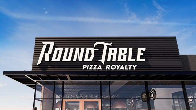
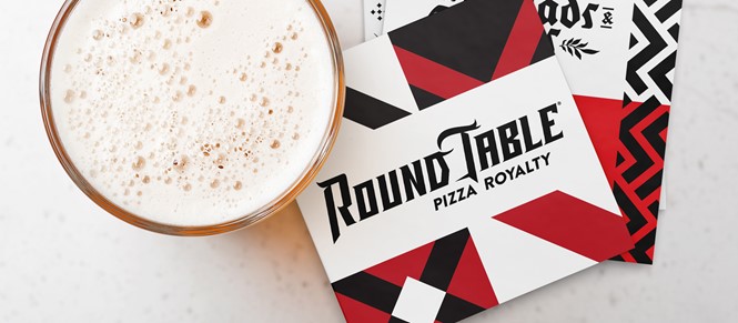
Pizza company Round Table has launched a full rebrand to be rolled out across its restaurants in the United States. The renewed identity draws from the company’s past to put forward a playful brand with lighthearted approach, through a gothic script logo and several in-store applications. The new identity comes on the occasion of Round Table’s 60th anniversary, following the acquisition of the company by Global Franchise Group in 2017.
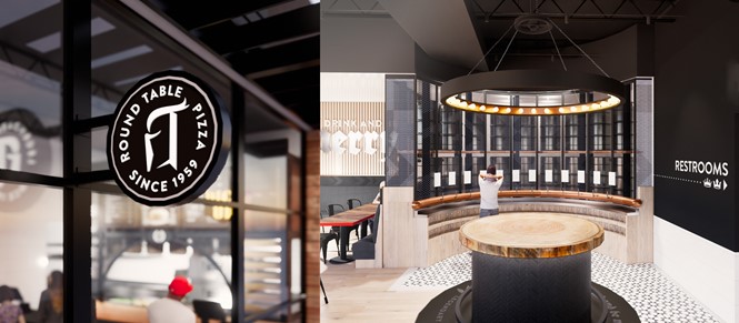
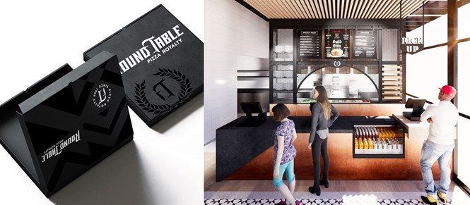
The logo takes inspiration from the company’s origins through the adoption of serif, blackletter font face, modernised and conceived to blend Round Table’s legacy with its fun personality. It also introduces a graphic element in negative space: a knight’s helmet can now be seen between the letters ‘d’ and ’t,’ a symbol to be employed as a seal and icon on packaging, uniforms, menus and badges. Furthermore, when taken alone, the helmet highlights the letters ‘r’ and ’t,’ standing for the initials of the brand name.
When compared to a variety of other pizza chains, such as Papa John’s and Domino’s, Round Table’s logo stands out for its use of serif typeface, which has already been consistently applied throughout the company’s website. The logo is minimal yet recognisable, though the knight’s helmet element appears difficult to make out unless taken on its own.
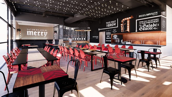
Additionally, as part of the rebrand, Round Table has announced new restaurant designs to be applied in the company’s forthcoming pizza shops throughout the year, with the first, fully rebranded store to be unveiled in summer. The renewed interior designs are an improvement on the undressed look of the old shops, introducing visual elements and decorations which echo the brand’s new identity and playfulness.
For more from Transform magazine, sign up for the Transform newsletter here and follow us on Twitter @Transformsays.


