Norwegian heritage shoe company rebrands with nod to its past
As more and more iconic and luxury brands turn to the same minimalist, sans serif fonts and logos to exude a more digital, modern feel, a few classic brands are rejecting this move in favor of a more singular approach.
Aurlands, the definitive Norwegian shoemaker famous for its timeless, handcrafted penny loafers, took the latter approach for its redesign. The reworked logo and brand identity is a prime example of a traditional and beloved brand whose redesign is looking towards the future, while simultaneously referencing a rich past.
In an age in which a number of brands are rejecting their history in favour of a more futuristic, digital image, Aurlands’s redesign exemplifies that the two can be happily combined.
Designed by Oslo-based branding agency Heydays in collaboration with typography designer Ellmer Stefan, the new Aurlands logo and design combines the clear modernity of a sans serif font with unexpected, yet subtle curves and flourishes. This unique typography is intended to specifically reference the brand’s history, as it was inspired by founder Nils G. Tveranger’s original logo and 19th century grotesque fonts. While the previous logo was clean and contemporary and featured an italicised sans serif font, the redesign maintains this same sense of neat precision while adding an ovoid border, a bold twist and all caps font.
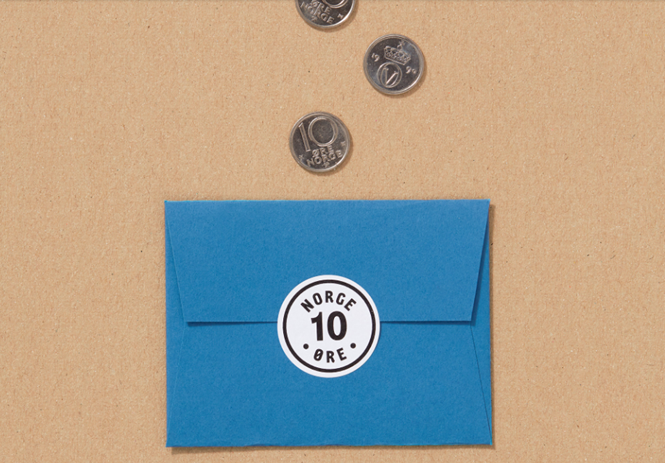
The company’s past is also subtly referenced through a newly created icon depicting the number 10. In 1926, Tveranger began placing a tiøring – a 10th of a Norwegian krone – in the shoe’s instep. Aurland honours this history by providing two tiørings with every purchase, and thus the 10 icon is the perfect reminder of the personal touches that make Aurlands a classic Norwegian brand.
For more from Transform magazine, follow us on Twitter @Transformsays


