Mega Marshmallows blends fun and fluffiness together in fresh brand
Mega Marshmallows has announced a new rebrand that merges the American flag and marshmallows even further, in the attempt to bring more identity to the brand.
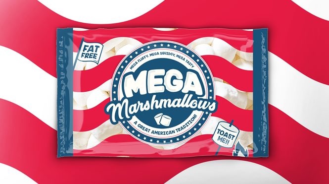
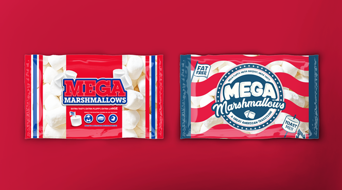
Hearing the word ‘marshmallows’ can evoke memories of big chunks of fluffy sugar. It can also remind American traditions and campfires, so it is just appropriate that Mega Marshmallows’ previous brand identity touched on the colours of the US flag. Now, the company has announced a new logo and identity that ties on that connection even further.
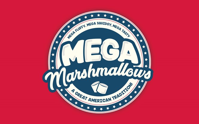
The new logo, created by brand design consultancy Brandon, has retained the stripes of the American flags but moved them outside a giant, circular badge hosting the name of the brand, encircled with the American stars.
The logo also keeps bold sports college typography and evolves it in rounded letters, reminiscent of the roundness and softness found in the brand’s product. The new identity merges typical American sports badges with outward moving letters, in the attempt to blend the American flag with the playfulness of sports.
“We simply amplified the brand assets and made them more relevant to the product,” Brandon creative partner Abigail Taylor says, “and people’s love of great American traditions like marshmallows by the campfire.”
Mega Marshmallow’s new packaging is an interesting example of how brands can draw inspiration from cultures to come up with fresh identities.


