Type foundry puts its best feet forward with new serif typefaces
Not long ago, web designers were confined to a handful of safe typefaces – safe in that they remained clear and legible in all major browsers. Needing to complement logotypes and align with brand guides digitally and in print, many have chosen geometric sans typefaces like Helvetica, Arial and Futura as secondary typefaces or even in their wordmarks. Fontsmith has called a point of order on the ubiquity of these monoline typefaces and released a trio of serif typefaces for storytellers, capable for use in display headlines, body text and more.
A combination of increased browser capabilities, CSS updates and improved screen resolutions have made it possible for more typefaces to shine across all platforms. And for typographers for whom the web has been a hellscape of bad leading, rivers of poorly justified text and utilitarian sameness, Fontsmith’s FS Neruda, FS Ostro and FS Kim are a breath of fresh air. Fontsmith founder Jason Smith says, “Everyone’s getting tired of the same old geometric fonts we see online… you don’t have to dumb down fonts. People want to read things properly, and to see and importantly feel something different – we can, and do, use serif typefaces digitally. There’s a backlash beginning against a lot of online brands looking the same: people and brands want to be identifiable. You can be more expressive in some cases with serifs.”
Typefaces that make great body text are harder to come by than display typefaces; the need for language accents, different weights and caps alone rule out most typefaces for use in body text. Additionally, as the godfather of typography Robert Bringhurst says, “Letters have a life and dignity of their own…well chosen words deserve well-chosen letters,” letters that should suit the words they display.
FS Neruda, inspired by Pablo Neruda, allows storytellers to, in the poet’s words, “write the saddest lines,” with a combination of contrasting weights, sharp and classic forms to make a flirtatious and authoritative typeface for readable use in all applications. The second typeface, FS Ostro, is designed with the elegance of a modern clockmaker, carrying a variety of text weights and is available in multiple display and text versions which again, are extremely versatile. Finally, FS Kim is a cheeky, chiseled typeface, less useful for body text than the other two serifs but striking, memorable and inspired with its truly sophisticated aesthetic.
Fontsmith has once again married form and function to create these versatile serif typefaces. If these new characters are a sign of trends to come, brand guides may soon look a lot more embellished and warm and a lot less ‘clean.’
For more from Transform magazine, follow us on Twitter @Transformsays.
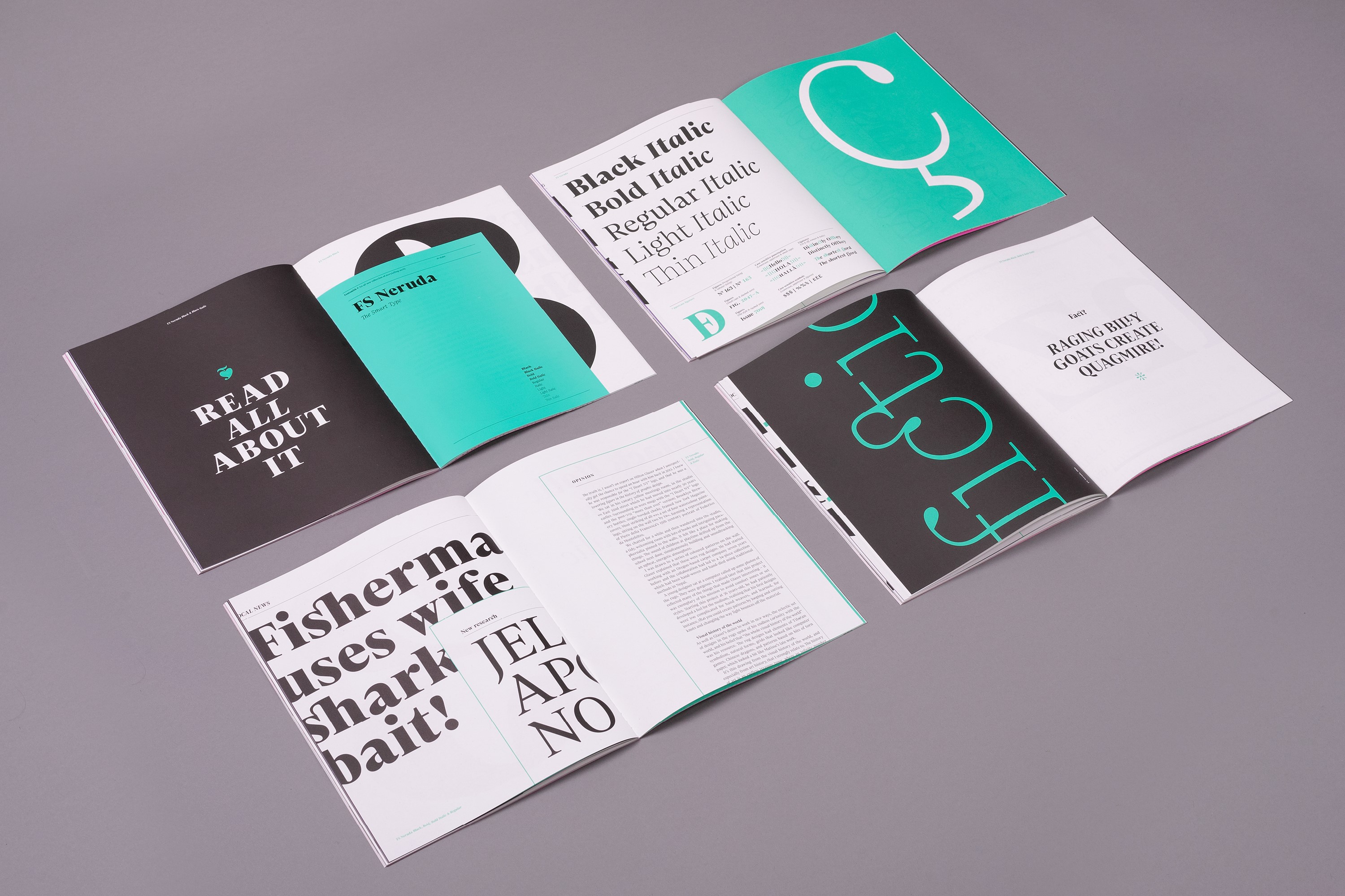
FS Neruda

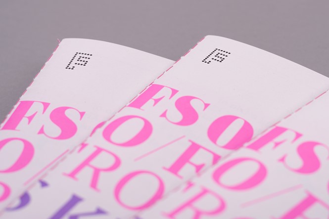
FS Ostro
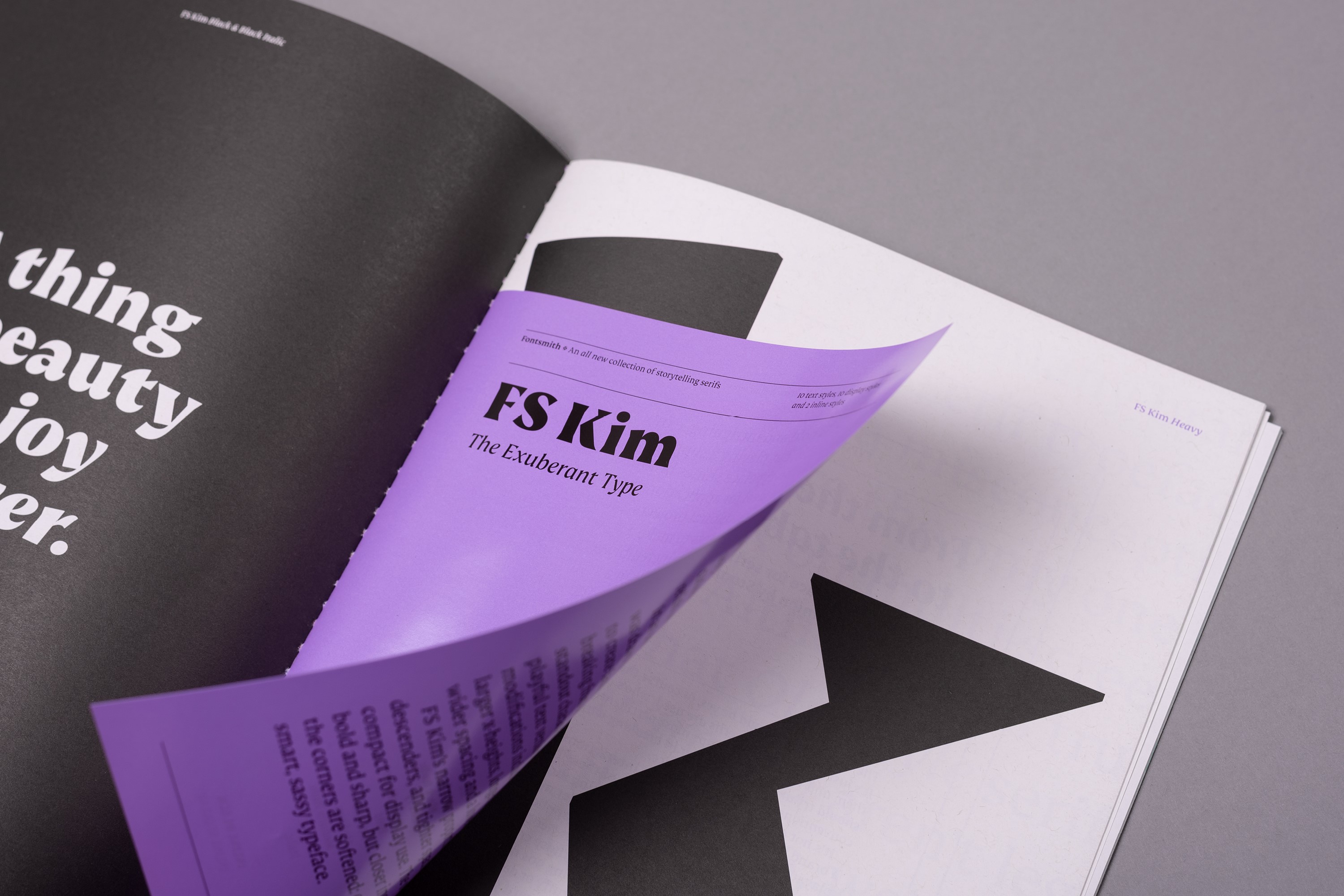
FS Kim


