Miami Marlins introduce new generation of brand identity
This is not the first time the Florida Marlins has undergone a drastic rebrand. In 2011, the then-Florida Marlins changed their name, logo, and uniform, in an effort to evolve, expand and reach new audiences. Almost a year ago, it did the same, launching a slightly altered logo that eliminated the use of the colour black. The rebrand wasn’t successful though, and the team has decided to change its visual identity once again, in the hopes that this time, it will get it right.
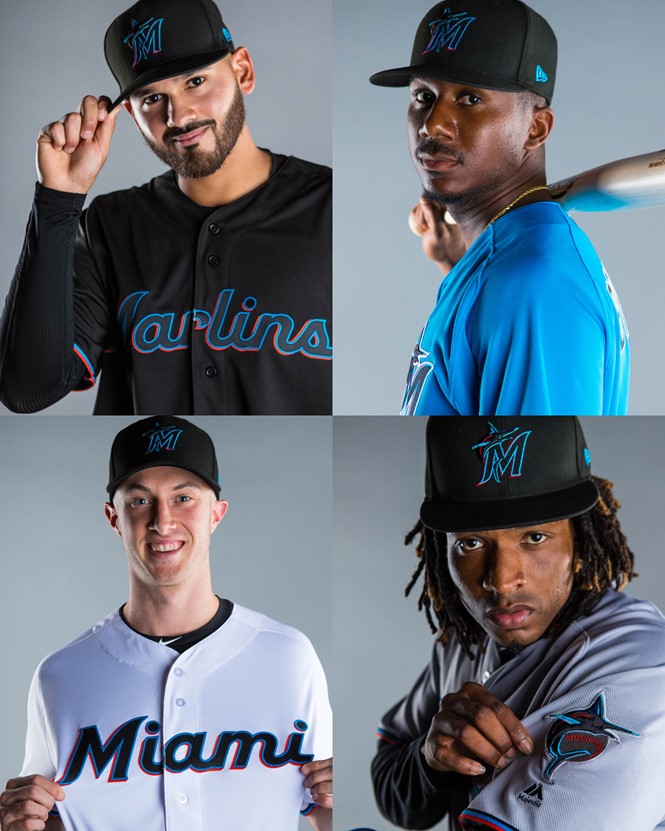
The rebrand marks the team’s growth and evolution with a stylish and contemporary new look that includes a new logo and new team colours.In an effort to reach the new generation of baseball fans, the Miami Marlins’ new visuals are vibrant, playful and dynamic, resembling the Miami community and representing its finesse.
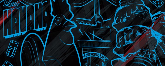
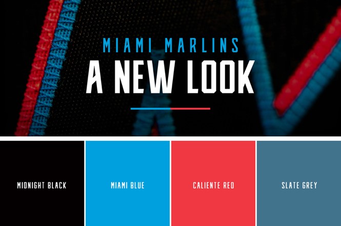
The team’s new colours are ‘caliente red,’ ‘Miami blue,’ ‘midnight black’ and ‘slate grey.’ The vibrant, yet urban shades refer directly to the urban culture and aesthetic of the town with the vibrant streets and metropolitan landscape of south Florida. Both the logo and the colours pay respect to the team’s heritage, while celebrating the diversity of its community, something that becomes apparent in the contrast made by the pairing of Miami blue and caliente red against the midnight black backdrop.
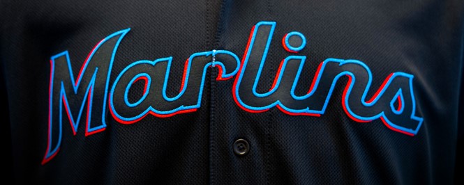
The new Miami Marlins’ monogram sees the ‘M’ written in a curved serif font, a choice that goes against the trend of simplistic sans serif font other brands are adopting. This choice however, was consciously made as a nod to the team’s Latin American roots, where this type of font is commonly found, and to the Miamis Marlins past, as it is reminiscent of the typography the team had in the 1950s.
The illustration of the marlin in the primary logo, is an updated version of the old one, now having a more athletic and dominating presence. It’s upright position, captures the sense of pride, power, speed and determination the team posses.
Alongside the new logo and colours, the team has also revealed the introduction of the club's new uniforms that carry the team’s new brand identity, completing the overall rebrand.
For more from Transform magazine, follow us on Twitter @


