Bank of America logo is the same, but better
Bank of America, the second largest banking institution in the US with an international presence in over 35 countries, has revealed a new brand identity, consisting, among other things, of a new logo designed by creative consultancy Lippincott.
With its new brand positioning summarised in the question, ‘What would you like the power to do?’ Bank of America conveys a clear message of giving the opportunity, and power, to people to live their dreams and achieve their goals.
This is the first time the logo has had an updated since the bank’s establishment through the merger of BankAmerica and NationsBank two decades ago. As stated in Bank of America’s press release, “The flagscape logo is also getting its first update since being introduced in 1998, reflecting a more modern brand that delivers both cutting-edge technology and high-touch solutions for clients.”
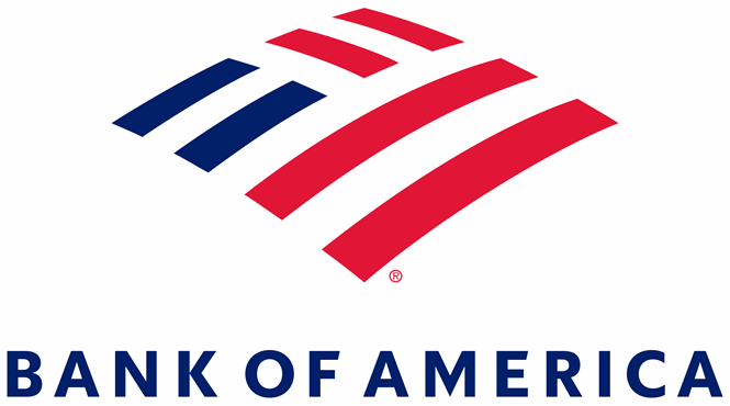
The two logos are not massively different from one another. They both have the wordmark alongside the same flagscape icon. However, the rebrand was designed to offer an updated, modernised version of the previous visual identity that shows the brand’s evolution in subtle yet effective ways.
The new logo sports the wordmark in an all uppercase typeface with wide kerning in a minimalist sans serif font. The illustration of the flagscape has its stripes spread further apart, with the shape having a more geometric design to depict a more believable and accurate flag. “The result is a refreshed logo optimised for physical and digital environments,” Bank of America says.
The new visual identity is more crisp, more dynamic and offers better on-screen translation, ticking every box in Bank of America’s to do list.
For more from Transform magazine, follow us on Twitter @Transformsays


