Dipping into a new brand
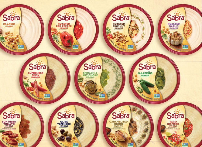
Call it a chickpea, call it a garbanzo bean, call it gram; whatever it's called, when pureed and mixed with olive oil, tahini, lemon juice and garlic salt it becomes hummus. And synonymous with hummus in many markets is Sabra.
Owned by Israeli food group Strauss – a partner of Pepsico – Sabra is poised to become one of the strongest brands in Pepsico’s arsenal. And, with a new CEO appointed in 2017, Sabra is also poised for change. Part of that movement is the introduction of a new brand, which debuted yesterday.
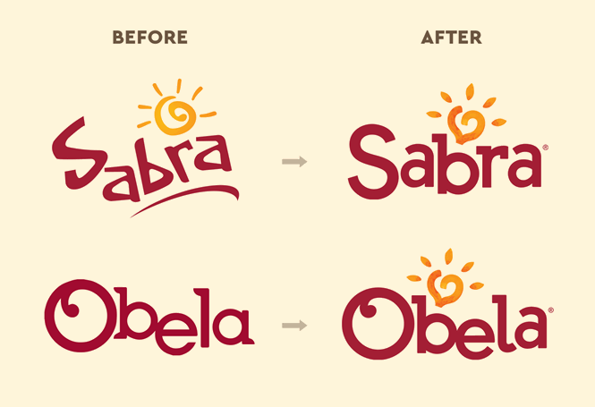
The biggest shift in the new packaging approach, carried out by New York based agency Beardwood & Co, is a revamped custom typeface. The previous wordmark was spiky, warm and immediately recognisable. Beardwood has capitalised on that prominence by curving out the letterforms and introducing a heart shape to the sun symbol in the wordmark. This amps up the warmth factor in the logo and allows for a more digital-friendly typeface used across the rest of the packaging.
“From the Sabra sun which is recast as a chickpea evoking the warmth at the heart of the Mediterranean, to fresh ingredients shot in sunshine on a kitchen cutting board, the new designs enhance flavour expectation and beautifully convey Sabra’s brand personality and promise,” says Eugenio Perrier, CMO of the Sabra Dipping Company.
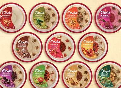
In some markets, Sabra is sold under the Obela brand, making one of the challenges put to Beardwood to unite the two brands and simplify the branding across the family of products. Obela, too receives the sunny heart icon and curving letterform treatment.
The textures, colours and label shape are largely unchanged, but more rustic-looking photography helps modernise the packaging. “We are in an era of real food. Consumers care more about the quality of ingredients and the innate healthfulness of what we eat. Sabra recognized it was time to let the ingredients shine. It was important to retain the clear window which Sabra pioneered to communicate trustworthiness and transparency while giving that mouthwatering glimpse at what awaits you when you open the pack,” Perrier adds.
The Obela range sees the biggest change as the shape of its label is aligned with the Sabra one, helping unite the two lines, but also invigorate the Obela brand.
For more from Transform magazine, follow us on Twitter @Transformsays


