For the internet, by the internet
Visual branding for companies that exist solely online typically refers to what that company provides or sells (Airbnb’s house locator icon) or to an animal or other visual representative (SuveyMonkey’s ape outline). Occasionally a cloud will make an appearance. What happens far less frequently is a digital brand using visual cues drawn from the web itself. That is just what Mozilla has achieved in its recent rebrand.
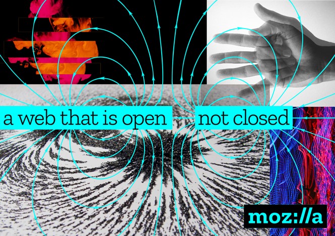
The 19 year-old non-profit believes in the open source web. Thus its new brand, using the universal protocol that appears in nearly every web address – :// – represents not only what Mozilla is, but in what it believes. “At the core of this project is the need for Mozilla’s purpose and brand to be better understood by more people. We want to be known as champions for a healthy internet. An internet where we are all free to explore and discover and create and innovate without barriers or limitations,” says Mozilla’s creative director Tim Murray.
To achieve that lofty goal, Mozilla enlisted London-based brand agency johnson banks to explore their own ideas, as well as those from Mozilla’s community, for an impending rebrand. The agency came up with a shortlist of seven working designs which were whittled down to three. “We wanted to think more deeply about Mozilla’s role in the internet and how that could be expressed, visually or metaphorically. We wanted to think more about how the internet works,” says the agency’s blog.
Eventually, the colon and two backslashes used in the http:// protocol wound up directly in the word Mozilla, forming the wordmark Moz://a. The brand system is also full of characters and emojis that exist on the internet or in computer language. Some of the initial designs are a bit campier than the ultimate, monochrome wordmark.
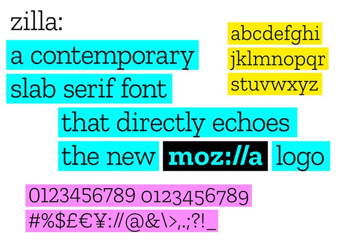
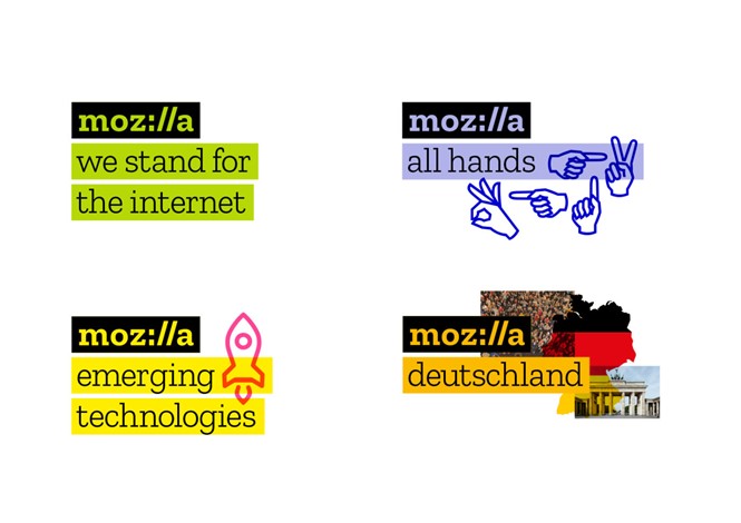
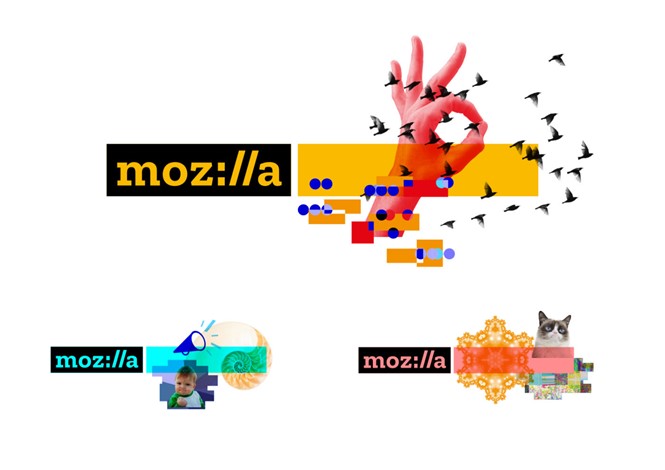
True to its purpose, Mozilla’s brand is open to all. The new font, Zilla, designed by Dutch type foundry Typotheque is available for free and is reminiscent of Courier – the font originally used as the coding default. The colour palette is drawn from the colours used to highlight text online. But the logo itself is used in application far more than on its own, says Murray. “As we looked at the elements of our brand identity, the concept of one image or icon standing for the whole of Mozilla, and the entirety of the internet, seemed anachronistic. Since imagery is an important reflection of the diversity and richness of the internet, however, we’ve made it an important component of our system,” he writes. Dynamic imagery allows the brand to change as the internet itself changes. And it makes the brand inherently ownable by artists, programmers and anyone using the internet.
Its a brand that exists because of the internet, and for the internet. It seems fitting, then, that its visual brand exists because of the internet, and for the internet, as well.


