Dating app Tinder launches updated logo
Released in September 2012, dating app Tinder allows users to select their preferred matches through a combination of pictures and a short profile on the individual’s interests. Optimised for an increasingly digital-first world, the introduction of Tinder was intended to make the first step towards approaching a potential partner less daunting. As one of Tinder’s six co-founders, Sean Rad, explains in a 2017 interview with Cosmopolitan, “You save yourself from an awkward moment.”
And, four years later, the success of saving multiple singles from potentially awkward dating moments has paid off. In a brand update carried out by the app’s in-house design team, Tinder’s now stripped back visual identity is perhaps the most drastic changes yet to the app which has changed the online dating scene forever.
A revamped logo and updated, gradient-led colour palette replaces the previous Tinder wordmark, which was led by a red-coral shade. The iconic flame symbol which previously dotted the ‘i’ of ‘Tinder’ is front and centre of its new brand identity, its bold and distinctive outline reflecting Tinder’s dominance as the dating app of choice for millions of people in all parts of the world.
Overhauled pink and orange tones create a more welcoming and friendly atmosphere to the potentially daunting task of signing up for Tinder; it’s also more reminiscent of the colour variety in the ‘sparks’ or ‘flames’ on which Tinder’s identity is based. Importantly, Tinder follows the route of older apps such as Instagram, or truly iconic brands like Pepsi or BP, in relying solely on its logo. Such a decision highlights the Tinder design team’s confidence in the app’s ability to be recognised – even without its wordmark.
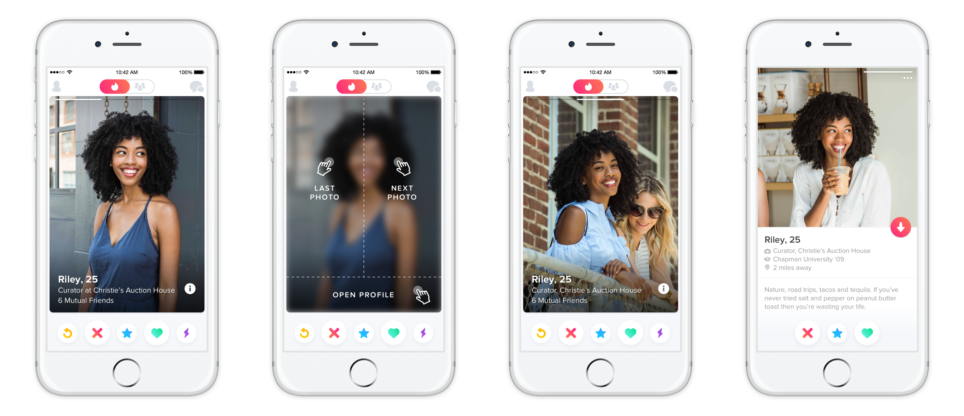
The app itself has also experienced an update. Emphasising the importance of user imagery, Tinder now dedicates more space to its users’ personal photographs and allows interested parties to reveal profile information by tapping an icon at the bottom of the screen. In a press release, Tinder says, “The new user experience is not only smarter, it’s better looking. Now, photos take up more real estate on Tinder – extending to the edge of your screen and giving you the bigger picture when it comes to your potential matches. It’s all part of an ongoing effort to make our app as fun and attractive as the community it serves.”
Ostensibly worth £2.3bn and counting 1.6 billion swipes in 190 countries per day, Tinder has arguably changed the format of online dating in a way not seen since the introduction of Match.com in 1995. Considering the risk Tinder’s founders took in developing an app-based dating site for a global audience, sacrificing its logotype in favour of an icon seems, for Tinder, an understandable next step.