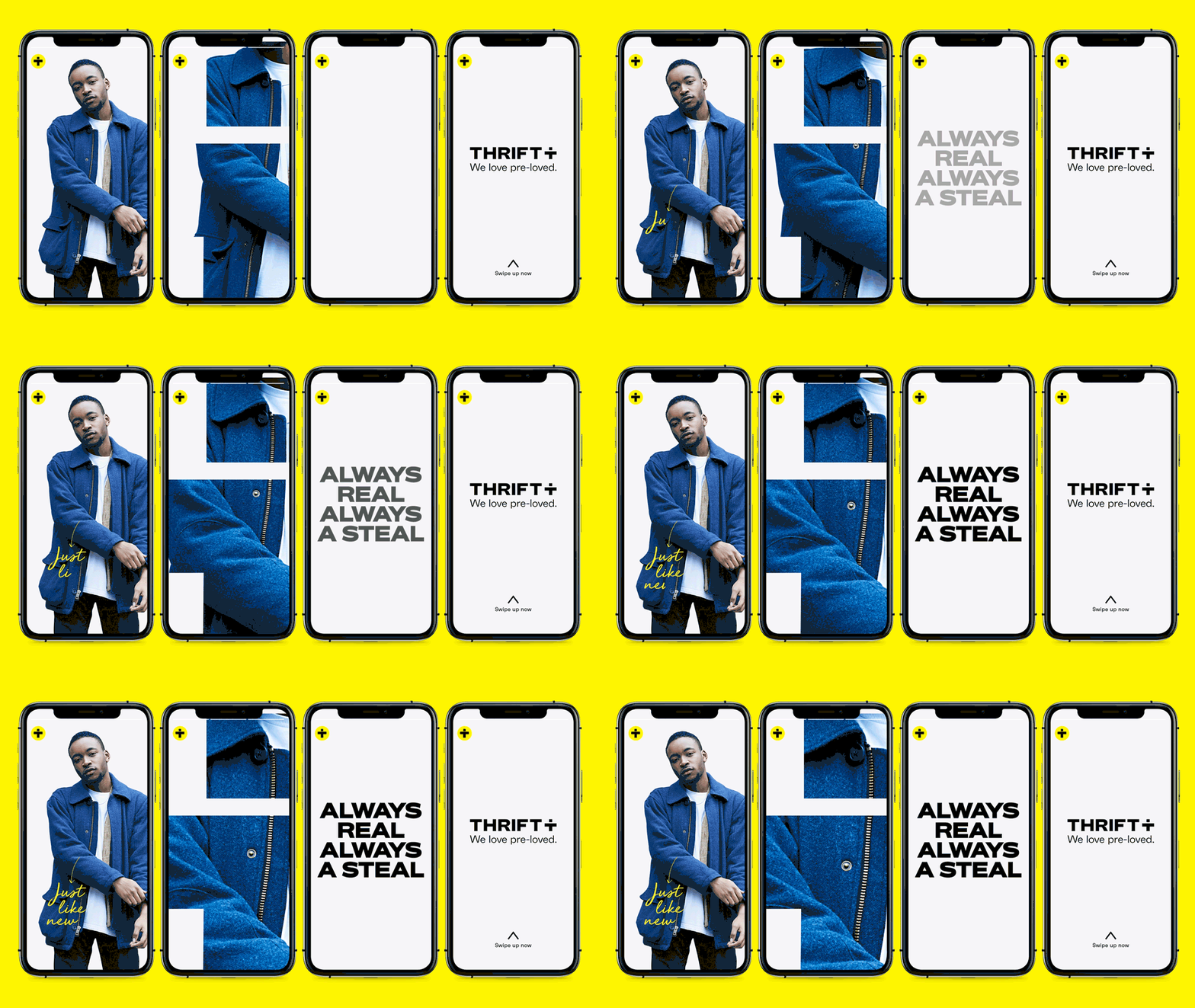
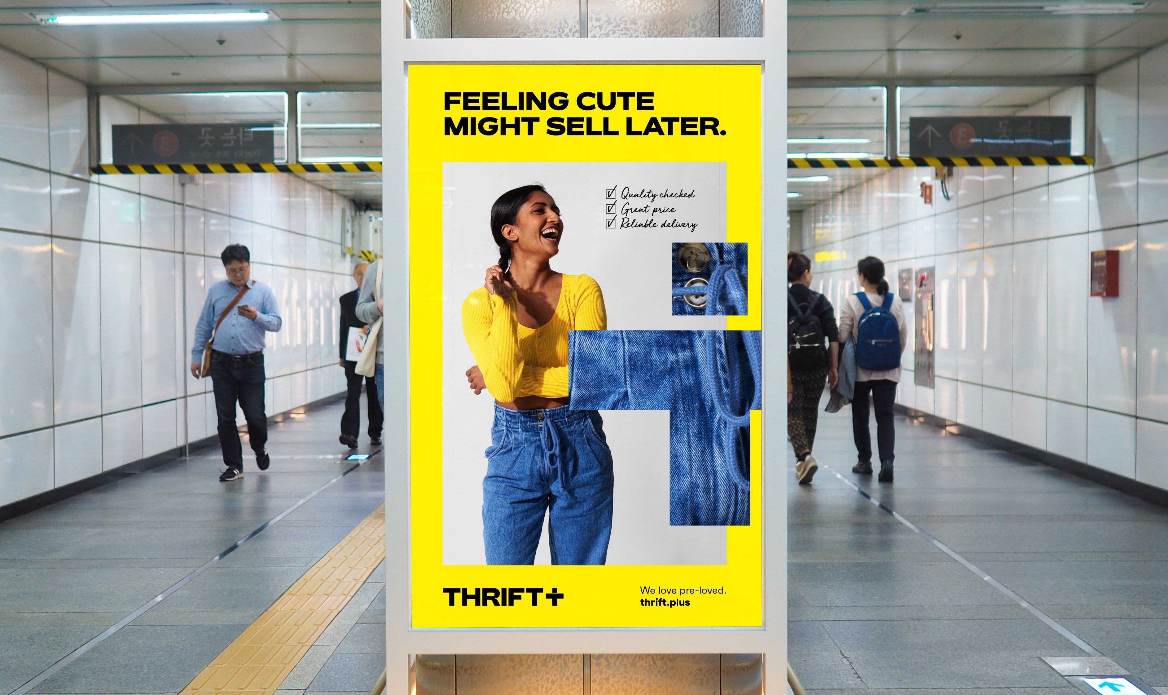
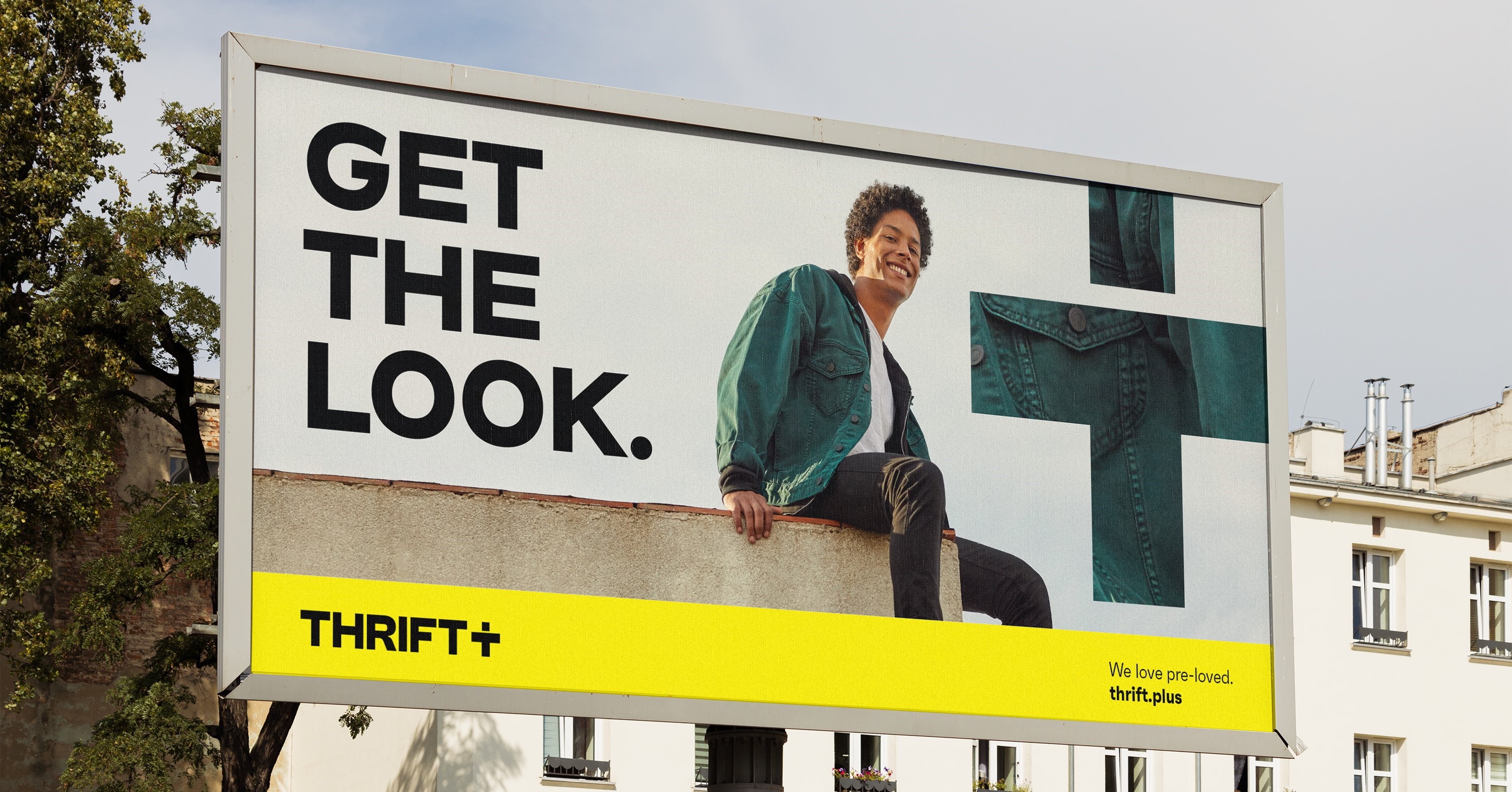
Vibrant Thrift+ identity designed by White Bear Studio

The mission of Thrift+ is to create a platform for consumers to buy and sell clothes in the circular economy, leading to a reduction in fashion waste. The London-based creative branding agency was tasked with pushing the brand into the mainstream by altering the typography, tone of voice and colour palette.
The second-hand clothes market has long been perceived as fusty, musty and dusty by Thrift+. The new identity created by White Bear would have to overcome this key consumer barrier, which was achieved by designing a new brand identity that demonstrates standout, personality and meaning.
"Our tone of voice is purposefully bold, confident and energising,” says White Bear’s creative director, Kelly Mackenzie. “Thrift+ are challenging the second-hand status quo, so we built a tone of voice that demonstrated their confidence in their service, that wasn't apologetic about being 'second hand', and that energised and empowered shoppers to buy and sell pre-loved with confidence. This is represented with a friendly yet frank, straight talking tone of voice.”

The brand now utilises a bold uppercase typography design that deliberately stands out from competitors. This is complemented by a hand-drawn secondary typeface which hopes to open a direct conversation between the brand and its ‘Thrifters’.
The brand’s new vibrant hero yellow is the international colour of optimism, while the altered ‘+’ device doubles up as a person and highlights the collective coming together of Thrift+ users who support circular fashion.
Mackenzie adds, “The plus communicates how the business over delivers on value, quality, and ease of service. We loved the idea of using the plus as a window into the Thrift+ world - be it as a zoom in device to highlight the quality of the clothes, or a keyline to showcase particular elements of a product.”


