Peter Arnell: Making it matter
In his new book, Peter Arnell Portfolio 1980-2020, the renowned brand strategist, artist and author showcases his work with iconic brands. In the following extracts, Arnell provides rich insights into his groundbreaking work with Donna Karan, Samsung, Wynn Resorts and Reebok.
Donna Karan, 1984
As Donna Karan prepared to launch her namesake label in 1984, her singular ambition was to create a new brand that spoke to a generation of young, ambitious, professional women by offering them chic and versatile clothing that blurred the boundary between their professional and personal lives. Patti Cohen, who was Donna’s head of communications and public relations—and employee number one—had been introduced to Peter’s work at Bergdorf Goodman by Dawn Mello, and decided to bring him in for an interview. By the end of that first interview— which spanned nearly twelve hours—the core identity of the Donna Karan brand had been set: namely, to hold up a mirror to this new generation of working women.
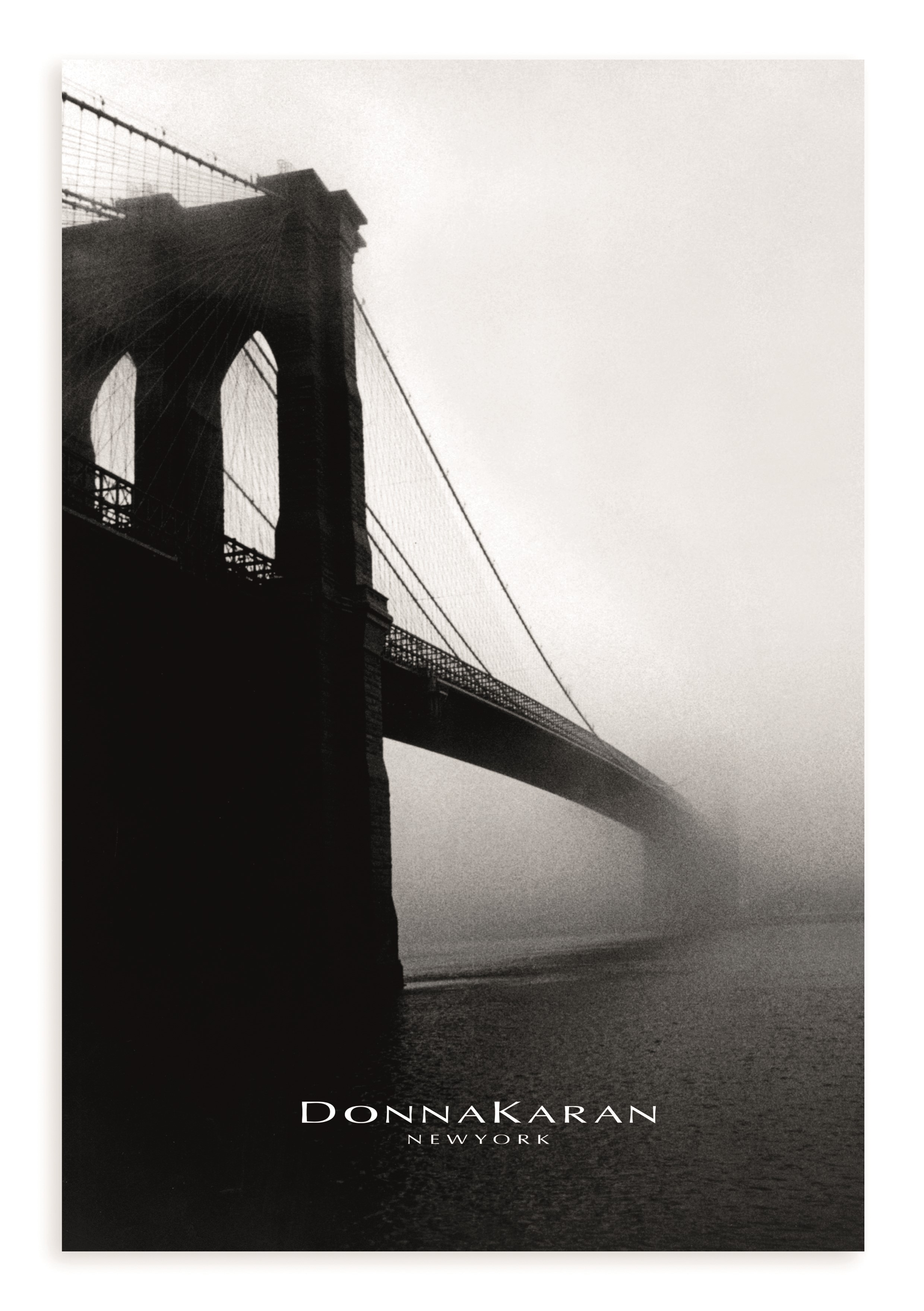
Armed with a point-and-shoot Contax camera, Peter roamed around his (and Donna’s) native city, capturing images that embodied the power and strength of Donna’s vision for a new kind of woman ... and he found it in the city itself: in the concrete, steel, and asphalt; in the rush of cars, and the surge of pedestrians. Returning to one of the most memorable sites of his own childhood—a spot at the base of the Brooklyn Bridge where his grandfather had worked—he captured what became one of the defining images of the Donna Karan brand: the Brooklyn Bridge, piercing the mid-winter mist rising off of the East River, stretching boldly toward the city just beyond, and all the hope and promise that it represented. Quoting both Edward Steichen’s haunting, largely unpeopled images of New York’s built environment, and Berenice Abbott’s life-filled photos that appeared in her seminal 1939 publication Changing New York, the reportage-style images that Peter (and subsequently, Denis Piel) captured of the city evoked drama and romance, but also grit, determination, and ambition: an unforgettable invitation to the brand that didn’t even show a single garment or model.
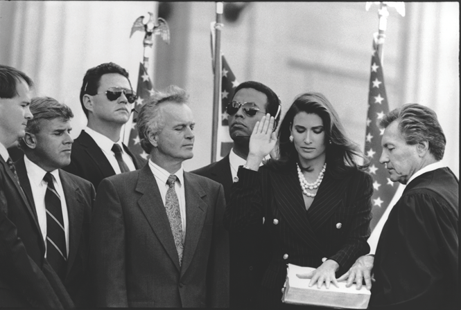
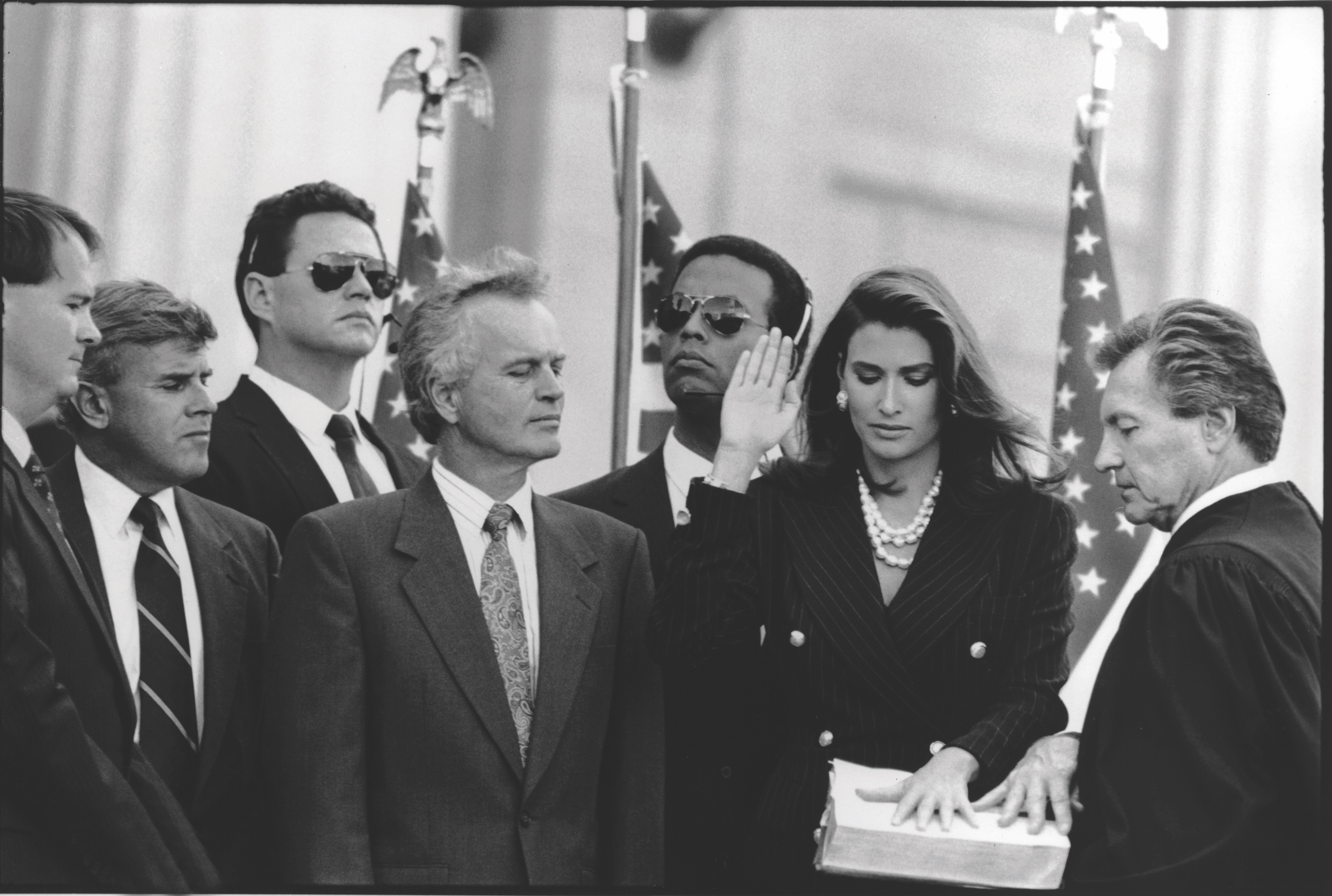
Subsequent campaigns, brought to life with the help of numerous legendary photographers like Arthur Elgort, Wayne Maser, and Torkil Gudnason, expanded and iterated upon Donna Karan’s central mandate of women’s empowerment. Perhaps most poignant of all was the 1992 series In Women We Trust shot by Peter Lindbergh, where the journey of a female politician to the highest office in the country is shown quite matter-of-factly: first, on the campaign trail; next, winning her election; and ultimately, taking the oath of office as president of the United States.
Samsung, 1996
In the mid-1990s, Samsung embarked upon a massive global expansion with their range of well-designed, affordable consumer electronics and home appliances. Up until that point, Samsung had been a marginal player in these spaces, selling solid but unremarkable items with generic designs. They needed to make a fresh statement about who they were as a brand in order to reach a mass consumer base for the first time, and they needed customers to see their product through new eyes. The Simply Samsung campaign was developed to introduce (or reintroduce) Samsung as an exciting and dynamic consumer-facing brand.
Samsung’s new range of products were highlighted with striking communications that showed a more human and approachable side of these products that were an indispensable part of modern life. Provocative, witty, elevated, and even sexy, these images alluded to the unexpected intimacy that exists between people and the functional objects that they rely on in their daily routines. Research had revealed that the gift of choice from parents to their college-bound kids was a microwave, but to gain the attention of this demographic, you had to speak their language: which, in the context of the mid-1990s zeitgeist, was unbridled sex appeal. The so-called Microwave Man—an extra-fit young man with a Samsung microwave tucked under his arm— transformed the utilitarian appliance into a genuine object of desire, albeit with a wink and a nod. It was unexpected, subversive, and instantly memorable. At the bottom of the now-iconic billboard, there were just two words: “Simply Samsung.” Nothing more needed to be said.
In a market segment filled with needlessly complex and frustrating products, the “Simply Samsung” tagline promised ease, simplicity, and intelligent solutions to the problems that consumers most urgently needed solved. Following the success of the Microwave Man ads, a blank check was given to engineer similarly bold activations for the remainder of Samsung’s consumer electronics division: TVs, VCRs, video cameras, computers, printers, fax machines, and cell phones—the latter of which in particular marked the beginning of Samsung’s extraordinary ascent. By explicitly showing technology as something that’s deeply personal, the Simply Samsung campaign anticipated the ever-growing degree to which technology would become embedded in the most intimate aspects of our lives, and sought to make it more familiar, more approachable, more desirable, and more human.

Wynn Resorts, 2003
When Wynn Resorts was contemplating a new name for their new flagship Las Vegas property, their first choice was Le Rêve—so named for the Picasso masterpiece of the same name that was planned to be hung in the lobby of the luxury resort and casino. And while that name was undeniably beautiful and evocative, to name a soaring, nearly five thousand-room hotel after a diminutive painting discreetly presented in the lobby felt somehow out of step with the ambitious scale of the development.
But as is so often the case, the solution was ultimately found hiding in plain sight: in the name of the company, and its founder, Steve Wynn. Wynn Resorts ... as in “win.” It was a distinctive, authentic, and radically understated alternative to the themed and gimmicky resorts that Las Vegas was known for. The decision to name the resort after its founder also followed a long legacy of business titans and magnates “self-branding” the companies they ran: legendary figures like Conrad Hilton, Henry Ford, and J.P. Morgan. By lending his name to his flagship resort, Steve Wynn in essence personally underwrote a guarantee to every guest: Wynn had to be the best because it was his name on the line.
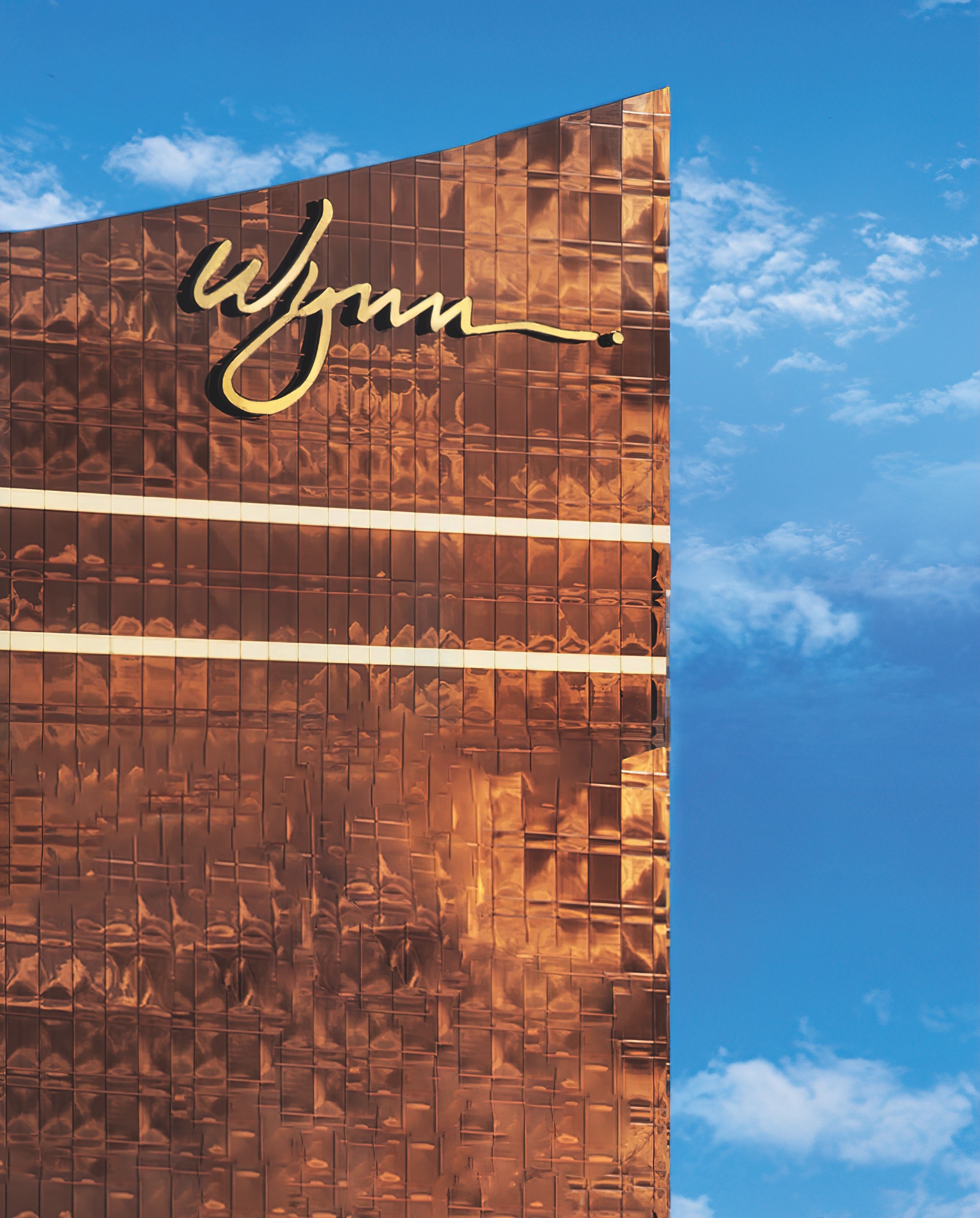
In developing the visual identity for this new destination, once again, the most obvious choice was the best one: the simple handwritten signature of the founder. In a sea of flashing lights and aesthetic excess, the simple, austere, and elegant Wynn signature stood out for all the right reasons.
Wynn Las Vegas represented the next generation of destination resorts and casinos in Las Vegas: less about spectacle and more about providing an elevated, refined, world- class experience.
RBK, 2003
Though Reebok had always enjoyed significant success with its performance footwear, by the early 2000s the venerable sneaker brand had found itself sidelined by other players in the lifestyle segment. To maintain relevancy in this heavily competitive, trend-driven market segment, Reebok was in urgent need of a reboot.
The overarching ambition was to connect to younger consumers in a way that felt authentic and natural to them; to talk to them the way they talked to each other— which in the early 2000s was increasingly over text, using quick, condensed, short- form abbreviations. The quickest way to text “Reebok,” for example? Simple. Just like the symbol on the NYSE stock ticker does: eliminate the vowels. R-B-K.
Rbk as a bold effacement of its own name positioned Reebok as a fearless, dynamic, confident brand that didn’t take itself too seriously. To bring this new attitude to life, a completely refreshed brand identity was developed that drew from the visual language of street art and graffiti, and a new flagship retail experience was opened in downtown Philadelphia that served as a multimedia, multisensory immersion into the new energy of the brand.
As an energetic and youthful brand, Rbk needed to authentically reflect and engage the voices that were most relevant to the younger generation. To help accomplish this, music industry executives were brought in to help broker relationships with artists like Jay-Z and 50 Cent. Far from conventional sponsorship deals, these 360-degree partnerships leveraged the creative genius and business acumen of these icons to create signature products and new Rbk sub-brands that became genuine pop culture phenomenons.
Rbk’s 2003 launch and subsequent breakout success helped to revitalize the Reebok brand, repositioning it as a youth-driven and style-conscious lifestyle brand, backed up by true performance engineering and Reebok’s respected heritage of speed, power, and agility.

All proceeds from sales of Peter Arnell Portfolio 1980-2020 will be donated to the Special Olympics in honour of its founder, Eunice Kennedy Shriver.
This article was taken from Transform magazine Q3, 2023. You can subscribe to the print edition here.


