Nokia announces major rebrand by Lippincott
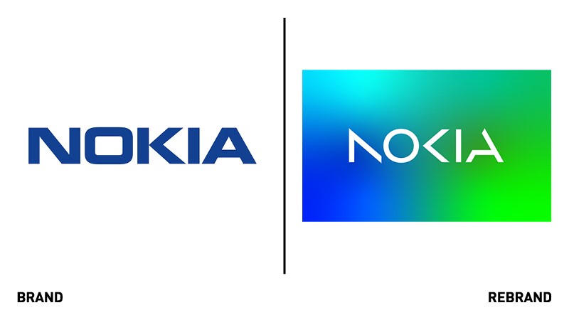
Having remained largely untouched since the 1960s, Nokia’s redesigned logo hopes to show off the company’s stature as a B2B tech innovation leader. Lippincott, the global brand strategy and design company, was responsible for updating Nokia’s logo and visual system.
With Nokia still being recognised as a company which once sold sturdy mobile phones, the Finnish multinational sought the help of Lippincott to use brand to change dated perception. Lippincott hoped the redesign would clearly signal Nokia’s revised purpose as a company that is now a pioneering tech innovation leader.
Still connecting the new brand to Nokia’s history, the refreshed logo retains the original sharpness of the ‘K’. However, Lippincott’s work softens the logo’s once heavy industrial feel by reducing the weight of the original letters. Making use of lighter, more dynamic forms, the agency hopes the new logo has a more contemporary look to it, synonymous with high technology.
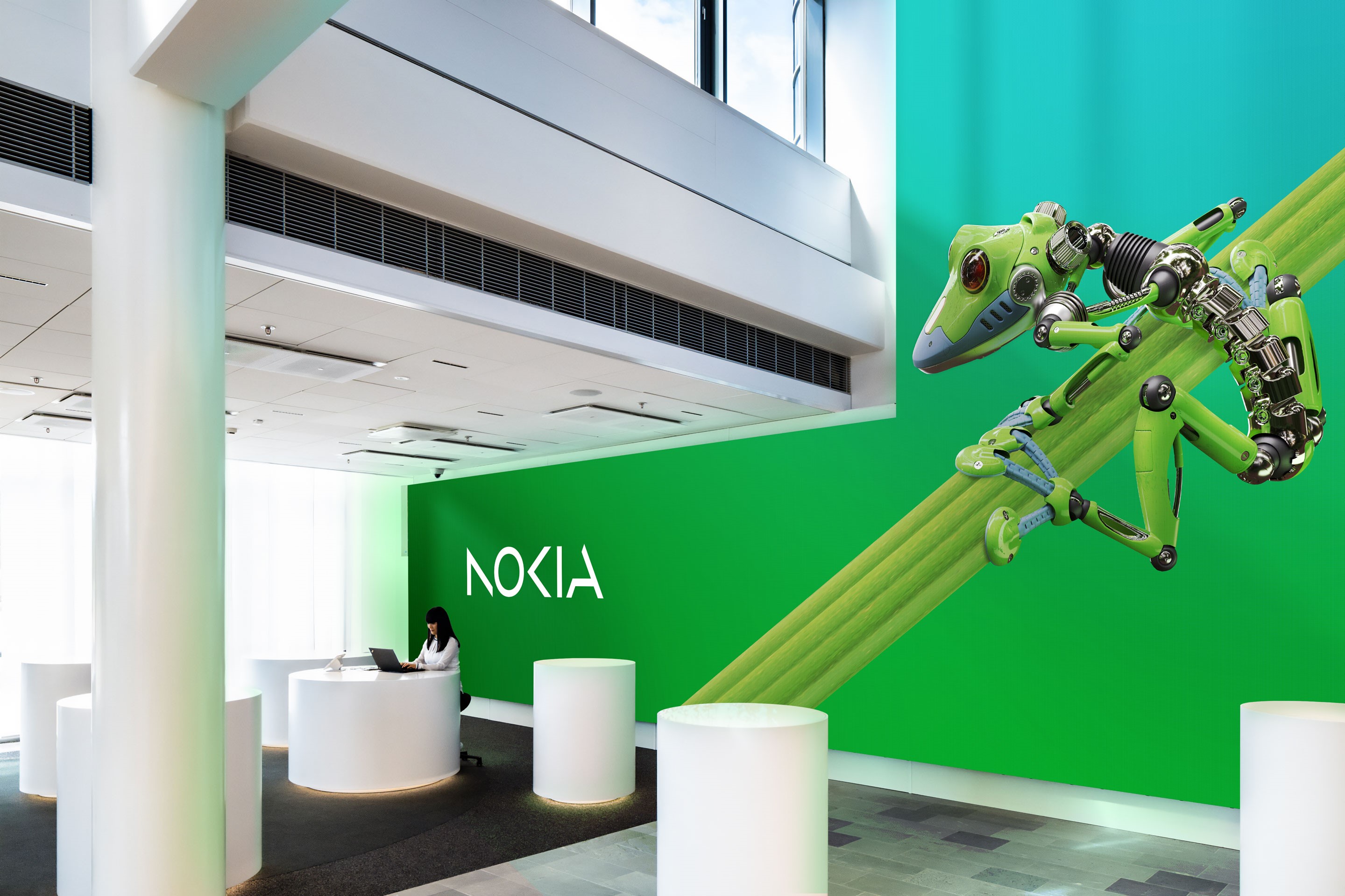
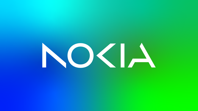
Lippincott also hoped to demonstrate Nokia’s belief in collaboration. Utilising an optical play, called apophenia, each individual letter was evolved into simpler digital forms where the human eye completes the invisible connections to spell out ‘Nokia’.
Acting as a sharp contrast to the rest of the tech industry, the revised logo will generally be seen as white against a kaleidoscope palette of colours. Its new visual features allow it to be dynamic, digital-friendly and optimised for motion.
Nokia’s chief corporate affairs officer, Melissa Schoeb, says, “This is a bold step in Nokia’s journey – and will help us get recognised by existing and prospective customers for the B2B technology innovation leader we are today. This brand refresh marks a transformative moment in Nokia’s history. Now is our time to step forward confidently, with a brand that represents who we are today, and who we strive to become.”
