Angus’ A-Z of logos: CN
In his latest monthly Transform column on the A-Z of logo design, Pentagram partner and creative director Angus Hyland focuses on CN (Canadian National Railway)
If you felt I was stuck in a groove already for this column with ‘B’ for British Rail, and now ‘C‘ for another railway, I should explain. There’s a connection between them, as the Canadian National Railway’s futuristic-looking red logo was in fact a big influence on BR’s ‘double arrow’ logo designer Gerry Barney, who said he wanted to create the “British CN”.
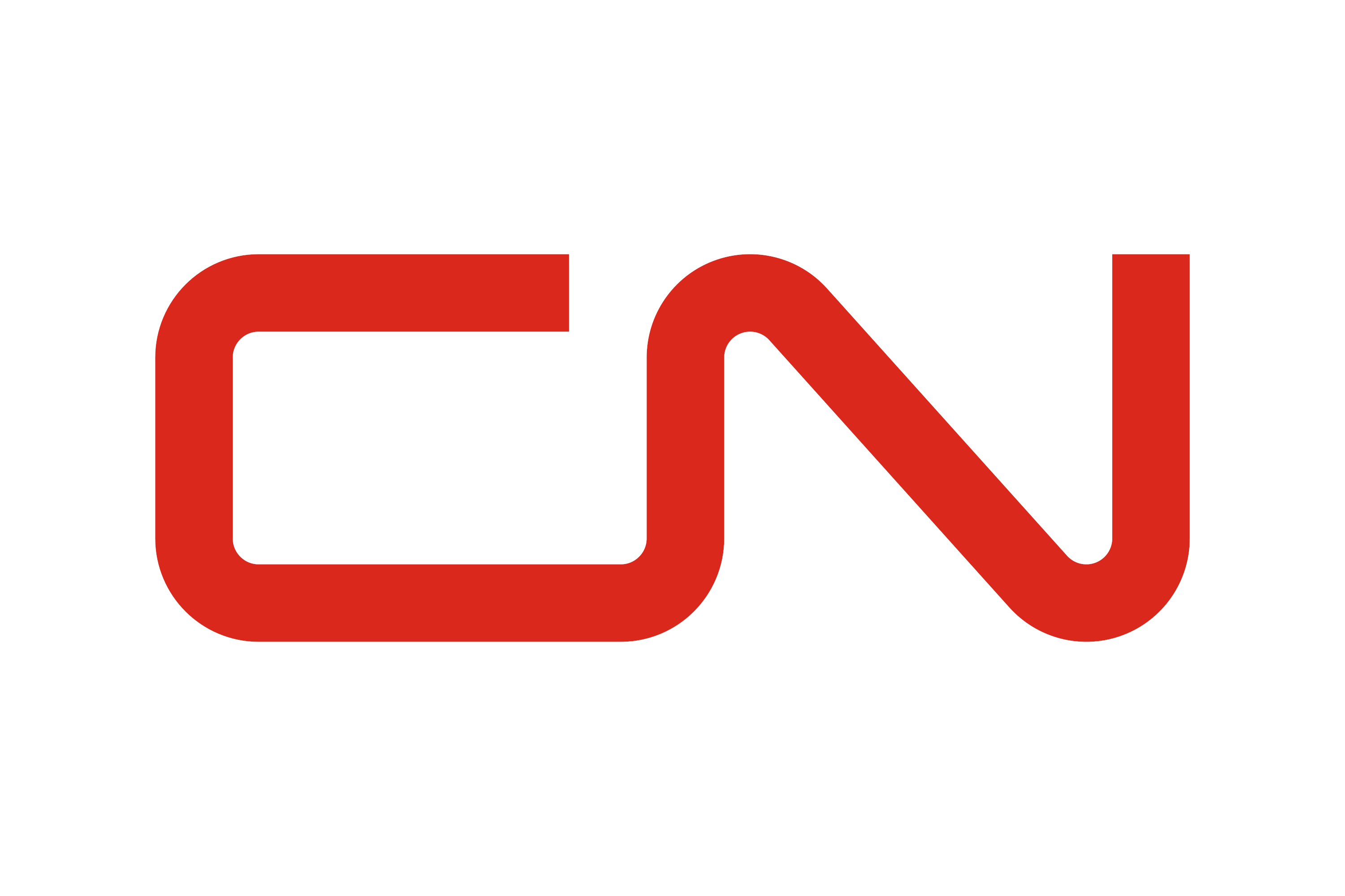
Whereas the British Rail logo is all straight lines and sharp angles, the CN logo is thoroughly ‘roundy’, so much so that it became known as the CN ‘worm’. It was a precursor to the other famous worm logo, the NASA ‘worm’ which was first introduced in 1970 (then retired in 1992 in favour of the redrawn 1950s ‘meatball’, and eventually reintroduced to everyone’s relief in 2020).
The CN logo was designed by Allan Fleming in 1960 and is still going strong. The logo was part of a complete overhaul of the company’s visual identity which included everything from locomotive paint schemes to building exteriors. CN needed a fresh, customer-friendly and technologically savvy new trademark that was powerful, progressive and dynamic. Fleming joined the letters ‘C’ and ‘N’ into one continuous railway track-like flowing line, pleasingly exaggerating its curves.
Fleming grew up in Toronto but was born in Britain. His father was a train switchman and a clerk for CN but died when Allan was young, so the CN logo is something of a homage to him. A few years after it launched, and at the request of the CN board, Fleming and his young family travelled by train from coast to coast, stopping at stations to ensure the new branding was properly rolled out. While the trip might be the nerdy designer's dream (or a busman’s holiday to employ a nearly-literal phrase), you can only imagine how many games of ‘I Spy’ were involved with a gaggle of restless children in tow.
One of several classic logos that were drawn on the back of a fag packet/napkin, in true Mad Men style the CN logo was sketched out on a cocktail napkin. The lesson here is that sometimes the simplest and most spontaneous ideas are the best and that you should always carry a pen so, as soon as inspiration strikes, you can get your ideas down on paper, as it’s still more intuitive than your smartphone.
Next time: A sugary snack for the calorifically-inclined.
Angus' favourite 'B' logo may be found here.


