US period care and wellness brand Cora undergoes emotionally relevant rebrand
The firm’s new brand identity was designed by Mother Design, an independent agency based in London and New York, with the aim of cementing its reputation as a leader in the menstrual care category. The agency adapted Cora’s packaging, tone of voice and communications in order to remain relevant to millennial consumers.
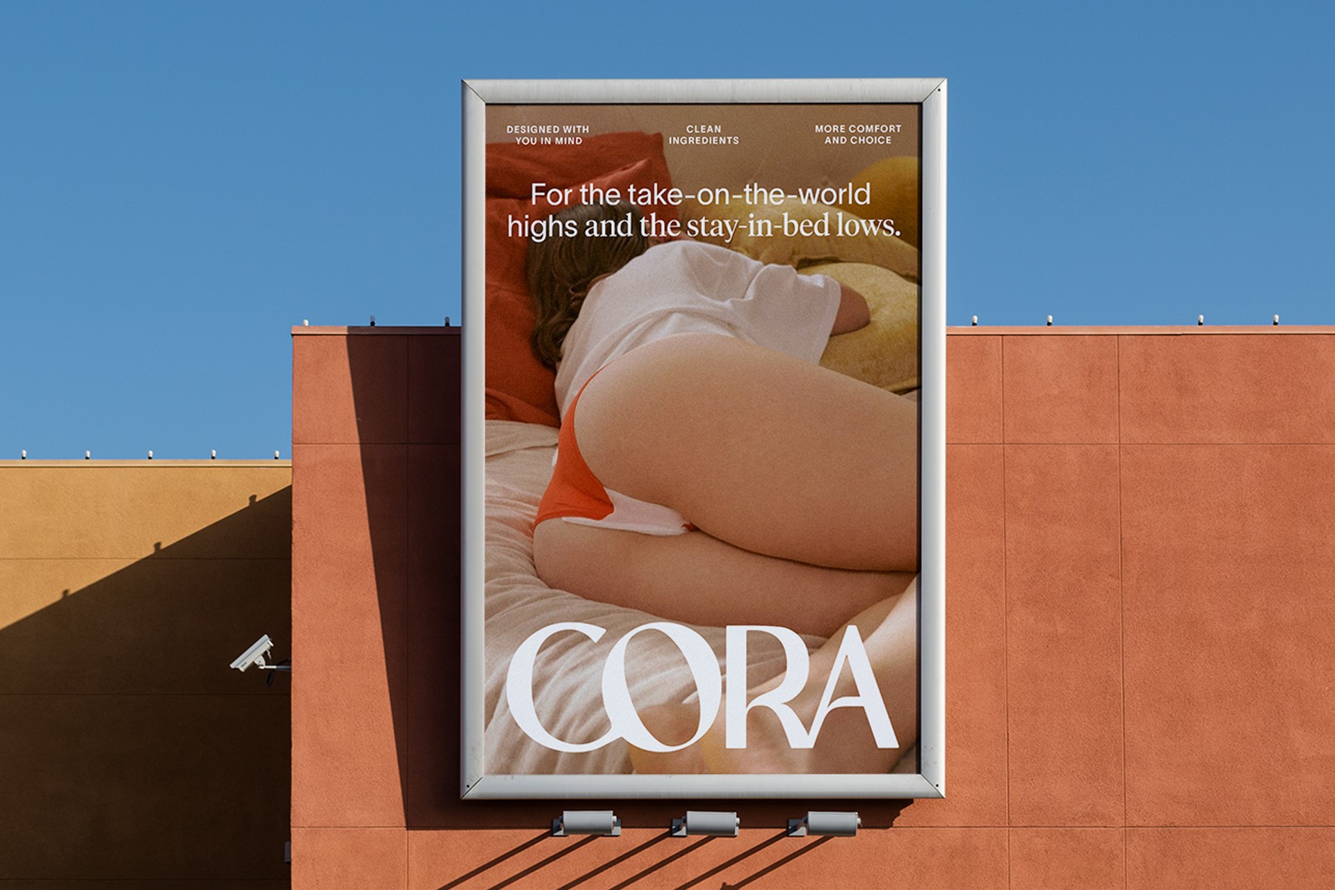
The rebrand was rooted in Cora’s belief that consumers nowadays want a more empathetic experience in which period care begins to feel more like self-care. Rather than being hidden out of sight, Mother Design worked to ensure the packaging was worthy of belonging on the consumer’s bathroom countertop.
Kathryn Jubrail, managing director of Mother Design, says, “The sector straddles a practical need to work and be efficient and the cultural conversation to do with our bodies and our identities. Consumers want an empathetic approach and understanding of their experiences that offers both emotional and physical comfort.”
A balance had to be struck by the agency between including elements that conveyed authority, clarity and support, along with elements which captured relatability. This therefore would represent the highs and lows of every woman’s personal experience.
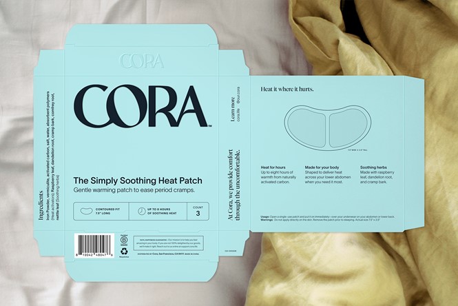
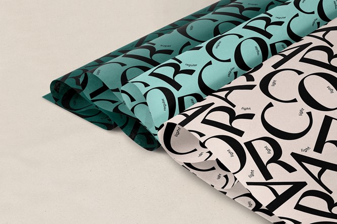
Creating a sense of authenticity is achieved in Cora’s new logo through its bold and oversized bespoke typeface. The rounded, fluid and balanced logo design sees the letter ‘O’ propped up by the letter ‘C’ to emphasise the feeling of support and care.
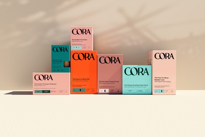
Aiming to create an easier navigation experience for the consumer, Cora’s new packaging colour palette makes use of a more modernised assortment of earthy tones, which is very different from the white used on the brand’s old packaging. With an array of different colours used for each product, the modern colour palette distinguishes itself from the bright colours used by competitors.
A clean and sophisticated typeface is partnered with a characterful editorial font to highlight words or phrases which bring a sense of duality and individuality to the brand’s expression. Furthermore, product naming was altered by Mother Design, shifting the tone of voice to be more emotionally driven. All product names now lead with the emotional benefit, such as ‘The Comfort Fit Tampon’ and the ‘Got-You-Covered Liner.’
Cora hopes these changes better align its brand to the broader category of self-care.


