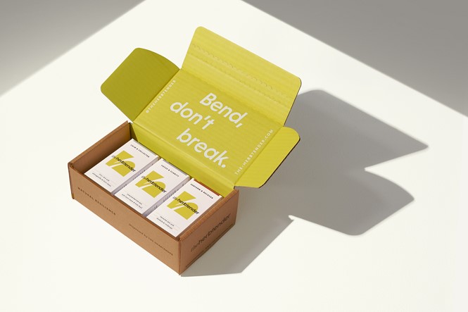
Natural adaptogenic supplement brand designed by London-based B&B Studio
In designing The Herbtender’s full brand identity, including naming, brand positioning, creative strategy, brand design and packaging, the agency brought the latest entrepreneurial endeavour of Laura and Mark Neville (of Upbeat Drinks) to life. The new supplement brand project highlights the product’s benefits of supporting the body’s ability to manage stress by regulating physiological function and restoring metabolic balance.
‘Bend, don’t break’ became the adopted brand mantra for the project, referencing the idea from ancient fables that the reed which bends in the wind is mightier than the oak that breaks in the storm. This essentially mirrors how adaptogens are believed to work, meaning the brand is showcasing flexibility rather than force as the true measure of its strength.
Shaun Bowen, creative partner at B&B studio, says, “While The Herbtender is certainly bringing ancient wisdom to modern lives, we were keen not to create too much of a traditional or esoteric look. We wanted to show that adaptogens have a timeless effectiveness, delivering the same benefits today as centuries ago, no matter how contemporary our problems might seem. Having the freedom to create every aspect of the brand – from identity to graphic language, photography to illustration – meant we could balance the look and feel for a world that feels cutting edge but natural, and desirable but credible.”
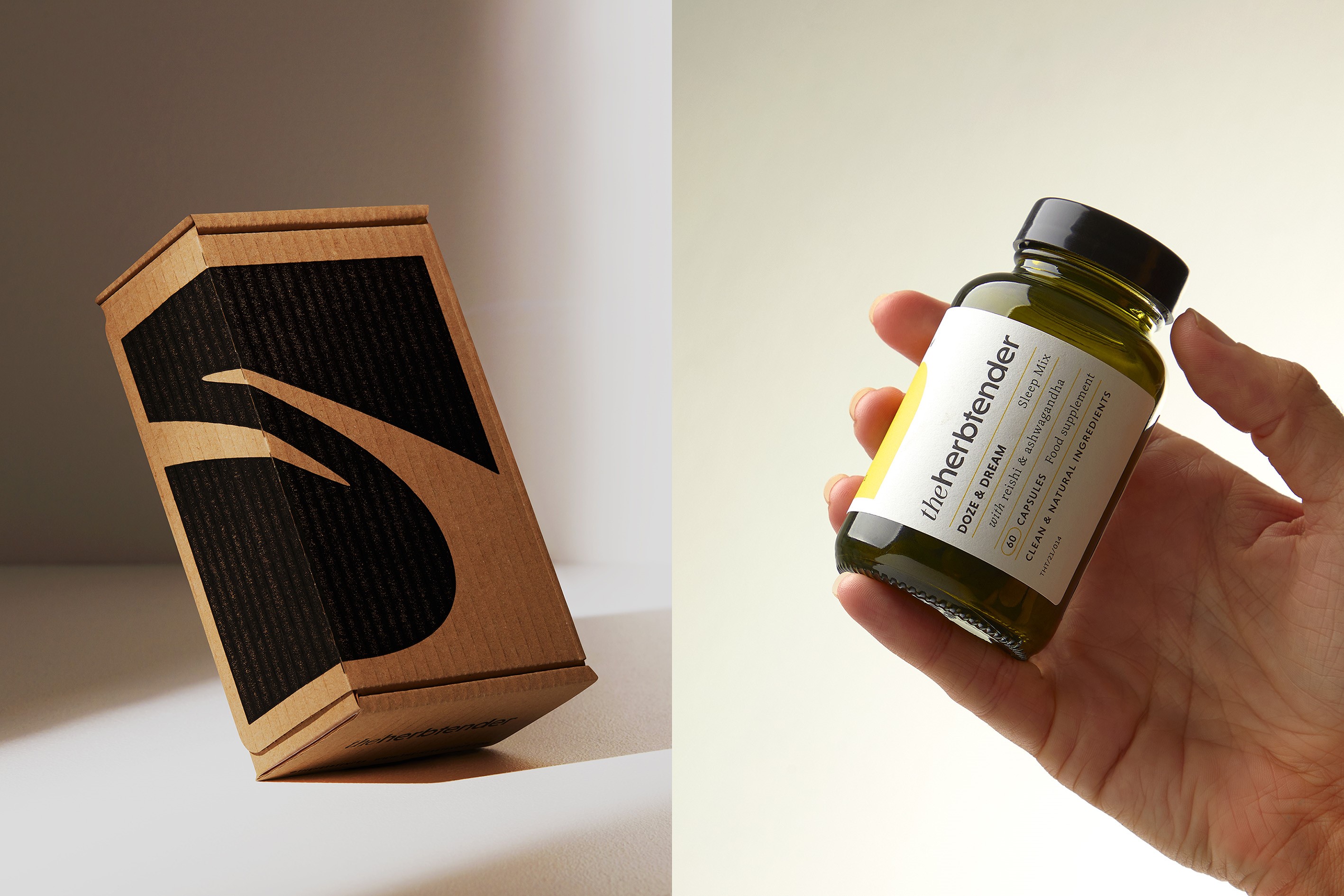
The brand’s medical herbalist who designed the new products, Schia Sinclair, helped inspire B&B to create the brand name of ‘The Herbtender’. The name strives to give an impression of care and efficacy.
A key hallmark of the project revolved around emphasising the credibility of the herbal ingredients used in The Herbtender products. The agency asserted the clean, plant-based and planet-positive aspects of the new brand and demonstrated its eco-credentials by selling additional supplements in compostable refill pouches.
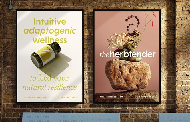
B&B aimed to visualise the brand’s theme of flexibility in The Herbtender’s logo by making it curvaceous and monogrammatic. An illustration style designed by Aron Leah uses free flowing lines to further emphasise this theme, while B&B’s ownable ‘acid green’ olive brand colour further adds to the brand’s depth.
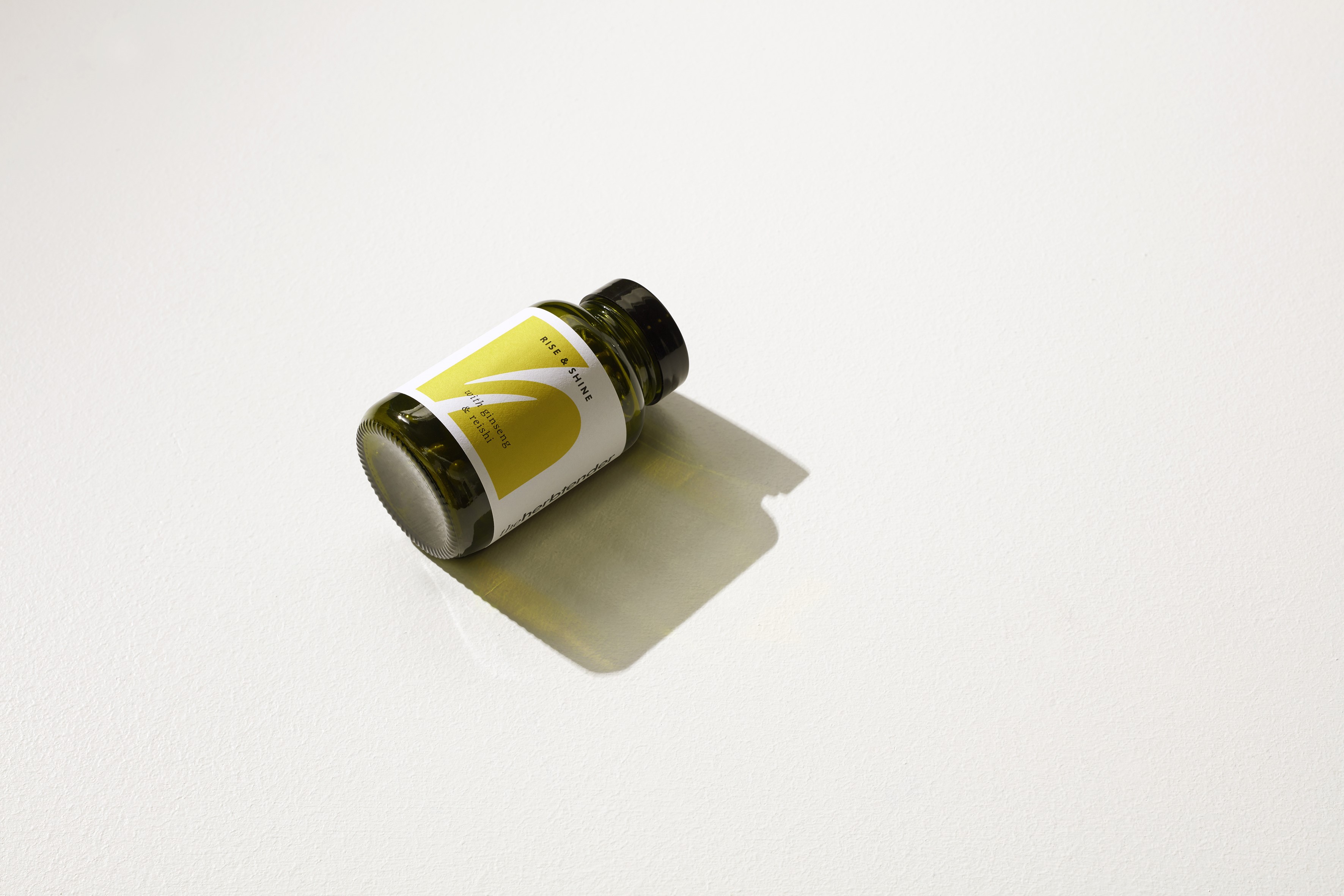
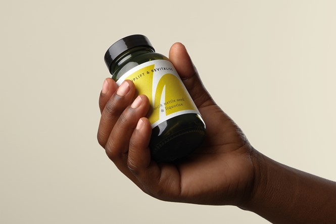
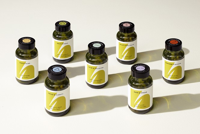
The seven supplements available target wellness needs from anxiety to sleep to immunity to physical performance, each receiving a unique colour and line design on its packaging, with a bespoke green glass jar also being utilised.
