Inclusive typeface designed for Tropic Skincare’s dyslexic readers
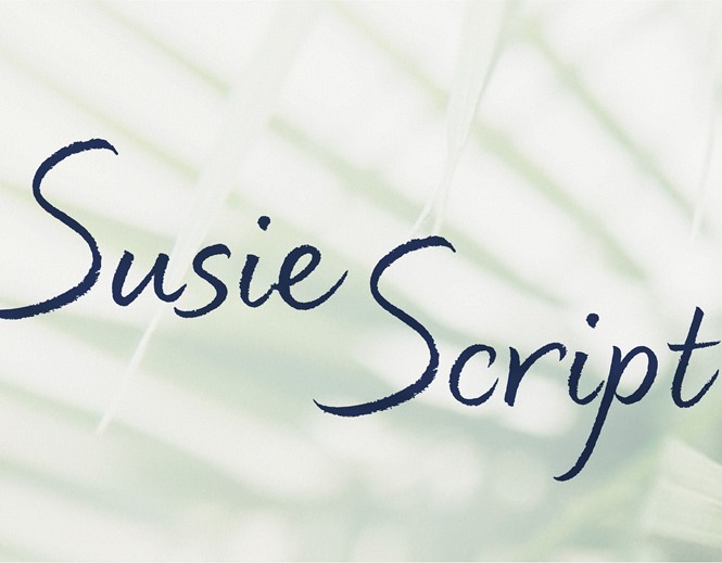

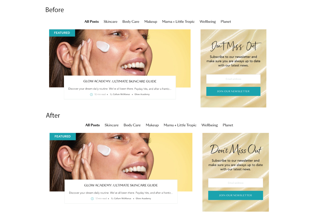
London-based Lewis Moberly created a bespoke typeface called ‘Susie’ to combat the difficulties some customers were having in reading the text on the brand’s website and communications. Named after Tropic Skincare’s founder, Susie Ma, the typeface is unique for its ability to appear clear yet sophisticated.
The agency was tasked with ensuring the new typeface was accessible to everyone without violating Tropic Skincare’s vibrant brand system. The decision to adapt the typeface was made on the back of research which indicated a quarter of beauty industry workers are dyslexic, with one in seven across all industries suffering from difficulties in reading and writing.
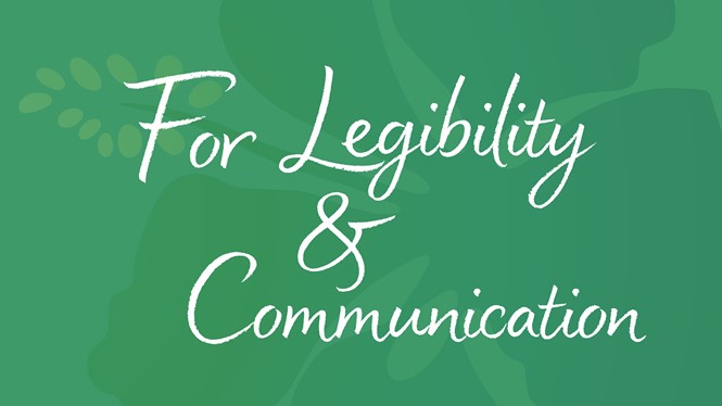
Emily Fox, creative director at Lewis Moberly, comments, “Our challenge was to create a handwritten typeface that could be easily read on all Tropic products and communications – where it may sometimes appear against a more complex backdrop. We were constantly testing and refining the script to ensure legibility, whilst not compromising on its expressive design.”
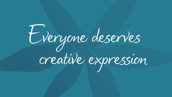
Lewis Moberly sought to create something new; a dyslexic-friendly font which moved away from the cliché of Sans Serif fonts. Recognising missed opportunities in creating typefaces which incorporated volume, variety and verve, the agency’s reimagined font unites clarity and beauty.
Attempting to offer a beautiful, approachable and dynamic feel, Susie adopts a handwritten look for its readers. The success of the typeface, while hoping to appeal to the majority, will ultimately be judged on whether dyslexic people consider Susie readable. Linked to the brand’s core values, the redesign forms part of Tropic Skincare’s push for inclusivity.