Global design agency Pearlfisher gives Pyrex ‘deliberately imperfect’ brand refresh

The historic kitchen brand had its brand strategy, identity and visual identity system updated by Pearlfisher in a bid to inspire the next generation to create. The project’s main aim was to push the brand towards being a way of life – not just a range of functional products – that makes bringing people together around food easier.
The strategy from Pearlfisher centred around the acknowledgment that young families face a new kind of pressure to ensure their cooking looks perfect. The agency believes that this first generation to grow up with social media now shies away from the kitchen and the opportunities to create memories with loved ones for fear of not meeting unrealistic culinary standards.
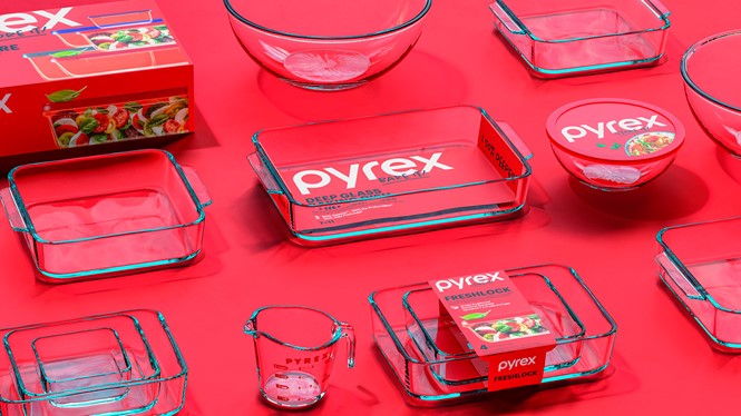
Aiming to instil confidence in the kitchen, new Pyrex sub-brands, Bake it!, Store it!, show off the new ‘Sharpie-style’ typography. The font is used to reflect the ‘hand-done imperfection’ which is innate to cooking.
Hamish Campbell, VP executive creative director at Pearlfisher New York, says, “Starting from our newly defined role for Pyrex in today’s contemporary family, we needed to make sure that Pyrex was at its most bold and iconic state in order to stand out. The handcrafted icons and illustrations – showing the many different facets to cooking – are deliberately imperfect to match the ethos and value now at the heart of Pyrex.”
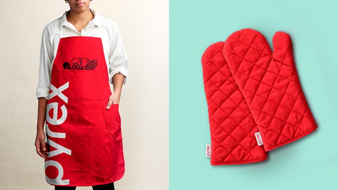
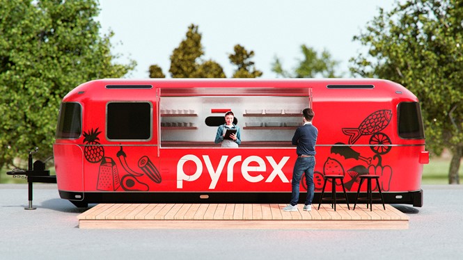
Pyrex retains its iconic red identity while adding new expressions and illustrations to make its products easier to identify. In an additional step to underline Pyrex’s new ‘boldly confident’ identity, the packaging and lifestyle photography sees an update which tries to capture the many different ways people cook.


