Pfizer unlocks its future by reconnecting with its heritage
Pfizer has deservedly been in the news for its production of one of the Covid-19 vaccines. Now, the pandemic is offering it a turning point in its corporate story, enabling it to rebuild its heritage into its brand communications in a holistic, relevant way.
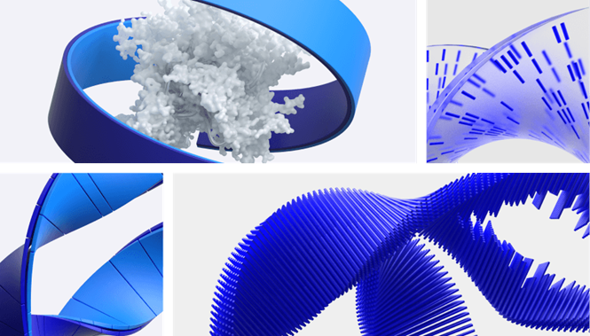
When brands reference their ‘DNA,’ it’s often a cliché. But, for pharmaceuticals brand Pfizer, unlocking its ‘pill’ logo to reveal its ‘brand DNA’ is almost literal. Its new wordmark includes a double helix device that visually frames its purpose. And, with the rollout of a major global Covid-19 vaccine in process, it’s not a bad time to rebrand.
Announcing its new brand, Pfizer documented its heritage of life-saving and world-changing science, including such breakthroughs as the mass production of penicillin, the elimination of the threat of polio and the eradication of smallpox. In the midst of another global pandemic, its brand is now equipped to stand for scientific breakthroughs, having literally broken through its visual confines.
The symbolism doesn’t stop there.
Designed by New York-based agency Team, the new brand is digital-first. It is in near-constant motion, a symbol for the company’s continued efforts to not only treat diseases but to cure and prevent them too. “Our new identity reflects the dignity of Pfizer’s history and captures the innovative spirit and science focus alive in the company today,” says Sally Susman, executive vice president and chief corporate affairs officer at Pfizer. Landor & Fitch delivered strategic and creative consultancy for the rebrand as well.
The new identity transforms the user experience, but the signature blue colour remains unaffected. The colour palette has been expanded with further shades of blue, but Pfizer is standing by its ownership of the colour, emphasising its heritage and leadership in the sector, according to Team. A secondary colour palette offers the ability for clearer navigation across digital applications.
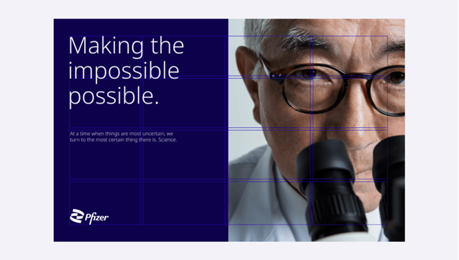
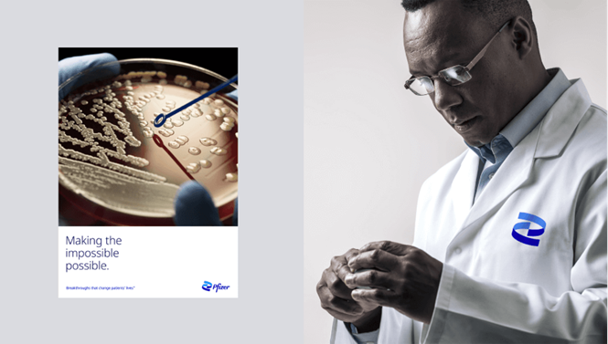
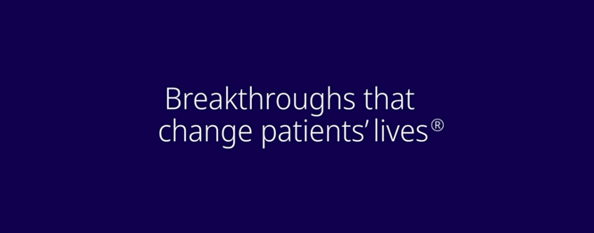
The new brand has considered the international scope of the company’s operations. Noto Sans, a Google typeface designed for use across multiple languages on digital applications, is the new brand font. Team calls its clean, open design a ‘philosophical and aesthetic match’ for Pfizer. Its use of imagery is intended to be strong, authoritative and caring, focusing on patients and caregivers, not manufacturing.