#NewBrandMonday: 22 February

Here are this week's selection of newly launched brands from around the world. For more from #NewBrandMonday, follow @Transformsays on Twitter.

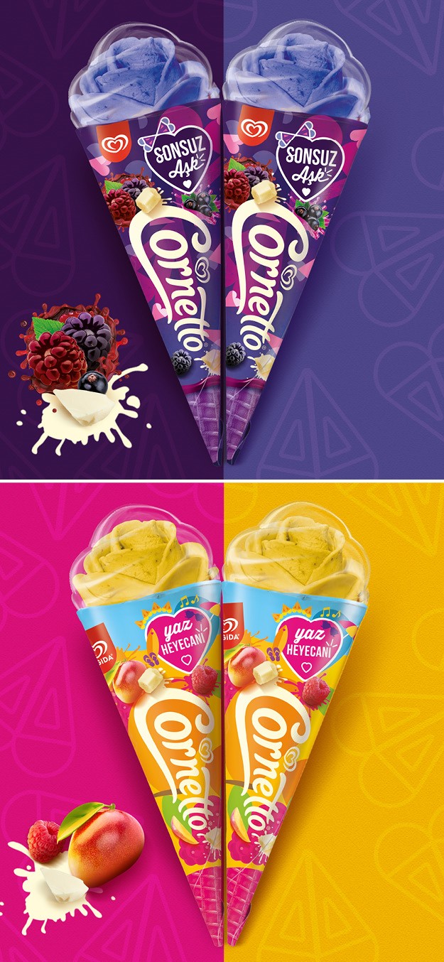
Cornetto Rose
Ice cream producer Algida Turkey worked with creative agency 1HQ Amsterdam to design three new packs, helping to promote its first new ice-cream format in years, a rose shaped Cornetto ice cream. Innovative technology means a completely new shape could be achieved for the much-loved Cornetto ice-cream. Building on the commercial success of previous limited-edition formats, Cornetto Turkey identified love as a core cultural trend that would resonate well with local consumers, as within the Turkish market the rose is symbol of love in its purest form. Cornetto Turkey and 1HQ Amsterdam explored a design approach that would clearly communicate three special moments of feeling or falling in love: first love (the past), summer love (the present) and soulmates love (forever). 1HQ Amsterdam translates these three different time phases in a subtle yet clever use of graphic elements in patterns and shapes along with clear colour differentiation. A bold heart-shaped holding device for the variant’s name created design unity for the trilogy. 1HQ Amsterdam used local nuances to guarantee each variant would stand out in the freezer. Capitalising on indulgence and flavour cues, 1HQ pushed the designs to ‘wrap’ around their corresponding themes to maintain commercial value and modernity.
“1HQ Amsterdam brought to life exactly what we imagined for this highly anticipated launch; the distinctive moments of falling or being in love come alive through a beautiful blend of indulgent ingredients and colours,” says Revna Tever, cornetto & kid brand manager at Algida Turkey

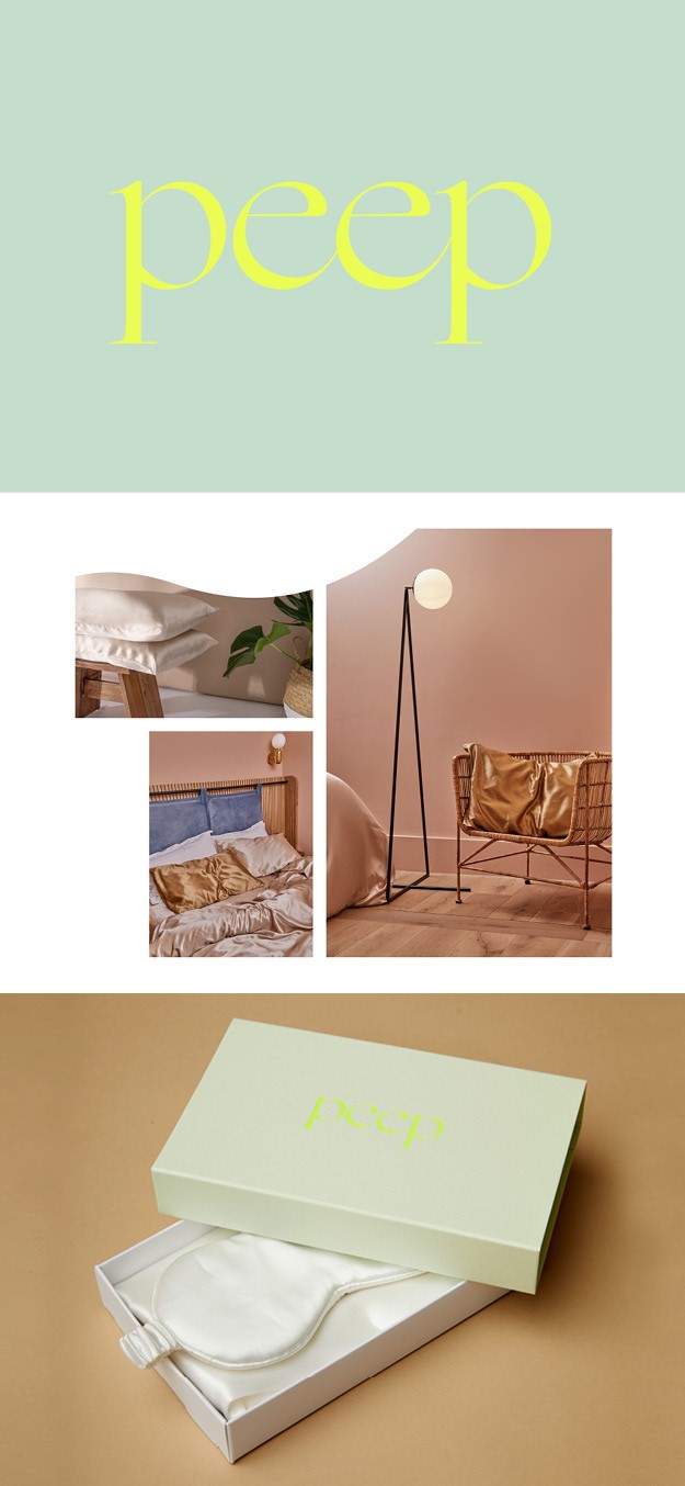
Peep
Creative brand agency Creative Spark launched Peep, a new 100% mulberry bedding brand, which includes a range of silk pillows and eye masks offering health benefits ranging from a better night’s sleep to good hair days. Founded during lockdown, Peep sought to create a product that would appeal to everyone with added health benefits. Creative Spark aimed to create a fashion brand for Peep, so it worked on creating an identity that would not only be successful now but had long term relevance. created a classic font identity with a strapline underpinning the brand’s values: Peep, sleep with beauty. The subtle pastel palette supports the brand’s attributes of health benefits and luxe living. Fashion-influenced illustration demonstrate the benefits of the pillowcases while clean interiors photography reflect an aspirational lifestyle.
“We conducted a huge research project to understand who the buyer would be, how they would find out about Peep and exactly how the silk products would benefit them. This brand strategy has already proven to be effective and robust. Launching in a pandemic year was a risk, but the right product, well communicated has made Peep an early success,” says Neil Marra, Creative Spark founder and creative director.

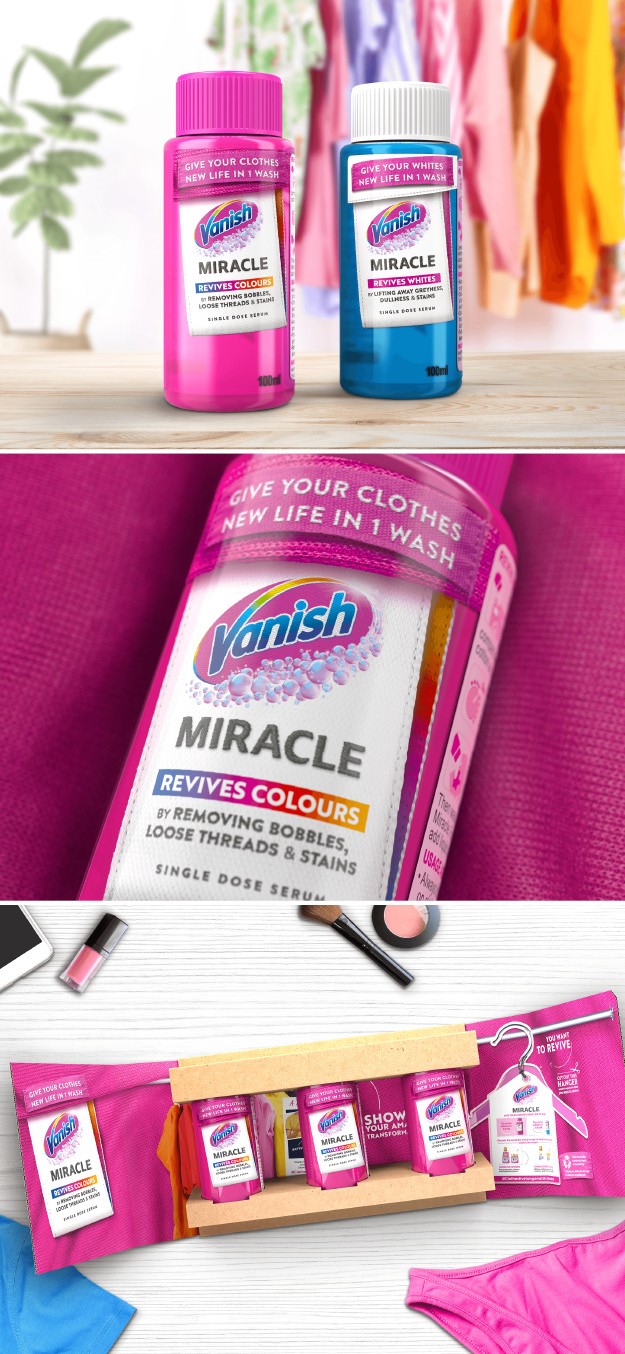
Vanish Miracle
Reckitt Benckiser (RB) reveals its new Vanish Miracle Revives Colours serum, a product that revives the colour of clothes in one wash and marks a significant shift in the fabric treatment sector. The serum helps people revive treasured clothing by removing the visible wear of garments and refreshes the colour. The Vanish Miracle serum is the result of new product development and signals a shift in the brand’s approach and positioning. It is driven by the clear purpose of helping clothes live many lives and boosting re-use and longevity, a driver that will propel all the brand’s future launches. Developed with design agency Dragon Rouge, the packaging and brand experience design of the product plays a crucial role in signalling the novelty of the product’s innovation and its transformative nature. Key design elements, like detailed background texture running through the design, with ‘before and after’ illustrations of the product’s benefits, connect to the rituals people go through when looking after favourite garments. The packaging communicates the concept in clear and easy to understand messaging, while signalling the product as part of the Vanish range, with its colour and logo referencing the parent brand. It also includes the new Vanish logo, redrawn to be a more vibrant, modern and confident expression of the brand.
“Rather than resorting to the established and tired design codes within laundry products, with Vanish Miracle, the brand is taking a leadership position in driving design across the category. This product highlights a much more considered role of design, linking its graphics and communication back to the clothes it cares for and the notion of extending the life of garment,” says David Robinson, creative director at Dragon Rouge.


