Service as a software brand
Breaking free from sector norms, IFS transformed its visual identity and strengthened its brand positioning by putting service at the heart of its brand. Elettra Scrivo reports.
Global enterprise software company IF’S brand was getting lost amid a sea of blue software company logos. Its outdated brand was failing to communicate to existing and potential customers. To visually express how its day-to-day business has changed, becoming more service-centred, it worked with agency Olix Consulting.
IFS appointed its new CEO, Darren Roos, three years ago, beginning a transformation journey of its own. While its values, like the importance it places on customers, remain unchanged, the company has evolved its internal systems, focusing more on service related products, and sharpened its go-to-market strategy terms. This, together with a growth pace three times higher than that of its nearest competitors, has pushed IFS to overhaul its visual identity and rebrand.
The new brand is a celebration of IFS’ progress as a business and a precursor for the biggest product launches in the company’s history next month, IFS Cloud, a platform will gather all the business’ product offerings into one. The new platform will allow companies to evolve, create new business models, expand faster and serve their customers better all while reducing the complexity of the day-today business thanks to the IFS’ meticulous data mining.
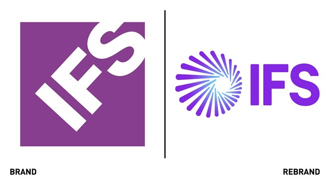
To visualise all this and communicate it to consumers in abstract terms through a new visual identity was the hardest feat for IFS. In addition to making ‘moment of service’ the new positioning/proposition, the in-house team also added memorable symbol to the logo, made up of different lines that come together to create a circle. The centre of the symbol, the ‘hole,’ enhanced by the changing shades of purple which become light blue, is the moment of service, where everything comes together in the service of customers. The symbol represents how IFS technology enables its customers to create value by joining the dots across their business.
“The rebrand will really tell people about who we are today and where we want to go moving forward, and it’s the result of a collaboration with our partners and customers” says Oliver Pilgerstorfer, CMO at IFS. “We spent a lot of quality time understanding how they perceive us and where they see the white space in the industry, and that gave us the assurance that the route we were taking was the right one. “
While the logo has become bolder and more eye-catching, paying homage to IFS’ latest work through the symbol, its most distinctive aspects, the name and colour purple, have been kept the same. This not only allows for easy recognition but also stays true to the values attached to them. “Our name is associated with industry expertise and the ability to always deliver. We have built a name up for ourselves as a company that always honours its commitments and delivers to keep our customers satisfied, and we didn't want to lose that because nor the customer trust it comes with,” says Pilgerstorfer.
The deep purple, which was slightly revitalised to inject more electricity and vibrancy in the overall brand, was kept not only for brand awareness but also because it has allowed IFS to stand apart from other businesses in the tech world, which mostly adopt mostly red or blue colour palettes.
“I remember being at a tech forum San Francisco a few years back and I all I saw was a splatter of blue and red of most software companies from Oracle to Adobe to Intel and Dell. If you just look at your smartphone, actually, you just see a lot of blue logos. At IFS we wanted to be distinctive, and all our partners, employees and customers associate the colour with us,” says Pilgerstorfer.
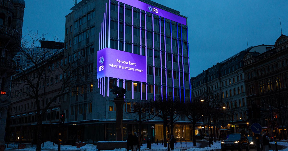
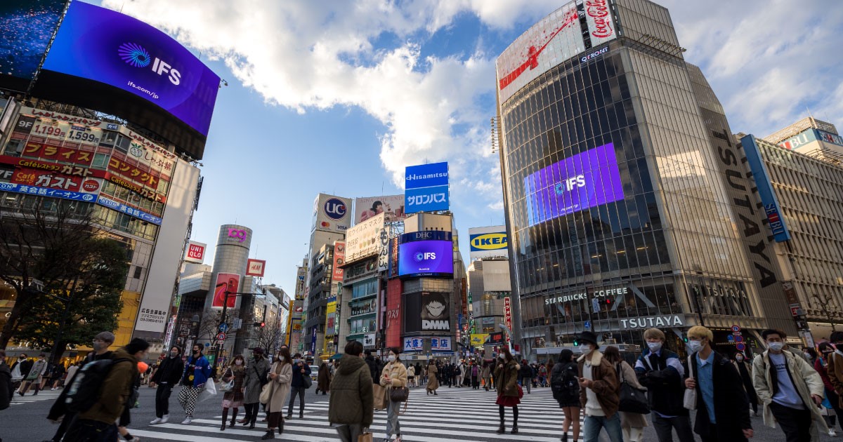
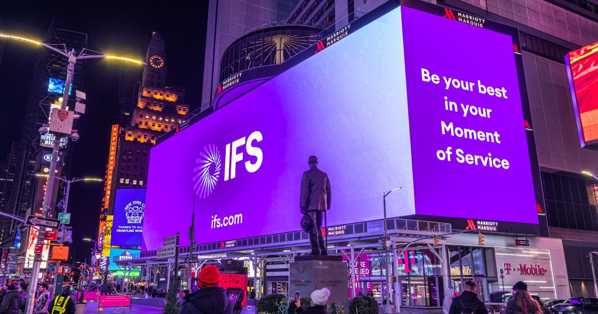
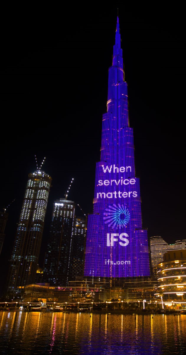
Through its striking striking colour palette and imagery, the new IFS branding is currently being deployed across different touchpoints, from digital platforms to print to office interiors and also on some of the world’s largest activation sites, including Times Square in New York and the Burj Khalifa in Dubai.
“The purpose of doing these out-of-home executions and personalised online activations is to market the message of how serious we are about our growth journey,” says Pilgerstorfer
In light of Covid-19 as most people stuck at home and consuming their news digitally, the team at IFS focused especially on online media takeovers, doing a number of media buy ins with large magazines and papers in its key focus market that cover different countries in Europe, from Germany to France, the U.K, Nordics, the USA and also a heavy investment in the United Arab Emirates and Japan.
Now, with a distinctive and ownable colour palette and a transforming agenda that puts customers path the heart of the brand, IFS is an ocean ahead of its competitors.