#TransformTuesday: 23 February

Here is this week's selection of rebrands from around the world. For more from #TransformTuesday, follow @Transformsays on Twitter.
Barking Riverside
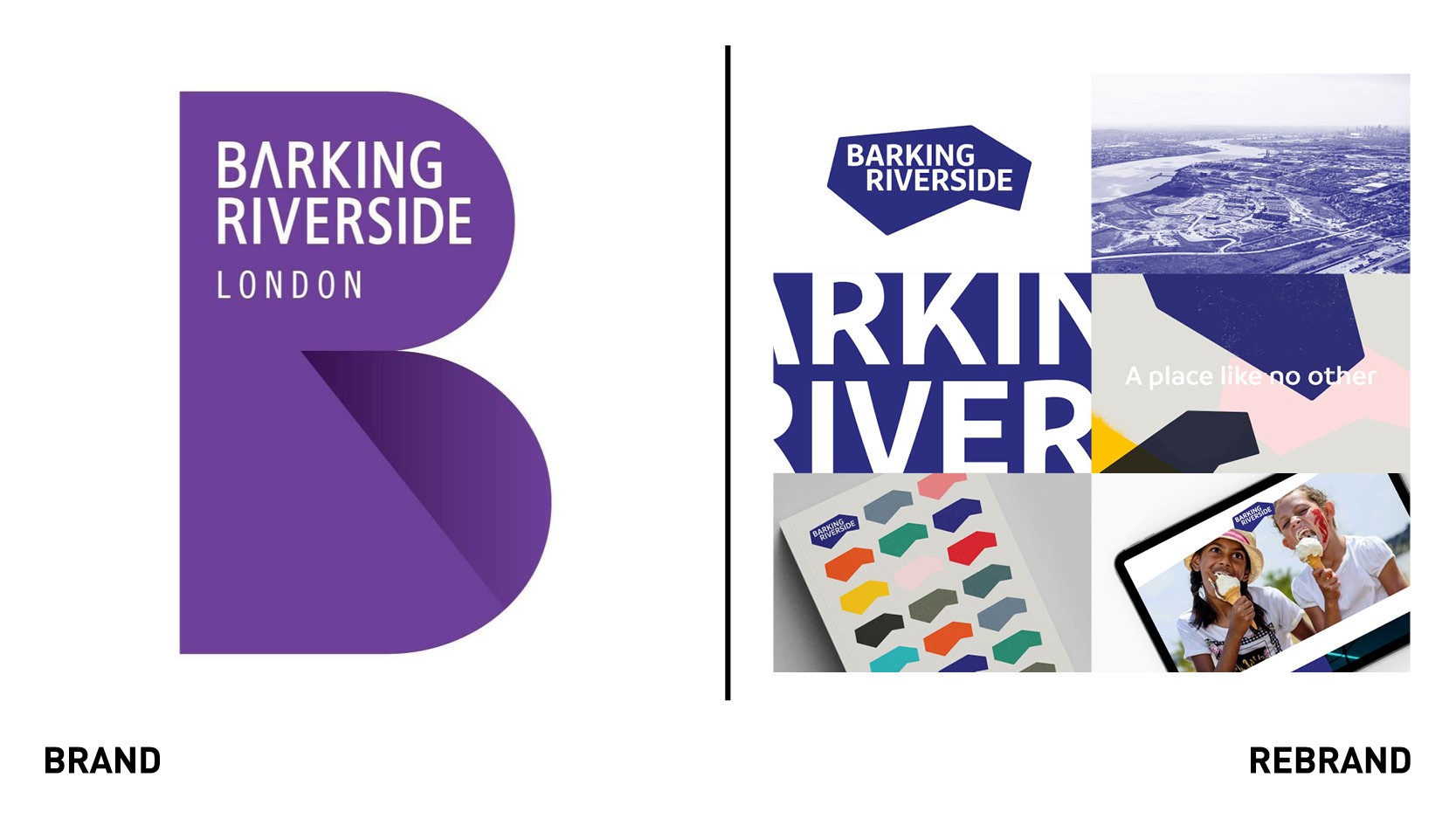
A new brand identity by Spinach Branding was launched for Barking Riverside, a placemaking project. Covering an area larger than London’s Hyde Park, Barking Riverside will become one of east London’s most important destinations, with over 10,000 homes, along with commercial and state-of-the-art leisure space, public open spaces and riverside walks. The new brand links to Barking Riverside’s unique co-design approach, which sees Riversiders playing a leading role in making the neighbourhood a fulfilling place to live, work and visit. The rebrand began with the development of a set of key messages, which capture what this place is now, and what it could become. From this platform, the basis for Barking Riverside’s bold and playful new graphic identity is a core message: Barking Riverside is a place like no other: a place to be, become and belong. Bringing this message to life, the logo mark reflects the shape of the physical space that is Barking Riverside. A range of vibrant textures and distinctive colour palette ensure the brand’s identity works multiple ways for different audiences.
“We see this brand as far more than just a tool to help sell homes and attract commercial partners. Authentic brand identity is very important in helping create a feeling of belonging amongst local people. We wanted to create something that reflects the collective pride we know people feel in a community as strong and as spirited as this one,” says Sarah McCready, head of placemaking and communications for Barking Riverside Limited.
“Central to the brand development was the need to collectively create a new placemaking brand model that made sense of the complicated relationship between place and the corporate entity,” adds Leigh Banks, brand strategy director for Spinach Branding.
Belvoir Farm
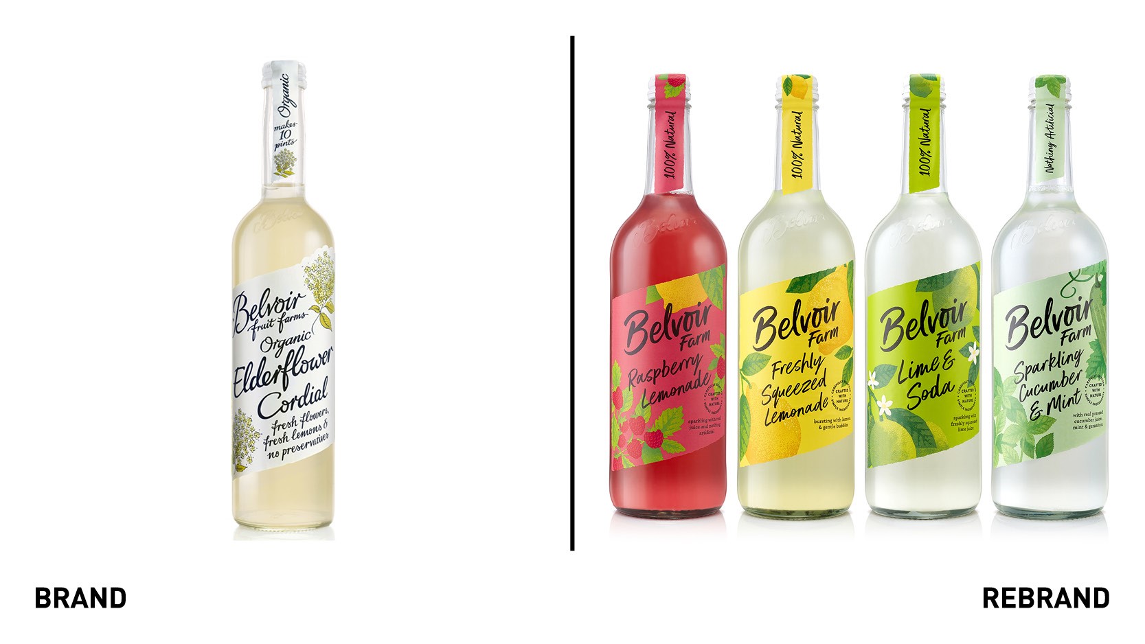
Soft drinks brand Belvoir Farm worked with B&B studio on a strategic repositioning and redesign as it seeks to drive growth, deepen consumer engagement and attract a younger audience. The rebrand builds on the brand’s authentic farming roots. B&B’s strategy was inspired by the philosophy and approach of the working farm where Belvoir is based. Dedicated to working hand-in-hand with nature, the farm is responsible for protecting the local wild eco-system and encouraging its flora and fauna. Belvoir’s new graphic identity and packaging design seeks to sensitively evolve the key assets from the existing and hugely recognisable design in a new, more wild, direction. The type becomes less ornate and calligraphic for a more natural and contemporary feel, while the illustrations are not so carefully placed in the layout but are instead allowed to grow into the design from the side as they would in nature. The illustration style has a rawer and more bountiful feel. Even the brand name has evolved, from Belvoir Fruit Farms to Belvoir Farm, in order to tell a truer, more authentic story. On pack, the design retains its handcrafted codes, but loses the ‘country fair’ feel for a bolder, more refreshing look. Range and variant signaling has been subtly improved and clarified, without feeling either corporate or systematic.
“We were really inspired by the farm, its commitment to sustainability and its connection to the British countryside, and we wanted to share that with consumers who might not know the story. In a premium soft drinks category that gets bigger and more complex by the day, it’s important to support the brands that care about the bigger picture,” says Shaun Bowen, creative partner at B&B studio.
Guide Dogs
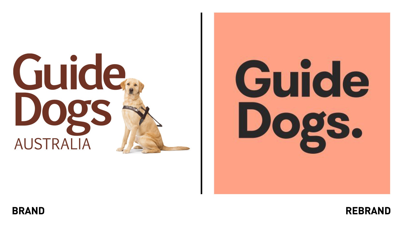
Australian charity brand Guide Dogs worked with FutureBrand to rebranded under one logo and brand idea to strengthen the organisation’s presence and better communicate the breadth of services it provides to people with low vision or blindness. Building on the charity’s 60 year history, the new brand will better reflect how Guide Dogs services across the country have changed to support people living with low vision or badness today, extending far beyond’s the brand’ namesake. The new branding embraces the full breadth of Guide Dogs services under the overarching strategic idea of ‘Find your way’. It acknowledges that supporting someone through a change in vision - or their experience of long-term low vision - requires choice and flexibility. The brand comes to life through a bright and optimistic colour palette which is supported by directional graphic patterns to add energy and movement across all branded touchpoints. A new direction on photography celebrates the sense of achievement found in everyday moments and the richness of human connection. Ensuring the new brand was accessible to people with low vision or blindness was also an essential requirement.
“Our beloved Guide Dogs will always be vital to our story, but now they’re part of a bigger picture. Our new brand is modern, dynamic and impactful, and builds on the strength of our history and of all our offerings,” says Charlie Spendlove, head of marketing and comms centre of excellence at Guide Dogs.
Just ask Max
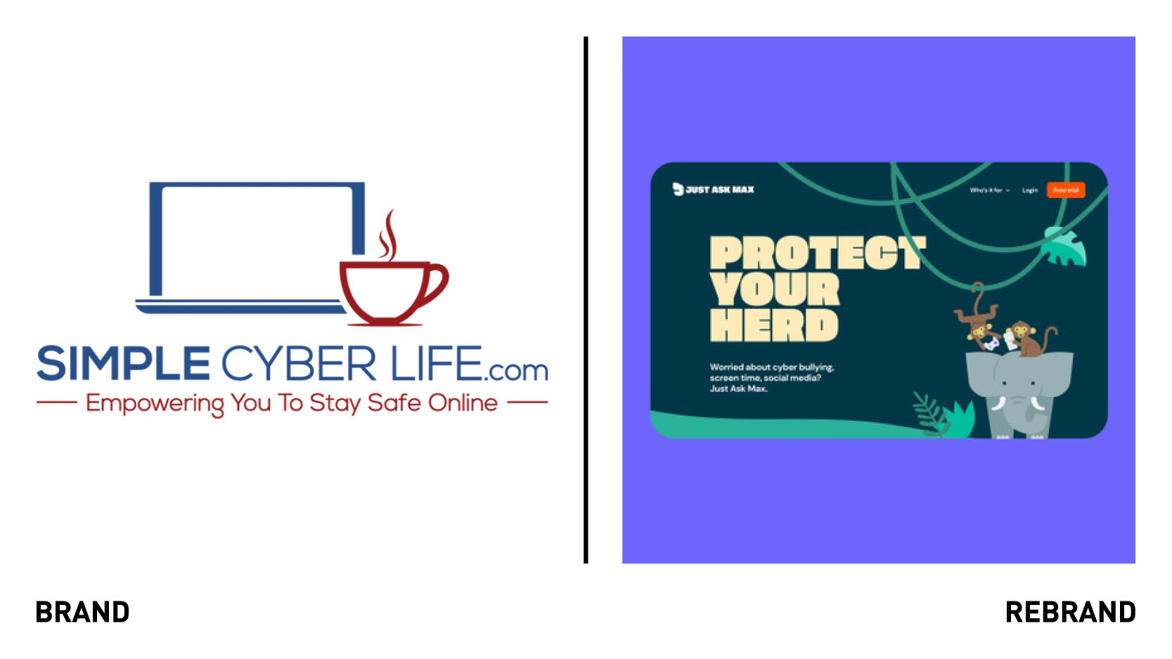
Online safety services for families, Simple Cyber Life, rebranded to Just Ask Max, which was looking to scale the business and sought a brand that parents and investors could buy into. With ‘cybersecurity’ being a much cliched language and imagery, with guard dogs, binary code, padlocks, and ‘techy’ colours, brand agency Among Equals built a completely opposite brand: warm, fun and playful that still communicated a serious message. The new identity is also a nod to the fact that while the internet can be scary for parents and children, it’s ultimately a life-enhancing force. This concept inspired the new name ‘Just Ask Max’ which describes both the brand’s service -ask employees about online safety issues- and also forms the basis for the new visual identity. ‘Max’ is inspired by an elephant (Maximus maximus), a solid, family-focused bulwark that is strong, wise and protective. The perfect defender in the wonderful but wild jungle that is the internet. Among Equals opted for an elephantine typeface (Tusker), created a wordmark then drew an elephant symbol using the ‘J’ in ‘Just Ask Max.’ The colour palette was inspiredly elephants and carefully chosen for both toes and digital usage, a combination of something that feels grown up and premium to counteract the more playful elements. Max was brought to life at every possible points from headlines (like ‘Let’s stamp out cyberbullying’) to functional calls to action (like ‘Join the herd’). A series of jungle-inspired illustrations were also designed to describe their many great services and features while building a rich brand world.
The Crown Estate

The Crown Estate, established by an Act of Parliament in 1961 as an independent commercial business that returns all of its profit to the treasury for the benefit of the nation, and now manages some of the best places to work, shop and visit around the country, has rebranded. Working with brand consultancy Saffron, the Crown Estate sought to elevate its profile and shift perception from being seen as a traditional business to a progressive, purpose-led organisation. Saffron worked on modernising the brand, bringing it closer to its audiences and unifying its visual identity and tone of voice across its diverse touch-points. It Egan by defining the brand personality of the Crown Estate, establishing unique, ownable and relevant principles that aligned to the brand purpose while creating a distinct character that would be the foundations of the organisation’s new expression. The new tone of voice delivers against the principles: balancing commitment, vision and the company’s leadership position in the UK. A visual framework was developed for the the ‘flexible endorser’ model, with rules and principles defined, to help make visible the role of The Crown Estate in its respective assets, services, events and destinations. Echoing the frameworks which connect The Crown Estate’s disparate assets, the layout system is a robust set of flexible ‘spaces’ which enable consistent yet individual communication material. The mapped spaces allow for positioning of all graphic elements - from the logo through to art direction and messaging.


