#NewBrandMonday: 15 February
Here are this week's selection of newly launched brands from around the world. For more from #NewBrandMonday, follow @Transformsays on Twitter.
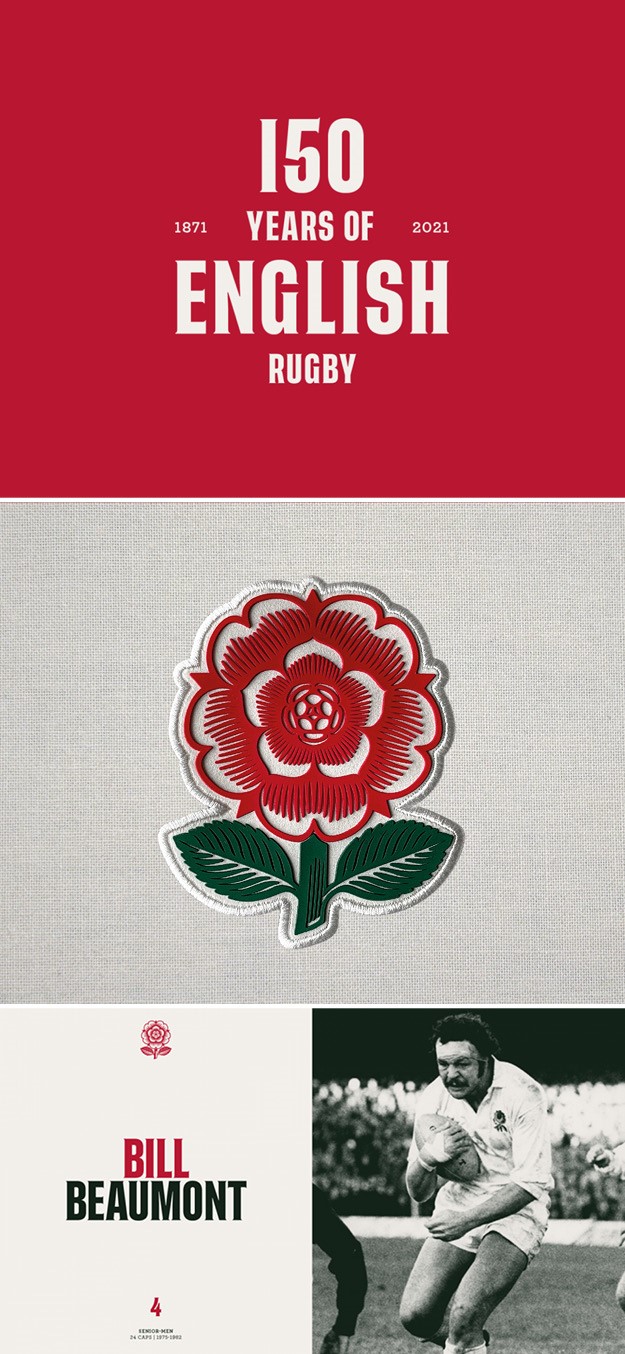
England Rugby
To mark the milestone of 150 years of rugby union in England, design agency ThisAway worked with England Rugby to create a heritage rose that would feature on a commemorative shirt to be worn in the opening Calcutta Cup game of the 2021 Guinness Six Nations, and in other anniversary celebrations throughout the year. With the rose being synonymous with English rugby since the game began, ThisAway chose the very first rose features on the caps of the 1871 team as the basis of the design for the anniversary heritage rose. With that as a starting point, the team began to create a series of initial sketches that concentrated on the form and shape of the rose itself, looking at drawing it in a wood-cut style. Collaborating with illustrator Chris Wormell, ThisAway helped craft and refine the details of the rose until it created a new iconic one. To ensure the rose worked on both light and dark backgrounds two versions were created and then each rose was drawn at three different sizes, with the smaller one having less detail. This flexibility enabled the rose to be used across various production methods from silicon injection to foiling. A serif version of the Tusker typeface currently used in the master England Rugby brand adds modernity to the brand’s heritage.

Olith
Spanish graphic and creative agency Bulldog Studio created a visual identity and packaging range for new oil brand Olith. Based in Tarragona, Olith is 100% committed to local consumption, organic production and the conservation of its land, with the result being a high quality oil with minimal environmental impact. Following this eco-friendly line, Bulldog Studio abandoned the traditional plastic package opting instead for recyclable material like glass and cans. They also created labels with a chromatic code that differs from the standard one found in the oil sector, focusing instead on the careful ecological process as the principal value of the oil. The design is simple, elegant and modern in its colours, while the zig-zag style cut of the label gives off a sense of tradition and nobility. The black and white image of the olive at the centre of label, along with the quality gold-stamped seal of the land, helps differentiate each variety of oil.
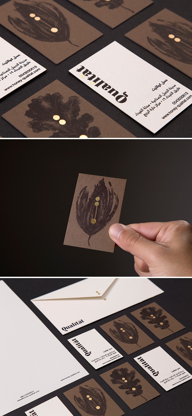
Qualität
Saudi Arabia Dots and Drops group launched Qualitat, a new brand offering a selection of organic honeys from different German beekeepers, which are then packaged and marketed in different cities across Saudi Arabia. Creative agency Estudio Dmentes designed the brand and packaging by combining visual cultures as different as the Europen and Arabic ones. The dots in the letters of the typefaces, with their golden stamping, become the last drops of a jet of honey that slide on the illustrations of an oak leaf or a flower metal, nodding towards the origins of the honey. The golden dots will be used as a visual resource that works to unite the design of the labelling. Extracting the points from the logo, isolating them, and placing them vertically shows how the drop of honey grow as it falls. The logo is simple yet elegant, allowing the typography to speak for itself. This helps to create bold labels without running the risk of the logo eclipsing the rest of the design. The colour palette enhances the brand values, with the black and golds referring to the quality and colours of the bees. Each different honey will be differentiated by colours with the same desaturated range related to nature. The Regatta typography, the core element of the brand, made up of thin and thick strokes, give the brand an elegant and strong appearance. The secondary typeface, Helvetica Neue LT Arabic, is clean and simple, compensating the visual weight of the designs.
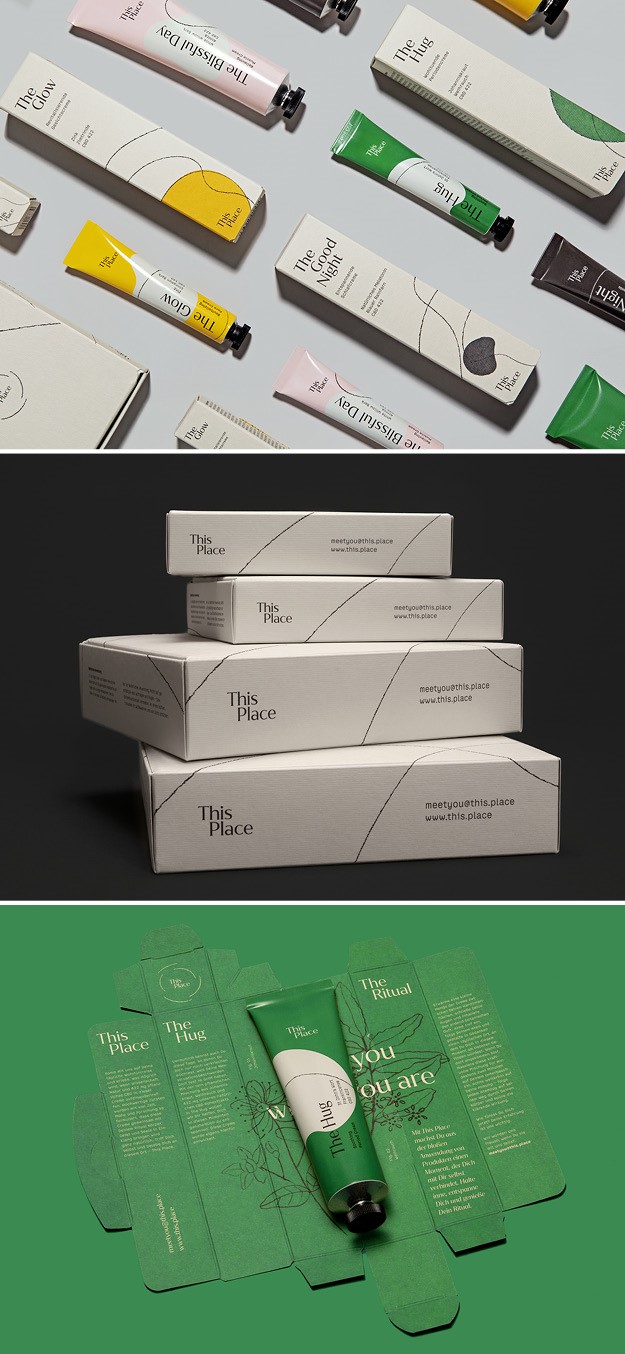
This Place
New German brand of CBD cream worked with YummyColours to create a brand identity that combined a medically-backed, organic CBD product line with a lifestyle brand experience characterised by customer education. YummyColours focused on women’s needs and on experiential opportunities to set This Place apart from traditional topical cream lines. The idea behind the brand is based on the concept of organic connection, which is inspired by the product’s natural ingredients and architectural spaces that blur the line between interior and exterior. The name and visual identity are developed through this concept and the packaging further highlights this idea of the relationship between inner and outer. The line artwork used in the logo and packaging was created by drawing lines using a wax pencil on a masonry surface and digitising them, adding to the of human-touch-like aesthetic. Each product has an associated shape that is used on packaging and informational digital content. The four shapes come together to form an abstract illustration that can grow with the addition of future products. Individual product boxes are a part of the whole, connected through the hand-drawn illustration, and each one includes a reveal of the individual product color on its interior.
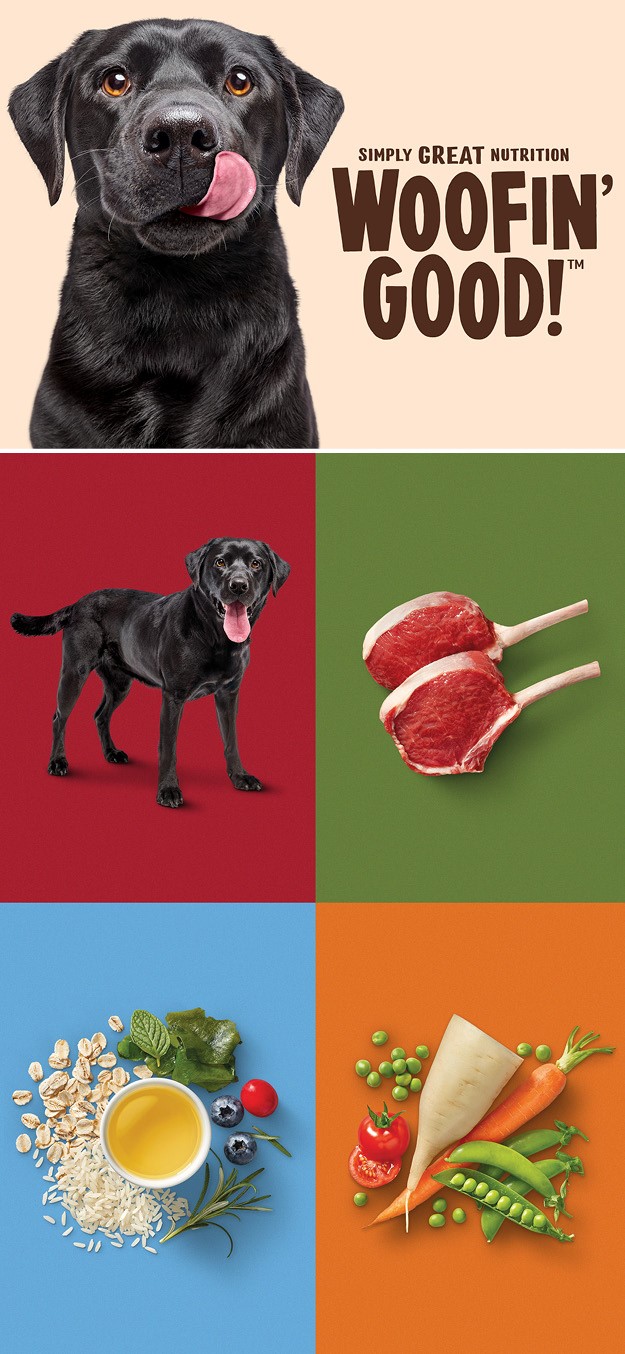
Woofin' Good
Brand and design agency Hulsbosch developed a brand strategy, identity creation and packaging design for Australian supermarket chain oles and its private label dog food range, Woofin’ Good. The brand has 35 exclusive dog food products for customers who are looking to satisfy their adult or puppy dogs with a wholesome range of wet and dry foods and treats that are more convenient to purchase as good value prices. Coles aims to inspire customers with premium quality Woofin’ Good! range made with real meat, no artificial colours or preservatives, to give dogs the essentials they need for a happy and healthy life. The brand captures the emerging consumer attitudes which show pets are increasingly integrated into family life and recreational lifestyles. This includes a current owner desire for health and nutrition for a well-cared for dog and creates ownership of the dog food category for Coles. The name is playful yet also points to the quality credentials of the product. The logo, a black Labrador licking his whiskhers, allows consumers to identify with his satisfaction and encourages an emotive engaging response. The food photography of the raw ingredients communicates the products ‘simply great nutrition’ proposition that allows the brand to stand apart on shelf. The colour palette enhances easy product recognition, while consistent fonts reinforce the brand. A specialty UV coating ‘gloss’ pack finish brings a vibrant appearance and attention for on-shelf.
“Hulsbosch have an in-depth understanding of category schematics and elite brand packaging architecture skills. They brought us the perfect brand name. Woofin’ Good! is fun and optimistic, easy going and reflects exactly what the brand is about, simple goodness,” says Belinda Anderson, head of marketing at Own Brand at Coles.