#TransformTuesday: 16 February

Here is this week's selection of rebrands from around the world. For more from #TransformTuesday, follow @Transformsays on Twitter.
Colliers International
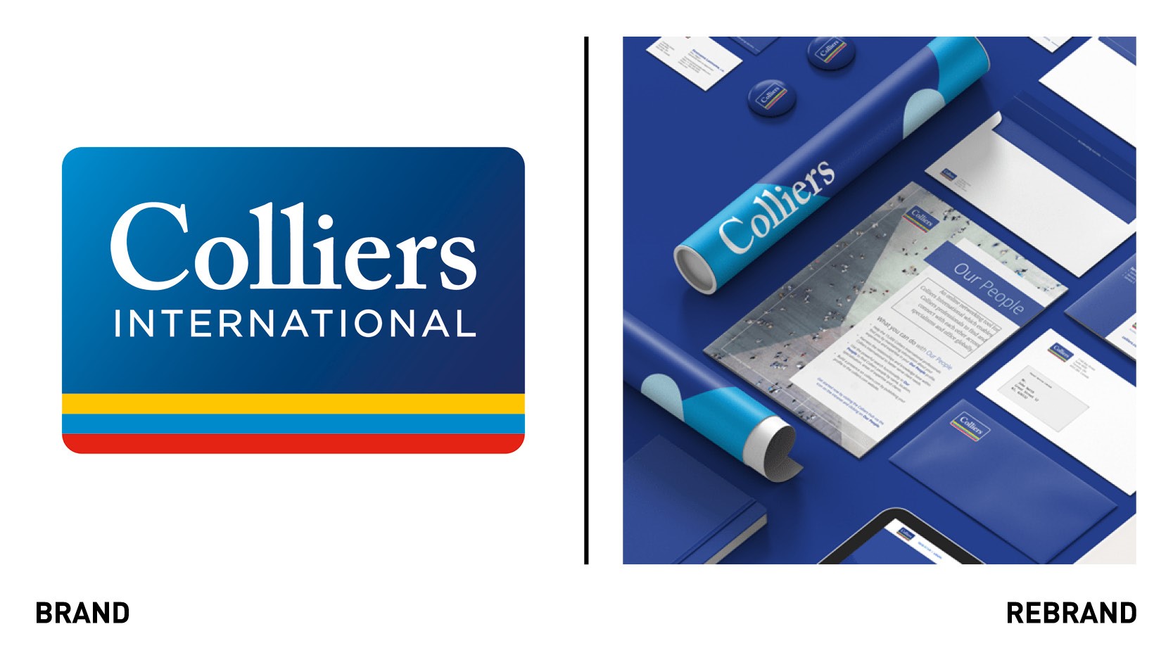
Colliers International, a real estates service and investment management provider, has launched a new visual identity as part of its new global brand strategy, designed for today’s evolving digital era. The rebrand aims to modernise the brand, maximise its stashed equity, strengthen the businesses’ presence within the industry and broaden its public profile. The strapline ‘accelerating success,’ which has always been at the forefront of Colliers business decisions, has also informed the rebrand, which builds upon the businesses’ culture of priding itself on acting with agility, championing new ways to make informed decisions and bringing passion to work. The logo design, which is the most recognisable element of the Colliers brand, has been updated, with the word ‘international’ removed to give more prominence for the word mark within the box. This allows for greater legibility especially for digital formats. The colour palette was updated to be bolder and feature energetic shades that align with the company’s enterprising culture, while the new typography seeks to communicate a clean and approachable brand. The refresh brings a suite of new design elements, including more prominent use of the Colliers tagline (“accelerating success”), new blocks and keyline design treatments and an updated library of photography and imagery.
“Our expert advice leads the industry into the future and how we represent ourselves reaffirms our position as market leaders and supports business growth. The changes we’re introducing today reinforces our commitment to accelerating the success of our clients and shape our industry presence,” says Tony Horrel, CEO Uk and Ireland at Colliers International.
firstlight group
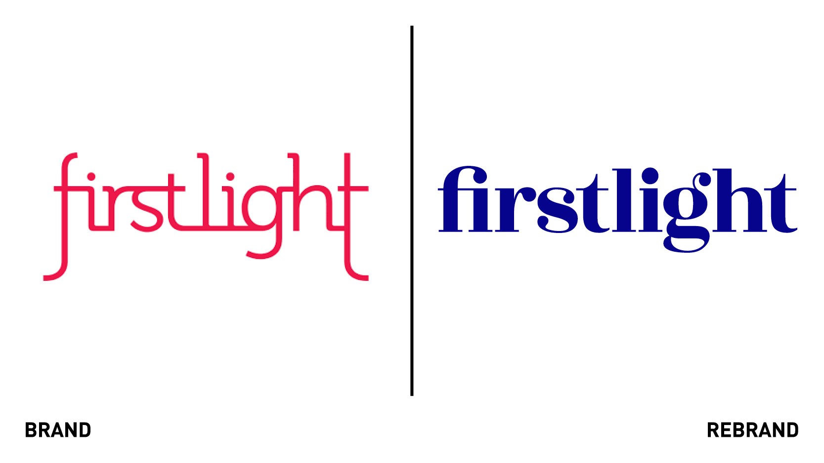
Firstlight PR has rebranded as FirstLight group, in an attempt to reflect a broader service offering beyond just media. The rebrand signals a shift in direction with a greater focus on providing a broader range of services under three new pillars: consultancy, comms and content. The rebrand sees the agency move beyond PR and will make it easier for clients to access the different services. The new logo adopts a bolder typeface and completely changes its colour palette ,going for pink to blue/ purple hue, which has an overall stronger presence. Firstlight PR was seeking a more confident and established look that conveyed the trust that their clients have in the business. The new look and feel is sharper and its simplicity gives it a much cleaner finish.
“Our heritage will always be rooted in helping clients create compelling points of difference that help drive their growth. From day one, we have always thought of ourselves as more than media but unfortunately ‘PR’ is often misunderstood and doesn’t describe the type of work we do, or the value that our clients tell us we deliver. We wanted to be explicit about that and ensure we’re constantly evolving our offer,” says founder and managing director Paul Davies.
Jimmy John's
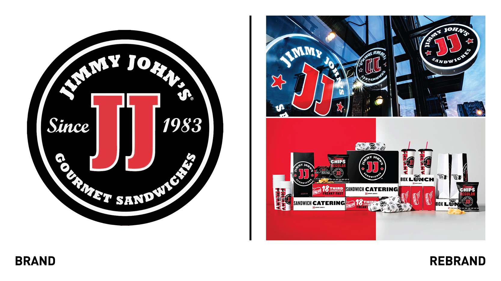
American sandwich chain Jimmy John’s, owned by Inspire Brands, worked with creative agency ChangeUp the to evolve its ‘freaky fast,’ reputation and big city attitude, focusing on quality, which has always been the core of the brand. To do so, ChangeUp first identified the heart of the brand, from the JJ initials to the iconic super seal, to perfect and codify the existing 40+ versions into one. Jimmy John’s was looking to simplify and modernize from 40+ logo variations used since 1983. The system is now one cohesive collection with its custom-crafted initials, wordmark, and medallion. The new packaging is an amplified version of the iconic Jimmy John’s black, white and red brand colours. The messaging and patterning evoke the brand’s bold and fun tone ofvoice. The quirky illustrations are also an important pat of the new identity. By unifying the hand-drawn linework’s imperfectness across the system of icons, the Flying Sandwich looks meatier, and Super Seal is ‘sealier.’
Match
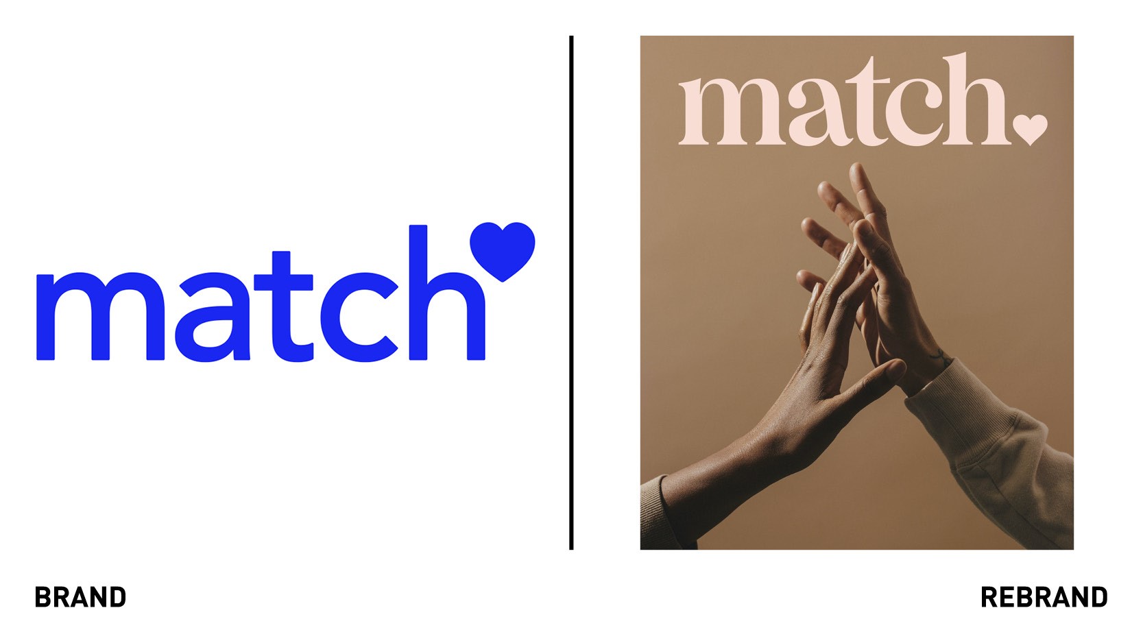
New York City-based branding agency Collins developed a rebrand for Match, an online dating site. While Match has a quarter of a century experience and knowledge in the online dating sphere, it was ready to be reorganised and refreshed to face its competition in the market. Match’s evolution was about taking the most powerful and meaningful qualities of the brand and delivering them in a new way, expanding the story and language to be of better service to users. Collins leveraged their long track record of success and industry mastery and focused on the idea of ‘hospitality and concierge.’ While other apps push users to engage, Match instead strives for the effortlessness of a concierge’s wave, showing users to the app but then leaving them to explore it in their own way. The heart in the logo moved from the top to the bottom, full stop, indicating the confidence in the service that the brand represents, becoming a simple statement with a clear ambition. The new logo shows how far Match has arrived since its inception. The colour palette is more tonal than the previous glaring and brightly coloured one, yet strives to be more inviting. The new brand strategy enabled Collins to amplify the experience of Match while also paving new roads for a more inclusive, ever changing-environment of dating, so that it felt elegant, playful and intimate. From hiring dating experts to new iconography and language that encourages you to be more open to the myriad of possibilities, Match supports users to focus on the good stuff: getting to know someone, crafting anticipation into the experience.
Osborne
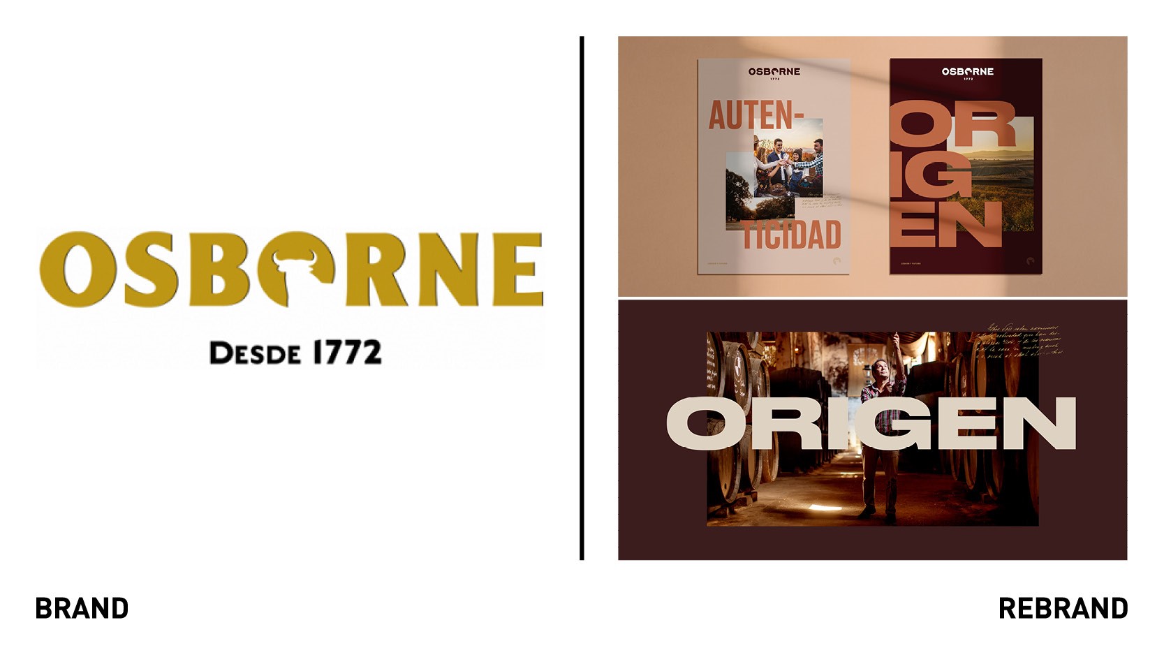
Spanish brand consultancy Baud worked with Spanish gastronomic brand Osborne to develop a rebrand to place it as a contemporary and innovative company without lost its origin and history. The brand redesigned its visual expression to put in value its trajectory, dimension and aspirations. The evolution of its corporate identity reflects its objective of promoting business ambitions in line with its 2030 vision and its corporate strategic plan. Baud focused on keeping the brand alive and attracting future generations without losing sight of the cultural roots the brand represents. The rebrand has been summarised in the strapline ‘Osborne: legacy and future.’ To develop the new logo with its own recognisable and timeless typeface, Baud carried out a study of the weight of typography offsetting it with the smudge of the symbol. In addition, they studied other aspects such as kerning, counterform, alignments, curvatures, and character height to create a logo with own, recognisable and timeless typography.
In the construction of the new colour range, an evolution of the brand's historic colours has been made to reflect through them the origins and the purest essence of the Osborne brand. These are colours present in the earth, in the trees, in the fields and in the wine, which represent the balance between tradition and modernity. The new typography uses condensed and extended fonts that generate a modern and versatile visual universe. The calligraphic typeface, extracted from the letters of Osborne’s founder, generates textures that evoke tradition.


