#NewBrandMonday: 1 March
Here are this week's selection of newly launched brands from around the world. For more from #NewBrandMonday, follow @Transformsays on Twitter.
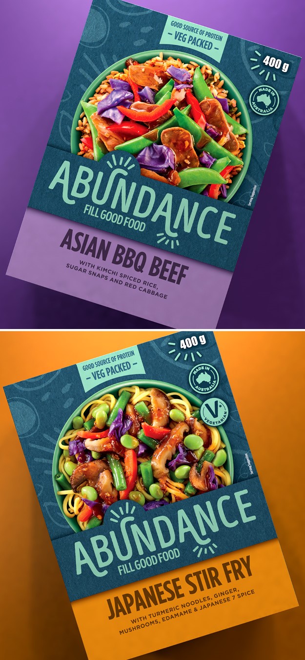
Abundance
BrandOpus Australia has partnered with Abundance to launch a new range of frozen ready meals into the positive health space. Abundance saw the opportunity of a gap in the category for portioned meals made with genuine ingredients that nourish the body. The globally inspired, vibrant and colourful meals are packed with ingredients designed for a time-short audience looking for convenience without compromise on taste, health and well-being. BrandOpus worked on bringing the brand positioning and concept ‘Fill Good Food’ to life.
“The end result is unexpectedly delightful, with a fresh, contemporary colour palette and inbuilt symbolism supporting the central brand idea. It delivers fantastic disruption and sets a new standard for the frozen ready meals category,” says Nikki Moeschinger, managing director at BrandOpus Australia.
“Working with BrandOpus we’ve brought the proposition to life in an intuitive way, through a strategic brand platform that celebrates a life of plenty, promising both physical and emotional fulfilment through convenience without compromise on wellness,” says Jessica Rea, Abundance brand manager.
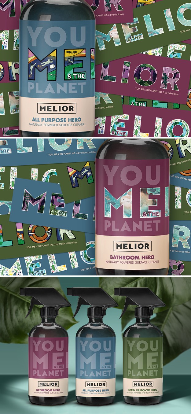
Melior
Design agency Biles Hendry created a brand identity and packaging for a new social enterprise MELIOR, a range of household cleaning products. The brand’s purpose is to offer more effective cleaning products, treading only ‘lightly on the planet,’ while employing people with disabilities who are often overlooked for employment. The name MELIOR is Latin for ‘better,’ a concept which is also reflected in the brand proposition statement, built around ‘people and planet firs’ concept. This inspired the strapline ‘You, MELIOR &The Planet.’ Disrupting category norms to make a clear point about being different, the packaging uses rich earthy colours, simple typography and an honest uncompromising statement, confidently shying away from shouty graphics and violent colours. MELIOR’s forthcoming artists collection will support emerging creative talent by providing a platform upon which they can add life to the MELIOR logo through customisation, resulting in beautiful limited editions.
“I wanted to merge a beautiful product, both on emotional and visual level, with kindness and effectiveness,” says Diane Cheung, founder of MELIOR.
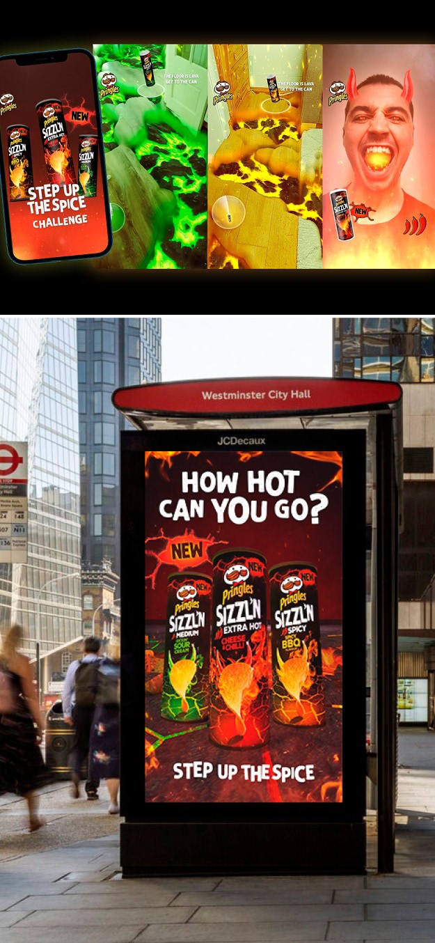
Sizzl'N
Pringles launched a new range of spicy crisps in the UK, Sizzl’N. Each flavour has a different level of heat intensity: Kickin’ Sour Cream (medium), Spicy BBQ (hot), and Cheese & Chilli (extra hot). The packaging, brand positioning and overall identity reflect the main ingredient of the new range: space. The vibrant and bold packaging achieves shelf stand-out while also using colourful imagery like flames and lava to give customers the idea of the strong flavours they will be tasting. While the brand retains the classic Pringles logo, which is what people are used to and know, the range also builds a playful and fun identity that is distinctive to itself.
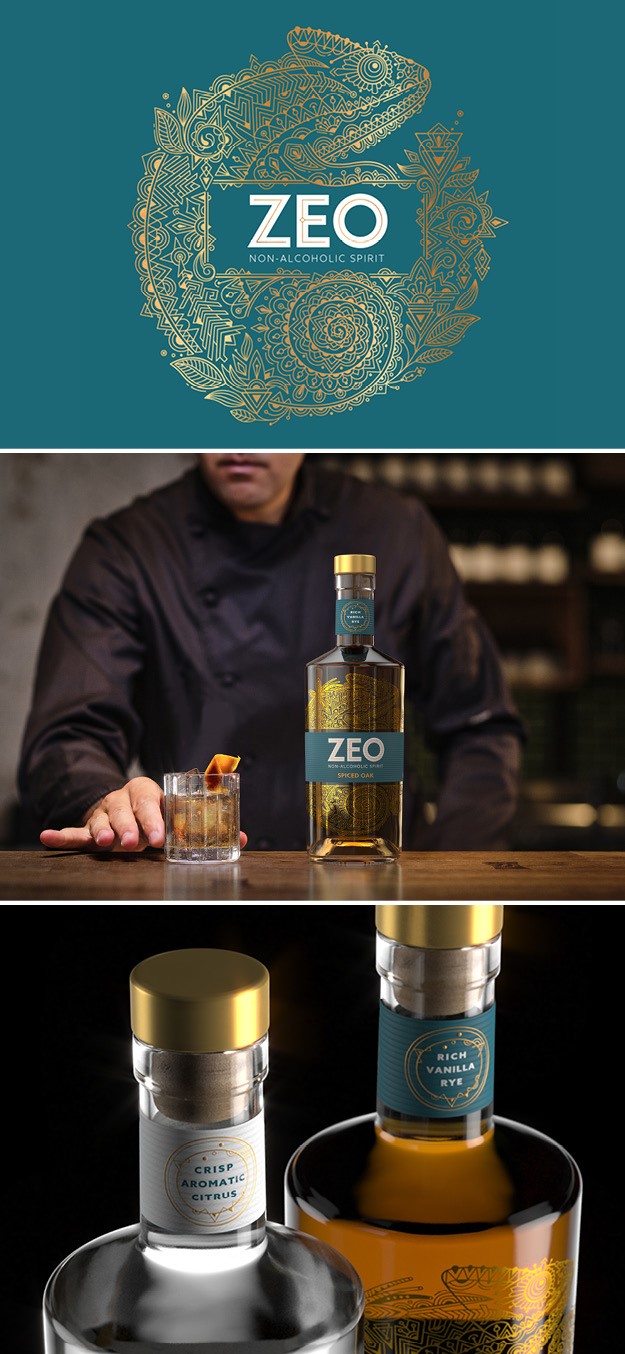
ZEO
Drinks design specialist agency Knockout created a new identity and bottle design for Zeo, a range of sophisticated, sensorial zero-alcohol spirits. The brand’s first two variants, Botanical Dry an Spiced Oak, launched in the UK market in November. Zeo possesses a sensorial dimension that mirrors the physiological effect of alcohol. Made with sustaiainbly- sourced botanicals and crafted through a complex five-step process, it has a distinctive ‘triple layered taste,’ making it a genuine alliterative for people who enjoy alcohol but occasionally decide not to drink. The duality of the need to blend-in with other alcohol drinkers yet wanting to stand-out is epitomised by the brand’s symbol, the chameleon. The intricate pattern illustration of the chameleon curling around the label conveys the sheer craft, sense of skill and attention to detail that goes into Zeo’s five-step distillation process. Hidden within the linework are depictions of the individual botanicals, which further reinforce the intriguing sensation of ZEO’s drink experience. This highly- detailed expression is then off-set by a clean, uncluttered wordmark, featuring bespoke typography that is bold in its simplicity, giving the brand a contemporary feel whilst supporting standout on the shelf and at the bar. Zeo’s bottle design strikes a dynamic balance between complexity an minimalism, underscoring the brand’s proposition as the best non-alcoholic spirit for modern tastes.
“As a player in a growing industry, ZEO needed compelling creativity to show that it was more than just flavoured water. The illustration of the chameleon is as delicately complex and versatile as the liquid within,” says Dominic Burke, Knockout founder.


