New ‘bullish’ identity for CALM developed by Studio Output

Band agency Studio Output worked with the Campaign Against Living Miserably (CALM), a charity that helps counter suicide in the UK, to develop a new visual identity that allows CALM to reach more people struggling with life.

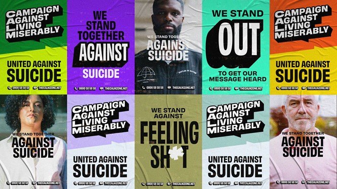
The new brand identity is firmly rooted in CALM’S ‘irreverent, bullish and empathetic,’ character. All three traits are always present, whether they are dialled up or down depending on the message. The three-colour palette also reflects each trait, and can be combined to stand out boldly or toned down to encourage people to open up.
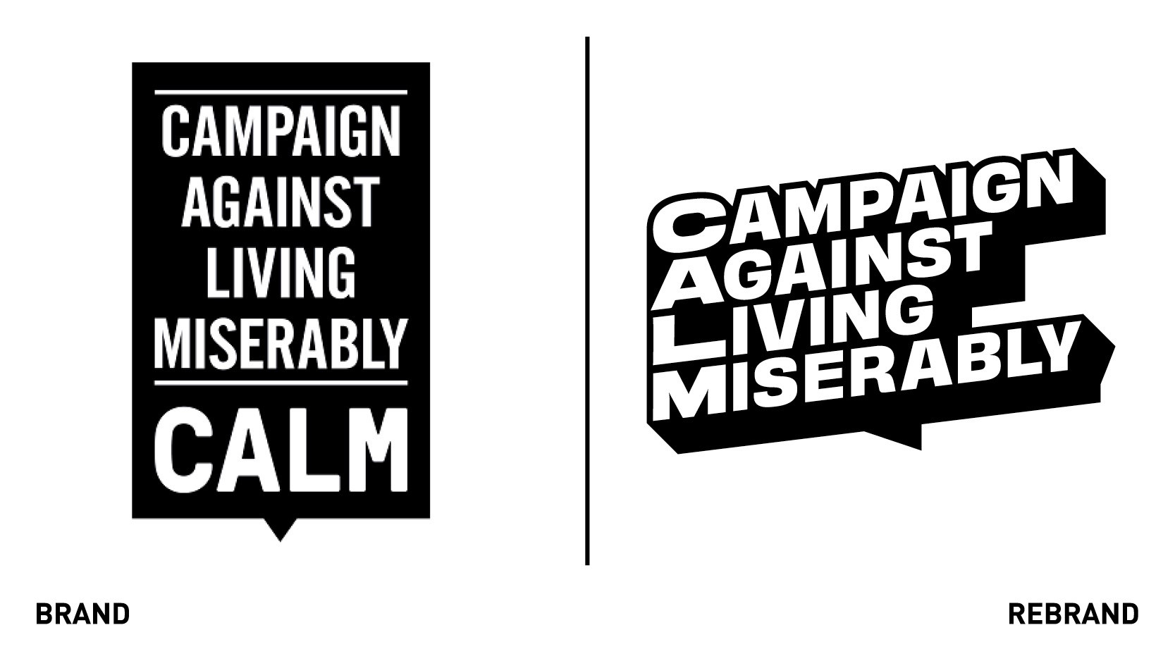
Similarly, the logo was also designed to be a bold statement of CALM’s mission, with Studio Output using its extruded text sale to define the graphic language beyond it. The character and ownable design language aim to give the brand the flexibility it needs, without losing cohesion, so all applications and experiences look and feel CALM.
To reflect CALM’s openness and willingness to help anyone in crisis, Studio Output wanted the brand identity to be accessible, making everyone feel safe and understood. To do so, it mixed cuts and weights of the ‘Obviously’ typeface, developed by the Oh no Type Company. This allows the charity to increase messages creativity but reduce sensitive information where function is the priority.
Studio Output also created a ‘brand+’ element to the system to support CALM’S engaging and entertaining content. Building from the core brand, the assets and logo use design codes relevant to the message, aiming to make each one aesthetically distinctive and expressive. The goal is to get people talking sooner, before they reach a crisis point, and end up taking their own life.


