Form designs new ‘modular’ identity for Estates East
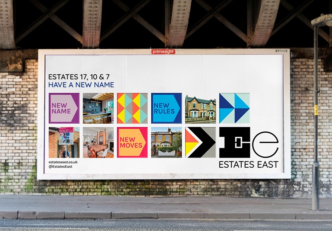
Design and branding agency, Form, designed a new brand for East London estate agencies, Estates 17, Estates 7 and Estates 10.
The new name ‘Estates East’ unites the three east London branches in one cohesive brand and was proposed by Form after they conducted a brand hierarchy analysis. The new brand strategy and visual identity aims to reflect the creative, vibrant and diverse spirit of east London.
The new identity developed by Form puts people and stories at the heart of its brand positioning, helping Estates East to achieve its goals of appealing to the local area’s changing demographic. The positioning also helps the brand reflect the company’s new young team and be better suited to increase market share.
The colourful rebrand expresses the client’s ambition to change the rulebook on estate agency. “As Neil Collins (founder of Estates East) and his team talked about the messages they wanted to convey, we quickly realised this project was more than a visual rebrand, it was a manifesto that riled against every cliche about corporate estate agency” says Paula Benson, partner at Form.
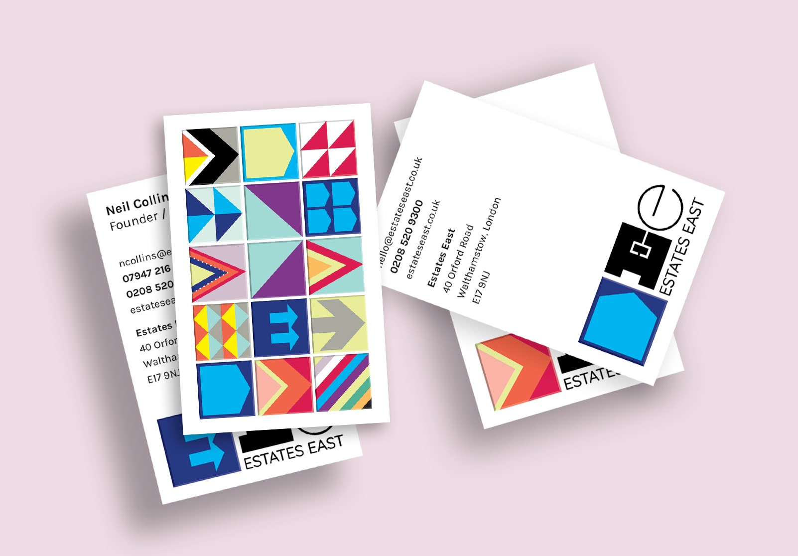
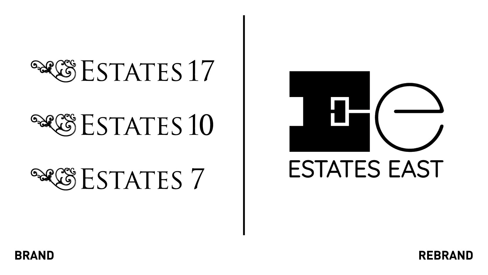
The ‘Ee’ monogram logo design features two distinct typographic elements. ‘Estates’ is represented by a bold capital ‘E’ derived from investigation of artisanal woodblocks, East-end industrial typography and traditional slab serif fonts. It aims to convey the company’s dependable, confident, and honest personality. The lowercase ‘e’ for ‘East,’ on the other hand, seeks to represent the creative, youthful and independent spirit of east London.
Once established, the logo will evolve for a ‘phase two’ development, in which the second ‘e’ will be adapted with interpretations by local east London artists. This aims to create an ongoing interplay between the blocky gravitas of the capital ‘E’ with a dynamic animated lowercase ‘e.’
A key part of the visual identity is a suite of lively ‘tiles’ consisting of graphic symbols and arrows pointing east. This modular approach allows for the tiles to be used in various configurations such as squares or long rectangles, making for a flexible identity.
Form also designed a suite of logos to act as figureheads for the different services and events which Estates East offer, as well as devising a strategy for social media content and template designs for Instagram, Facebook, LinkedIn, Twitter and Tik Tok.
Additionally, the design studio named and created a sub-brand identity for the new homes department of Estates East. ‘Future Build’ will focus on new builds and provide in-depth advice for developers. Part of Form’s work has involved the creation of a separate style guide and webpage design for the ‘Future Build’ department which incorporates their reinterpretation of the parent brand’s arrow tiles in neon.