Finding clarity in the complex: That Thing combines data and philosophy to launch Intropic
After a couple of years honing their product under the radar, data refinery business, Intropic, commissioned London-based brand studio, That Thing, to design a solid brand identity and website for their next phase of growth.
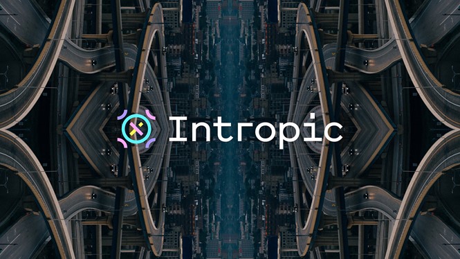
That Thing built Intropic’s identity on the idea of finding clarity in the complex, which reflects Intropic’s mission of joining the dots (data) to find meaning. That Thing encapsulated this concept in the logo, which it designed around the moment data clicks into place, unlocking the next big idea. The logo represents the three pillars of Intropic’s operation: data, symbolised by the four semicircles on the outside; information, represented by the circle; and insight, represented by the ‘x’ shape within the circle.
While the logo is designed to be legible on different online platforms as the brand is digital-only, it also aims to be expressive and emotive. That Thing wanted to distance it, and the rest of the visual identity, from the common tropes associated with data, like dots, explains Mark Williams, founder of That Thing.
“Looking around at competitors we realised that was a bit of an easy way out, so we began thinking outside the box,” he says.
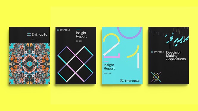
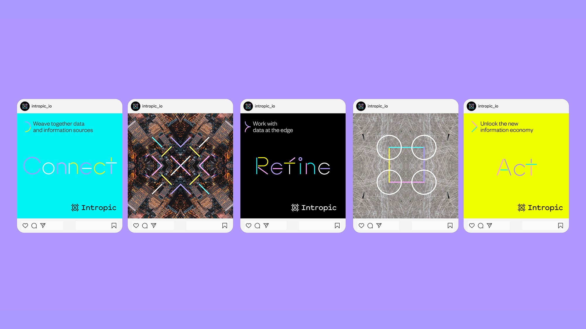
The studio came up with symbols and patterns instead, which reflect how big streams of data create compelling geometric designs when distilled down. The patterns, inspired by murmurations and cymatic patterns, form every aspect of the brand’s visual identity. In the website, they move together with every scroll, forming different symbols on every page. In the typography, the curves, diagonals and straight lines of symbols form a modular and geometric typeface.
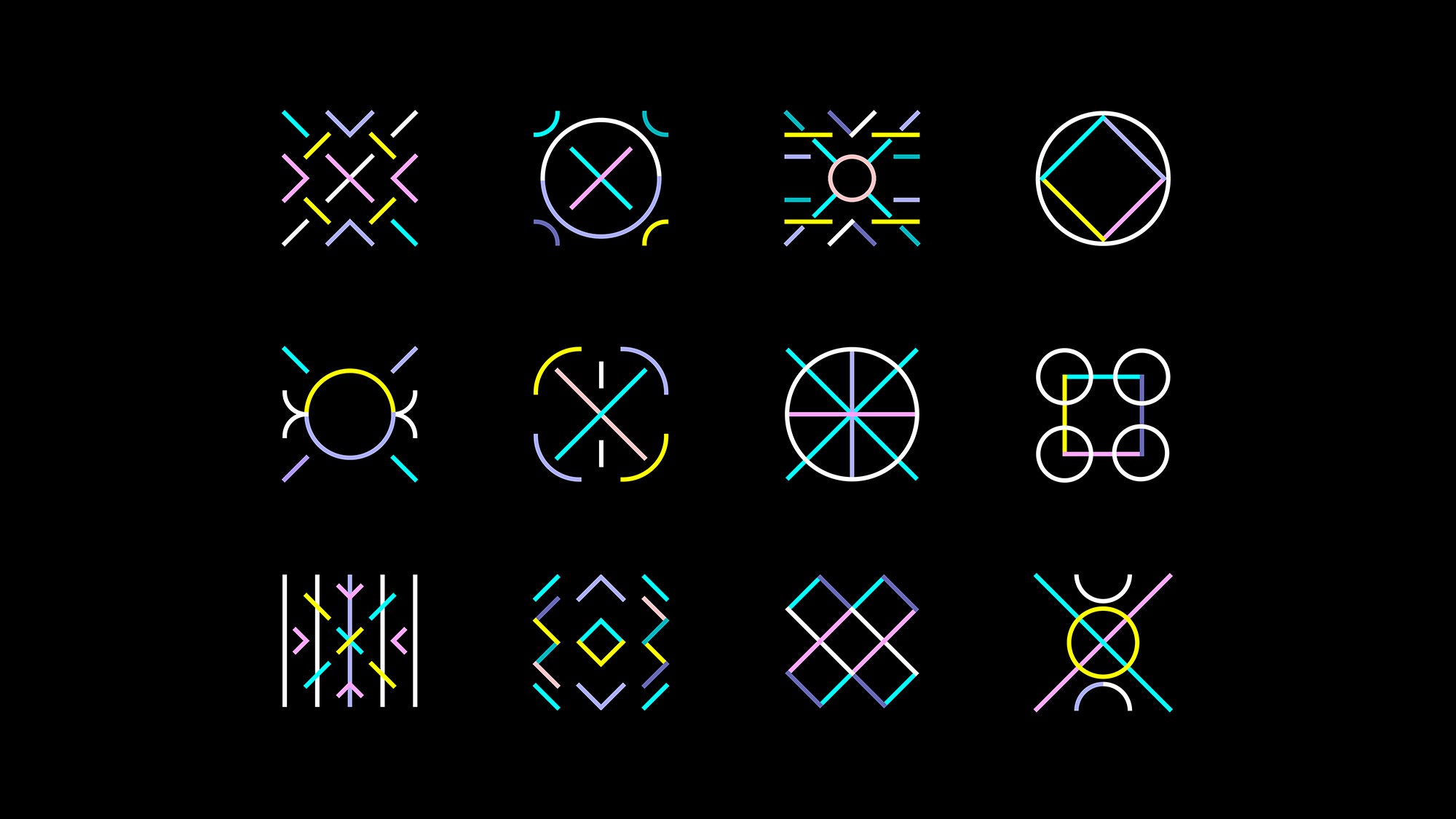
That Thing aimed to take something very complex, like a pile of sand, and turn it into a a compelling pattern that feels purposeful. This design technique allows for all assets to be made from the same components yet be distinctive and individual.
This is especially evident in the art direction, which draws the eye to hidden motifs in chaotic everyday environments, like people in a pool or pigeons flying in the sky. “We developed a mirrored, almost kaleidoscopic, approach to imagery, similar to the one of the symbols. As patterns are formed by repeating complex imagery over and over again, one starts realising how insights can be drawn from real world situations. Giving this twist to everyday images will also allow Intropic to use stock imagery but make it ownable,” Ead says.
The symbols and photography are complemented by a vibrant colour palette, which further distances Intropic from competitors. The hot pinks, bright yellows, and teals juxtaposed to the black background are far removed from the usual greys and blues found in tech and data brands, and allow Intropic to stand-out and pop.
“Early on we established that data isn’t dark. Inside of it lie amazing possibilities and opportunities and therefore it should be represented in a vibrant, colourful manner rather than in a heavy, dark mode with dots. We wanted the colourful visual identity to show that data is a positive force if harnessed the right way” Williams says.
“We love jobs that change how you look at the world and this has been one of them. Working with Intropic made us totally rethink the concept of information and begin to understand what a fundamental force of nature it is. Harnessing it in the right way is going to be vital to help the world take on some of its biggest challenges. Intropic’s new brand will help to establish them as the most exciting business in the information economy as it enters a new and important era,” says Joe Weir, co-founder of That Thing.


