Design Bridge brings NYC’s PDT speakeasy above the surface
Global design agency, Design Bridge New York, worked with NYC-based speakeasy bar, Please Don’t Tell (PDT), to design their new visual identity and packaging with the aim of transforming the secret speakeasy into a full-fledged brand.

Hidden through a phone booth in New York’s East Village, PDT needed a brand refresh to visually reflect its creative experience to the outside world. The pandemic forced an already struggling industry to fight for its survival and lockdown was the final straw. It gave general manager, Jeff Bell, the time to work on his long-held ambition for PDT to branch into retail and launch a new ready-to-drink cocktail range.
“PDT is a New York institution and is a globally recognised speakeasy. To stay relevant, it needed to pivot its business after being forced to close during 2020. Together, we saw an opportunity to evolve the bar into a complete brand, putting it in a strong position in the post-coronavirus landscape,” says Mike Perry, creative director at Design Bridge New York.
The brand identity needed to reflect PDT’s exclusivity and secretive experience within its design, ensuring that it could grow beyond the bar, to a new audience and market. Renowned for its craft cocktail movement, with mixologists telling a story within every drink that they create, PDT’s new brand identity needed to transport the story beyond the glass and into a wider market.
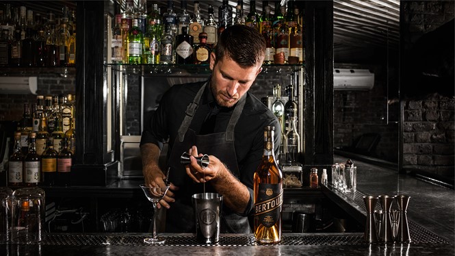
Jeff Bell, managing partner at PDT says, “At PDT we take as much care and attention with the experience as we do with the creation of drinks. We want the entire visit to be thoughtful, with every detail being considered. This means the glassware we select is unique and specific to our drinks program. And now, when we offer items to go, such as pre-mixed cocktails, the design of our labels and packaging reflect the premium quality of the drink inside.”
“To ensure the bar maintained a presence during lockdown, we needed to distill the intriguing speakeasy experience on-pack. Featuring a wax seal and snake tongue-shaped ribbon, the bottle dramatises the bar’s air of exclusivity. The cocktail name sits prominently on the bottles, but we kept the embossed PDT name slightly hidden, recreating the journey of discovery that customers have when entering the bar itself,” says Gregor Johnstone, design director of Design Bridge New York, when speaking about the new to-go cocktail range packaging.
Design Bridge took inspiration from 1920s speakeasy calling cards, incorporating elements of their design and reputability into PDTs new imagery. The new logo makes use of Ouroboros: a symbol of transformation and rebirth. The PDT logo shows two snakes (as opposed to the singular one typically used) within the circle, which symbolise the ‘above and below the surface’ of PDT’s concealed speakeasy experience. The logo aims to convey how the brand was moving beyond the underground and into consumer retail.
Hand-drawn with illustrator, Gerry Barney, the new logo seeks to instill an element of craftsmanship into the brand, replicating the care that PDT’s bartenders put into mixing drinks. Beyond the primary snake emblem, the team created a series of logo evolutions including a monogram and hand icon, establishing a brand toolkit for PDT that can extend across multiple touchpoints.
Inspired by the copper accents found within the bar itself, Design Bridge softened the brand’s red colour palette into a more earthy tone. This, juxtaposed with a deep black, aims to elevate the feeling of mystery and secrecy of Prohibition- era speakeasies.


