Supple Studio designs identity for first new Scouts branch in 35 years
Bath-based graphic design agency, Supple Studio, designed the identity for Squirrels, the first new branch of the Scout’s family tree in 35 years. Catering for four to five year olds, the new branch aims to get kids active, allowing them to explore nature and have fun while earning Scouts badges.
Supple Studio was commissioned to create an inclusive tone of voice and visual language for Squirrels that would complement the Scouts master brand, and work well both online and outdoors. To do so, Supple Studio began by rewinding to the beginning of the Scouts story, to Brownsea Island, where the Scouts movement was first born more than a century ago.
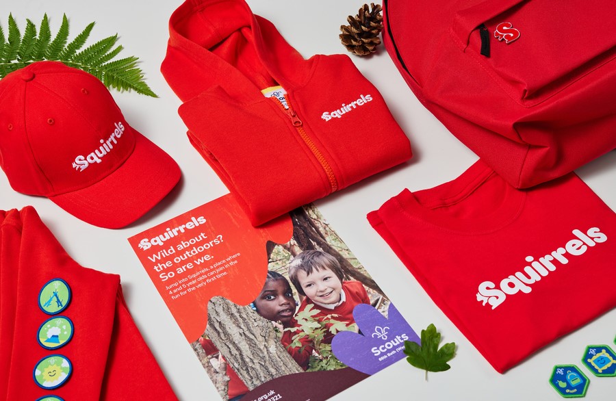
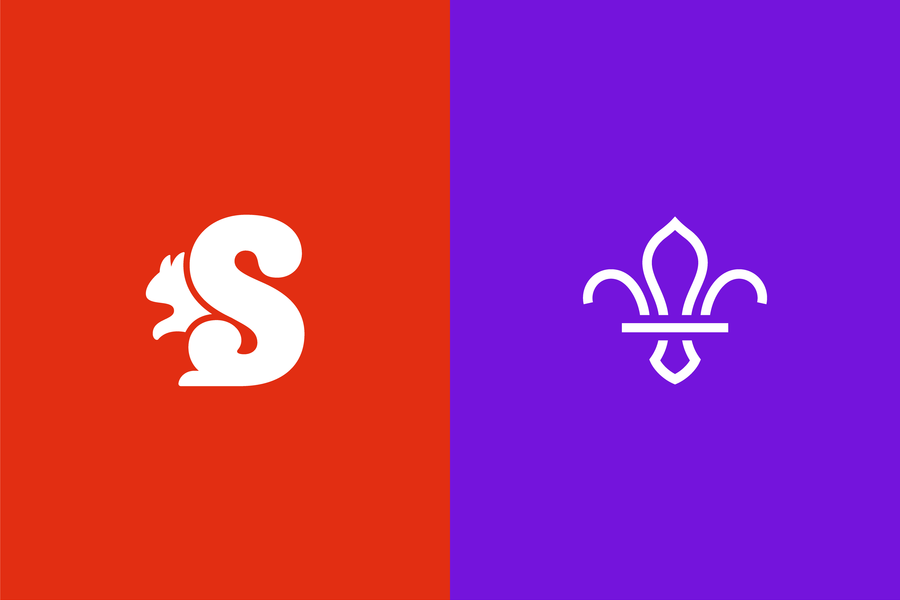
The island’s flora and fauna inspired Squirrels’ visual language, which culminated with the creation of a ‘squirrelly’ logotype, hidden in the letter ’S.’ The silhouette of the squirrel’s head combines with the ’S,’ which becomes the animal’s fluffy tail.
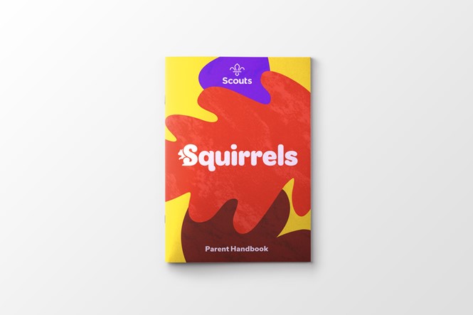
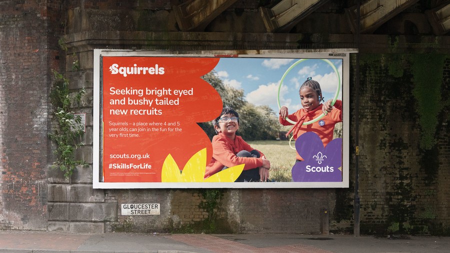
The visual identity also includes a vibrant colour palette, centered around the primary bright red, paper-cut illustrations and tree rubbing textures that are age appropriate. Supple Studio commissioned photography and art direction to have a child’s eye view. Similarly, the tone of voice was given a sense of curiosity and wonder that reflects that of pre-schoolers, with posters including straplines like ’seeking bright eyed and bushy tailed new recruits.’