NWHL embraces inclusivity and gender equality with new name and identity
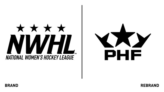
The National Women’s Hockey League (NWHL) has rebranded with a new name, the Premier Hockey Federation (PHF), and a refreshed logo ahead of the 2021-2022 season.
The PHF is the first professional women’s sports league in North America to lift the word ‘women’ out of its title. The new name aims to redefine the league’s brand based on the skill and talent of its athletes as opposed to their gender.
“The Premier Hockey Federation is home to some of the best professional athletes in the world who deserve to be recognised for their abilities and to be empowered as equals in sport. This league has come a long way since its inception in 2015 and we believe that this is the right time and the right message as we strengthen our commitment to growing the game and inspiring youth,” says PHF commissioner Tyler Tumminia.
The PHF name was inspired by empowerment, gender equity, and inclusivity with respect to differences in the gender identity of current athletes, prospective players, and league stakeholders. As PFH expands across the United States into Canada, and increases its international talent, the rebrand also sought to have a global appeal.
“From an opportunity standpoint, it’s huge. I understand and appreciate not having to define ourselves as female athletes anymore. Now we are defining players based on skill and what they bring to the game. This is about recognising that regardless of gender, athletes are talented,” says Metropolitan Riveters captain Madison Packer, a member of the league since Season 1.
The new logo, which pays tribute to the history of the NWHL, aims to present a modern identity with simplicity and flexibility. The black and white scheme is preserved in the primary emblem, while stars from the original design form the silhouette of a crown atop the PHF acronym. The use of both the stars and crown are symbolic of ambition and achievement but also form a subtle ‘W’ to convey the idea of raising women to the top.
“We’re excited to build on all of our momentum from the last year, ‘Raise the W’ and embark on this new era with our athletes, teams, partners, and fans. No labels, no limits,” says Tumminia.
Boston Pride sophomore forward, Sammy Davis, says, “This rebrand strategy speaks volumes about what women in sports and women, in general, are trying to do. We’re trying to be seen for more than just being women. It's important to be pioneers, to be first. Set the foundation and show people that it's okay to be different and it's okay to want change.


