#TransformTuesday: 7 July

Here is this week's selection of rebrands from around the world. For more from #TransformTuesday, follow @Transformsays on Twitter.
Dix Park Conservancy
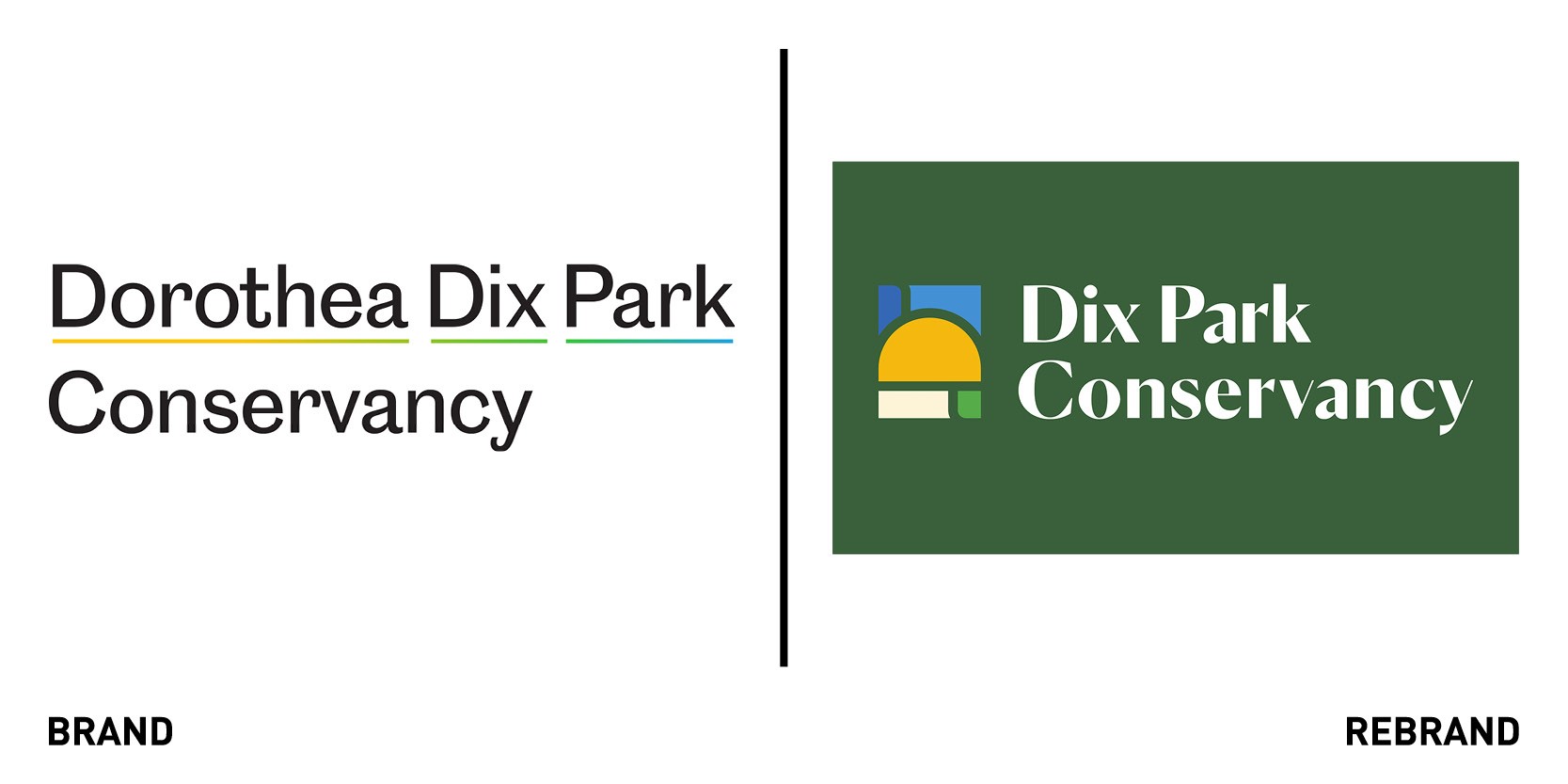
Dorothea Dix Conservancy, the non-profit conservancy of the largest city park in Raleigh, North Carolina, Dorothea Dix Park, worked with Charleston-based branding design agency SDCO Partners, to develop a bold, inclusive, and timeless new identity for a once-in-a-generation urban park. The new identity reflects the park’s mission of enhancing the physical, mental and community health of its people, and was informed by the park’s five pillars: community, history and legacy, art and culture, gardens and ecology, health and play.
The typeface, a mix of serif and sans serif, and the bright oranges, greens and azures, echo the playfulness, optimism and inclusivity of the brand. The vibrant colour palette, envisioned by world-renowned landscape architect Michael Van Valkenburgh, draws from the park’s landscapes, envisioned, with the green hills, valleys and fields, golden prairies and blues of skies, creeks and ponds. The rebrand also included thoughtfully crafted products rather than simple branded merchandise. The collection, which includes kites, beanies, and posters, evokes emotion, inviting personal connection and pride, further reinforcing the park’s inclusive identity.
Barilla
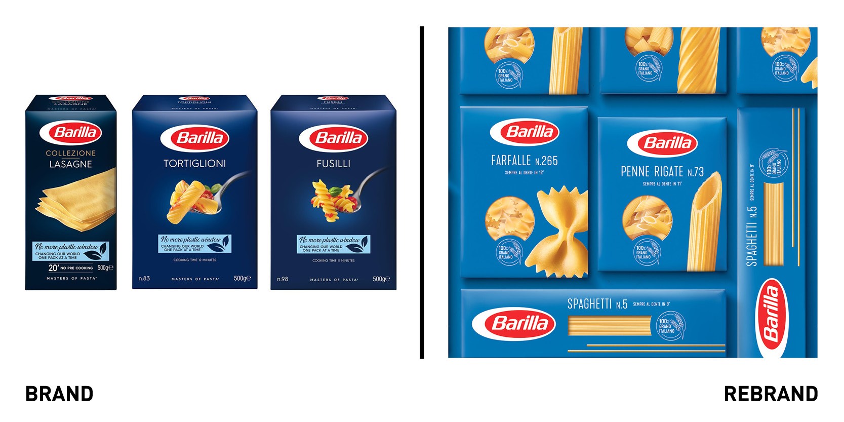
Italian multinational food company Barilla worked with global design agency FutureBrand to launch a new global brand strategy and architecture. The new identity aims at telling the brand’s unique story, its passion, lightness and love for pasta. The unifying element of the narrative is the pure blue of the Italian sky, which embraces everything, from the cultivated wheat fields to the production of pasta served to the tables of thousands of families. This intense azure that replaces Barilla’s traditional blue celebrates the Italianness of the most loved pasta brand. The product is displayed in al its naturalness, letting the raw material tell its story and show even those small imperfections that make it unique
“The protagonists of the new creativity are our values: passion, conviviality, sharing and the new quality of our pasta. Barilla wants to offer a renewed, better pasta, a product that Italians may love more than ever and that can represent a unique moment of joy and sharing with the ones they love and their friends,” says Elena Tabellini, vice president of marketing at Barilla.
Australia
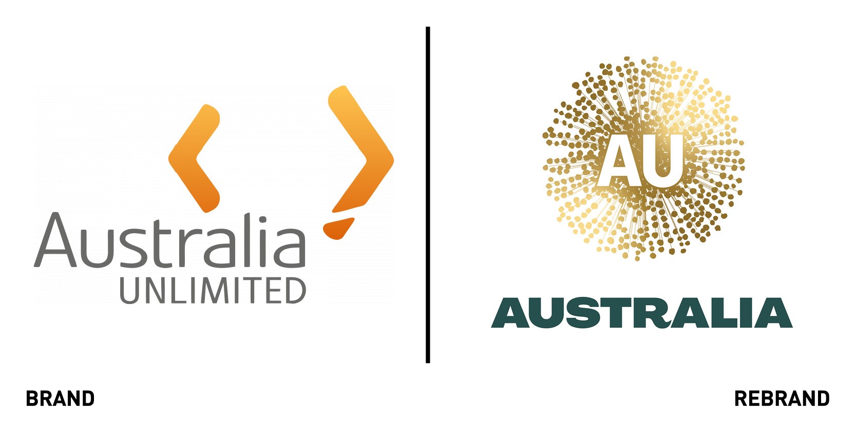
The Australian Nation Brand Advisory Council developed an international visual identity for Australia to promote it as a ‘brand’ to international markets. The nation brand is a government initiative that aims to unify Australia’s different trading brands, celebrate the country as a trusted exporter of good and services, a competitive investment destination and a good place for tourists. The Council specifically recommended to the government that Australia focus on other elements of its culture not kangaroos as it would reinforce the stereotype already associated with the country. The visual identity, designed by Australia’s largest marketing communications company Clemenger Group, is based on different interpretations of the wattle flower, Australia’s national flower. The wattle was chosen as a symbol to provide “a blank canvas, to tell a new Australian story,” writes the Nation Brand Advisory Council colour. Previously, Australia was inconsistent with its use of multiple logos and colours, confusing potential audience. This time, the Nation Brand Advisory Council colour palette is centred around two colours, green and gold, rather than yellow.
TGI Fridays
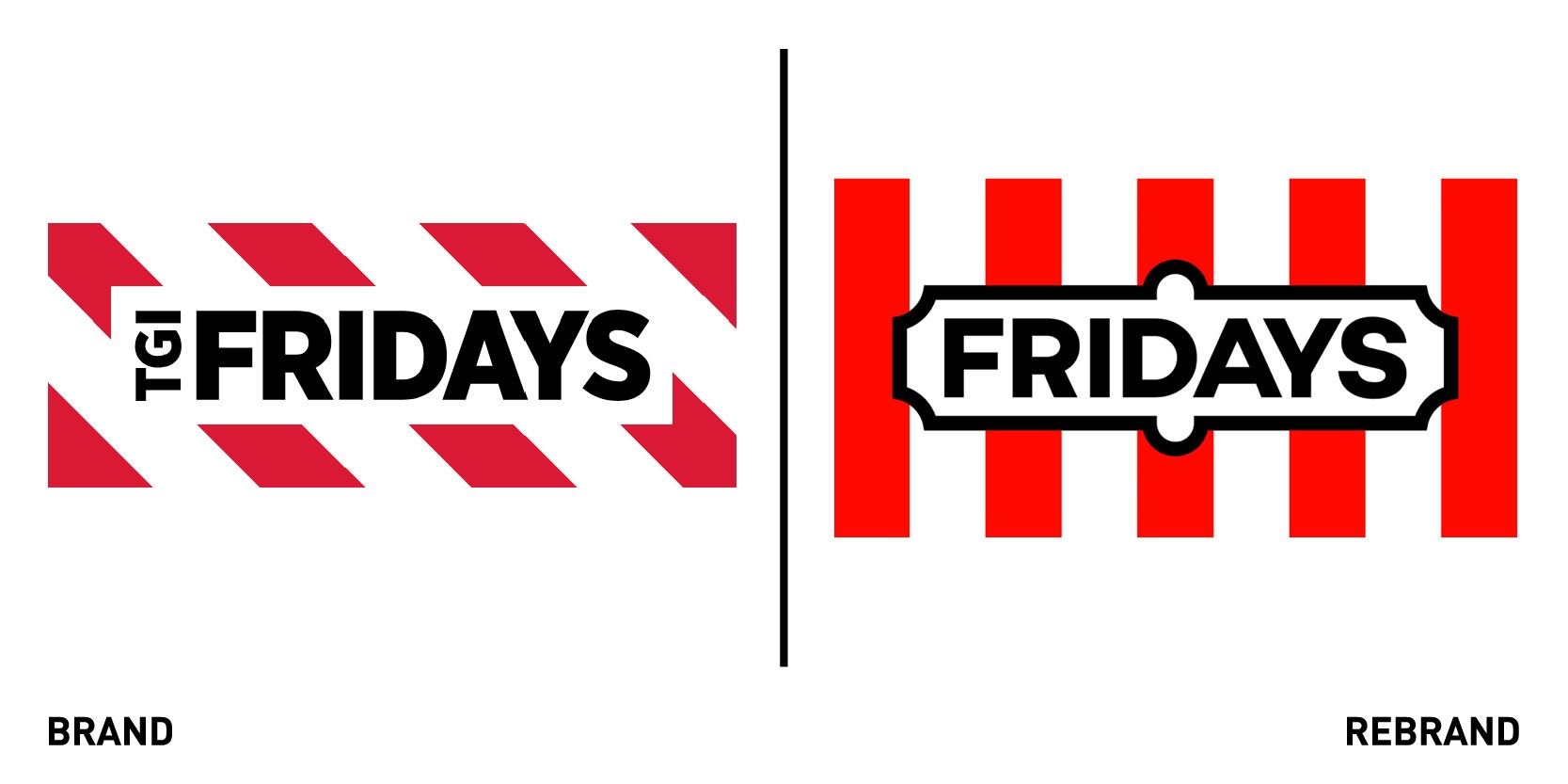
Creative agency SomeOne in London worked with restaurant and bar chain TGI Fridays to develop a new verbal and visual identity. To do so, SomeOne began from establishing the essence of the brand, ‘The Fridays Feeling,’ the original idea of fun and entertainment from back in New York and a reflection of the energy and excitement the brand brings to the party. The first change was the name- Fridays, has over time TGI had become lost and confused. Fridays is now sharper and more focused, and can be used in a number of headlines and play of words. The new visual identity takes inspiration from the iconic original signage, the mot recognisable part of the brand. It was reintroduced in a bold and sophisticated way, reducing down to the F icon, a symbol to be deployed when closer to the brand, onsite or online. Digging in the brand’s past, SomeOne also pulled out the vertical strips, which were used in the original awnings of the 1965 bar.
“Our vision is to make Fridays famous again so we needed to breathe fresh life into the brand by relevantly leveraging the past. The Fridays Feeling is the inspiration for our new food and drink menus and a service plan designed to consistently deliver the best guest experiences and a generosity of spirit,” says Robert Cook, CEO of Fridays.
The tone of voice was also rewritten to be more exciting and personable, with a right balance of fun vs function.
“While we focussed on developing a watertight operating system, it was important that we didn’t lose sight of the character synonymous to Fridays. So we have made sure to deliver a touch of frivolity on all design materials and instil that as part of the brand’s DNA. Whether it be playful copy, cheeky icons or illustration,” adds Cosmo Jameson, design director at SomeOne.
FFS Shaving
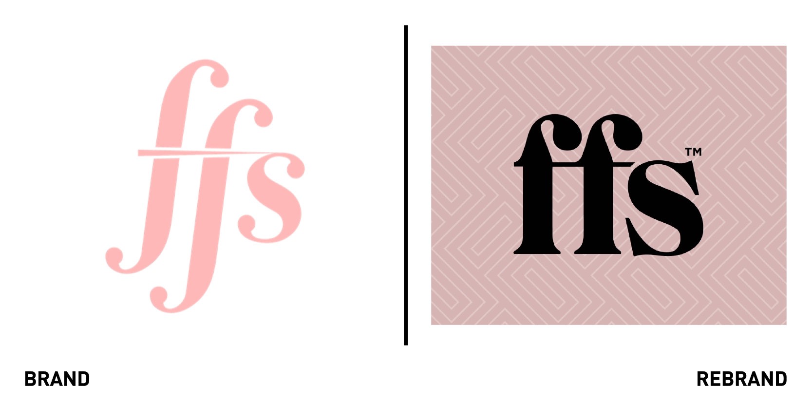
London-based design agency Free The Birds created a new identity and positioning for FFS, the UK’S first and biggest direct-to-consumer women’s shaving brand. The rebrand includes an updated logo and a new, premium aesthetic using a distinctive white geometric pattern on a pastel colour palette, enhanced by an accent of darker colour. A new tagline, ‘Beauty should be effortless,’ reflects the brand’s ethos, of making beauty routines and purchases easier through a subscription service delivering quality products. The FFS brand name, which originally stood for ‘Friction Free Shaving’ has been evolved to unlock visual and verbal twists on the acronym, including ‘For fun’s sake,’ and ‘For fairness sake.’
“When we launched the brand back in 2015 it was about rebellion and shaking-up the tired and often overlooked women’s shaving category with an irreverent, raised eyebrow. Five years on, and proud of all that we have achieved, it felt like the right time to refresh and showcase how we’ve evolved. The new FFS Beauty name, look and feel reflects our growth into a more sophisticated, conscious and contemporary brand, but one that remains committed to disrupting the wider beauty industry without taking itself too seriously,” says Des McManus, MD of FFS Beauty.
Air Wick Freshmatic
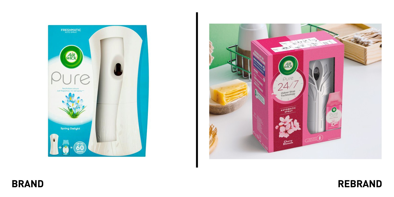
Global brand Air Wick, which neutralises odours through fragrance sprays, owned by British multinational consumer goods company Reckitt Benckiser revealed a redesign the Air Wick Freshmatic automatic spray. RB worked with DCA, a product design and development consultancy company, to transform the device, with the redesign of shape. The new design has a 17.2% reduction of plastic, with softer curves and the inclusion of a blossoming effect with the spray hole integrated into this. RB also worked with global design agency Marks to bring the new design to life through packaging. Using the theme ‘continuous freshness’ to capture the new fragrance and odour-neutralising technology, Marks refined pre-existing visuals into a simple, easy to understand design. While the redesign retains the bold colours familiar to existing customers, it further simplifies the layout to ensure it communicates clearly and achieves shelf stand-out, with each fragrance illustrated on the pack and emphasised by a specific colour palette.
“Understanding our customer’s desires for the redesign was essential. The device has always delivered in terms of fragrance over a long period, but the new design allows the product to take centre-stage in the home environment, something to be proudly displayed, not hidden away,” says RB’S Freshmatic marketer David Bermejo.


