#TransformTuesday: 3 November

Here is this week's selection of rebrands from around the world. For more from #TransformTuesday, follow @Transformsays on Twitter.
Brex
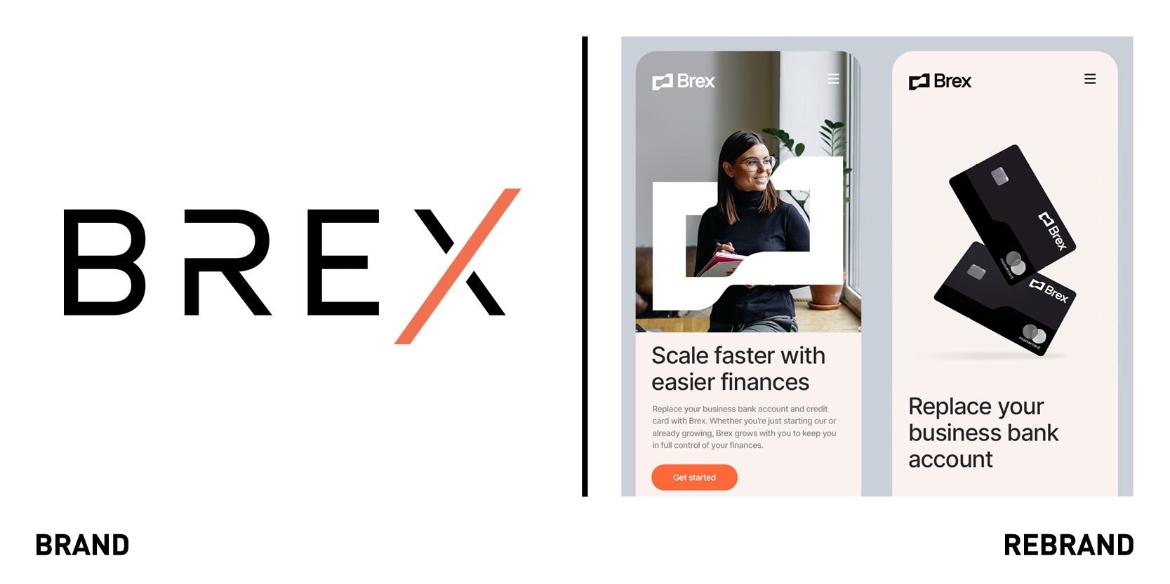
Fintech company Brex worked with design agency Gretel to create a new visual identity that would speak for business founders in an emotionally resonant way and still be positioned for mainstream recognition, sustaining its success within Silicon Valley and beyond. Brex wanted to leverage its new brand expression to highlight its offerings beyond card services and cement its position in helping all growing businesses realize their full potential. The goal was to transform its pre-existing brand mission of dreaming ‘big’ into actionable design concept. The evolved brand system, including the product, website, and physical credit cards, allows the brand to engage its audience on a deeper level by standing out and embracing their aspirations. The system’s pillar is the flag logomark
“The mark alludes to a rippling flag and represents the entrepreneurial spirit of Brex’s customers. It’s a powerful symbol that stands for the vision, courage, ambition and pride of achievement that anyone building a business can relate to,” says Matt Delbridge, associate creative director at Gretel.
The graphic shape of the flag is used throughout the design system to create dynamic compositions and illustrations that provide a flexible tool for storytelling. Building the use of shapes and negative space reflects how Brex builds on momentum of upward movement, helping its customers cut through the noise of owning a business to go beyond. Brex’s signature orange remains the brand’s hero colour, pushing the brand’s communications beyond the financial category’s standard white-and-blue.
Fox's Fabulous
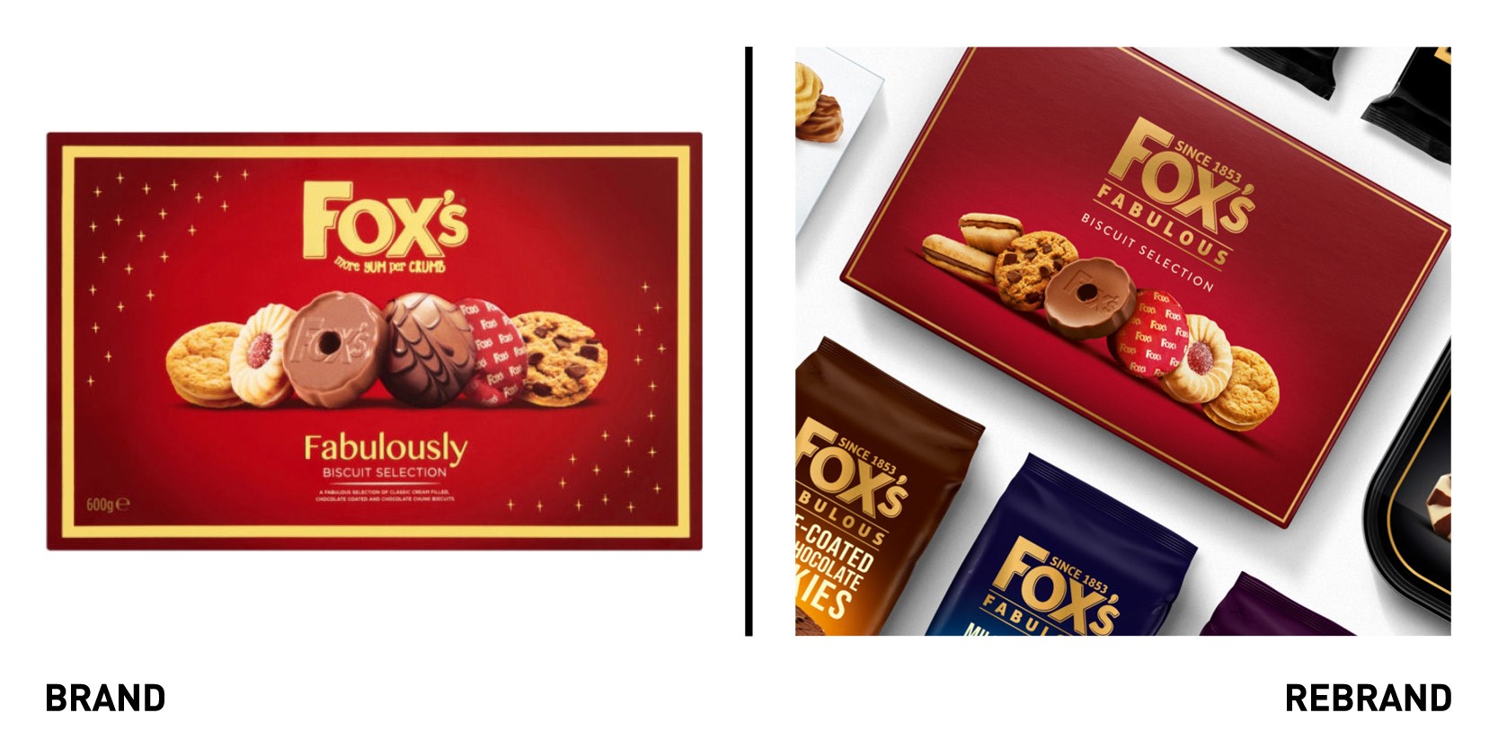
Global branding agency Coley Porter Bell worked with Fox’s Biscuits to redesign its premium biscuits range, Fox’s Fabulous. Coley Porter Bell created a design solution called ‘The Start of the Show,’ which works across the full range of products and ensures every biscuit gets its moment in the spotlight to convey what makes it proudly Fox’s. The new logo integrates the brand story ‘since 1853’and underlines Fox’s quality and baking expertise. The launch follows on the success Fox’s Biscuits experience during lockdown when it provided comfort food for people forced to stay indoors. The packaging has a premium look and feel, and has a clear shelf stand-out, with every colour representing a different type and flavour biscuit.
“We wanted to strengthen our premier tier with a design that reflects the high quality of our much loved biscuits and we feel the creation of Fox’s Fabulous has done just this,” says Muriel Breugelmans, marketing director at Fox’s Biscuits.
Stroud Brewery
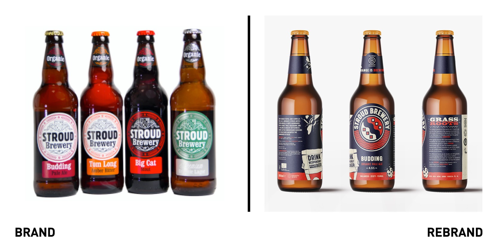
One of the leading independent and B Corp certified breweries Stroud Brewery worked with Design agency Level to create a new look that champions responsibly farmed beer, celebrating both taste and ethics while opposing the ‘worthy green’ organic stereotype. With an ambitious growth agenda including national and export opportunities, Stroud Brewery sought to add weight to its brand to take on a category saturated with noise and an unhealthy dose of green washing. The goal was to open up a new ethical and sustainable beer subcategory and encourage all other beer brands into it, so to lead by example. The core brand messaging was changed to ‘drink responsibly-framed beer,’ and witty ‘change is brewing’ conversations were added to convey how a regenerative approach to people and planet equals a better business and beer. The trick was designing an honest and credible visual identity that didn’t have the traditional organic look and feel inspired by the local environment and positive culture.
“LEVEL were keen to bring our fans on the journey. We asked our fans for input to tell our provenance story and LEVEL incorporated their feedback into the development of the brand mark. Our fans also contributed to our ethical story and our favourite response ‘no nonsense, clear conscience’ now features as the nucleus on our glassware and across our comms,” says brand manager, Nadine Stroud.
Vredestein Tyres

One of the oldest tyre manufacturers in the world, Vredestein, worked with global branding agency JKR to refresh its worn-out visual identity with a more modern one, reflecting its goal of expanding globally. JKR combined elements from the brand’s glory days of tyre advertising with contemporary thinking to create a unique and digital-first identity. The heart of the rebrand became the concept of ‘Refined by Design; which conveys the company’s commitment to both performance and design, as reflected in its choice to partner with famous Giugiaro studio in Italy in 1997. Another core element of the identity are the ‘journey lines,’ or the marks that Vredestein tyres leave on the world; each product of category features an ownable style of journey line to be used across communications. The logo was refined and be fine-tuned for digital applications and be legible when moulded into tyres. The typeface, Mono45 Headline, is a monospace uppercase font that’s as legible as it is characterful, inspired by typefaces used for vintage posters, as well as industrial purposes and technical literature.


