#NewBrandMonday: 2 November
Here are this week's selection of newly launched brands from around the world. For more from #NewBrandMonday, follow @Transformsays on Twitter.
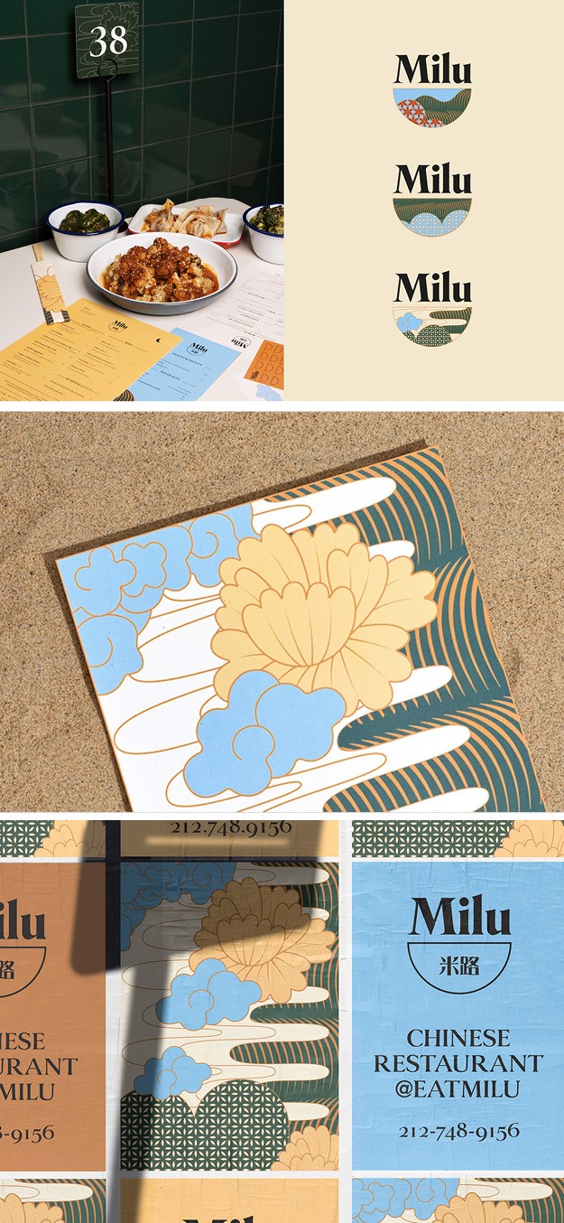
Milu
New York City-based creative design and branding agency Saint Urbain created a compelling visual identity for new contemporary fast-casual restaurant in the heart of Manhattan, Milu. It offers traditional Chinese flavours with a modern twist and explores Chinese regional cuisines with a desire to share the flavours and cultures. The brand is modern yet unpretentious, conveying authenticity and quality through design for both their restaurant and line of sauces and condiments. The name means ‘rice road’ in a literal sense but also sounds like the Chinese words for 迷路, meaning “getting lost’. This double meaning represents both the client’s different backgrounds and relationships to Chinese food. The visual identity is inspired by Chinese illustrations with a modern twist, resulting in a fun, warm and bold brand. The aesthetic of the restaurant is influenced by historic Hong Kong-style cafes and their cultural significance in serving affordable, Canto-Western food.
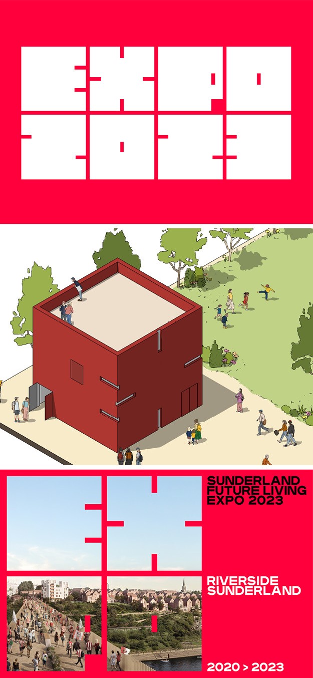
Sunderland Future Living Expo 2023
Creative agency Studio Blackburn has designed a new brand identity for the The Sunderland Future Living Expo 2023, a unique public event that will culminate a three-year engagement programme that will support the delivery of the new urban quarter at Riverside Sunderland, UK. The Expo addresses three key themes: advanced, modern methods of construction; green, celebrating sustainable and low-carbon development and smart, showcasing city-wide and smart home technology. The visual identity attempts to encapsulate all three themes in one. The typeface, Plaax, was chosen for its sturdiness and geometric qualities and the primary red colour is an unabashed reference to the identity of the city. The geometric logotype reflects city blocks viewed from above.
“We wanted a logotype that offered a flexibility and could work across many formats. The modular nature of the four squares enabled us to display them horizontally and vertically as well as stacked, to get the maximum out of the spaces available. This approach also enabled the use of images within the shapes, allowing images to shine through,” says creative director at Studio Blackburn Ryan Jones. “The identity we’ve created with them will hopefully serve as an appropriate vehicle for an event driven by a huge array of talents and stakeholders including architects, planners, regeneration experts, residents, educators, thinkers and doers,” adds head of Studio Blackburn Paul Blackburn.

The Pinter by The Greater Good Fresh Brewing Co
Creative agency Studio Blackburn had designed a new brand identity and packaging for The Greater Good Brewing Co’s world-first innovation Pinter, which allows people to brew 10 pints of fresh beer or cider from the comfort of home. Studio Blackburn was tasked with creating an impactful product brand identity for the Pinter reflective of the Fresh Brewing, innovation and quality that the product delivers. All elements of the packaging, from the small bottles of yeast to the packaging of The Pinter unit itself, help define an entirely new category in the world of brewing, feature both a more technological look with clear yet bold typography that set out the instructions, and bright colours, such as red and azure, that give the brand a lighter tone.
“The logo system we created was split into two categories; an identity for The Greater Good company brand, giving them a completely new look and feel, in which we produced a typographic emblem and wordmark. At the same time we looked at a brand system that worked for their revolutionary new drinking machine—Pinter—for which we utilised the face of the product for its logo,” says senior designer at Studio Blackburn Mark Jones.