#TransformTuesday: 21 January
Here's this week's selection of rebrands from around the world, from Irish distillers to Ivy League educators. For more from #TransformTuesday, follow @Transformsays
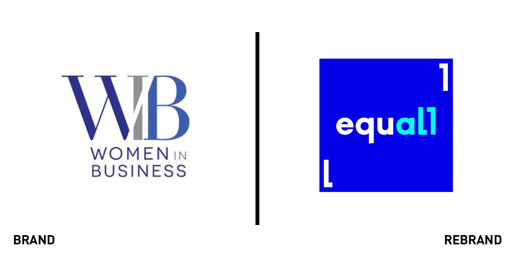
Equall
Most well-known for its annual conference, the London Business School’s Women in Business group has unveiled a rebrand and renamed its conference to Equall to mark its 20th anniversary. The rebrand, carried out by London-based agency StormBrands, ditches a staid wordmark in favour of a colourful, photography-first visual identity. The Women in Business wordmark itself is simply rendered in a navy sans serif font. The word Equall uses two brackets in lieu of Ls as part of a device that runs throughout the visual identity. Superimposed atop bright colours, the brackets frame each image and message used in support of the conference. The new brand also encourages the use of open space, freeing Equall from a corporate and restrictive preceding brand, according to StormBrands. “Diversity should be celebrated. Pops of colour help tell the stories and communicate optimism. Electric blue is the dominant colour, which brings energy and dynamism to a brand that felt static. It was important to have maximum vibrancy and pace while still being legible, clear and professional,” says Gabriella Corbett, graphic designer at StormBrands. The brand launched on 16 January and the conference will take place on 6 March.
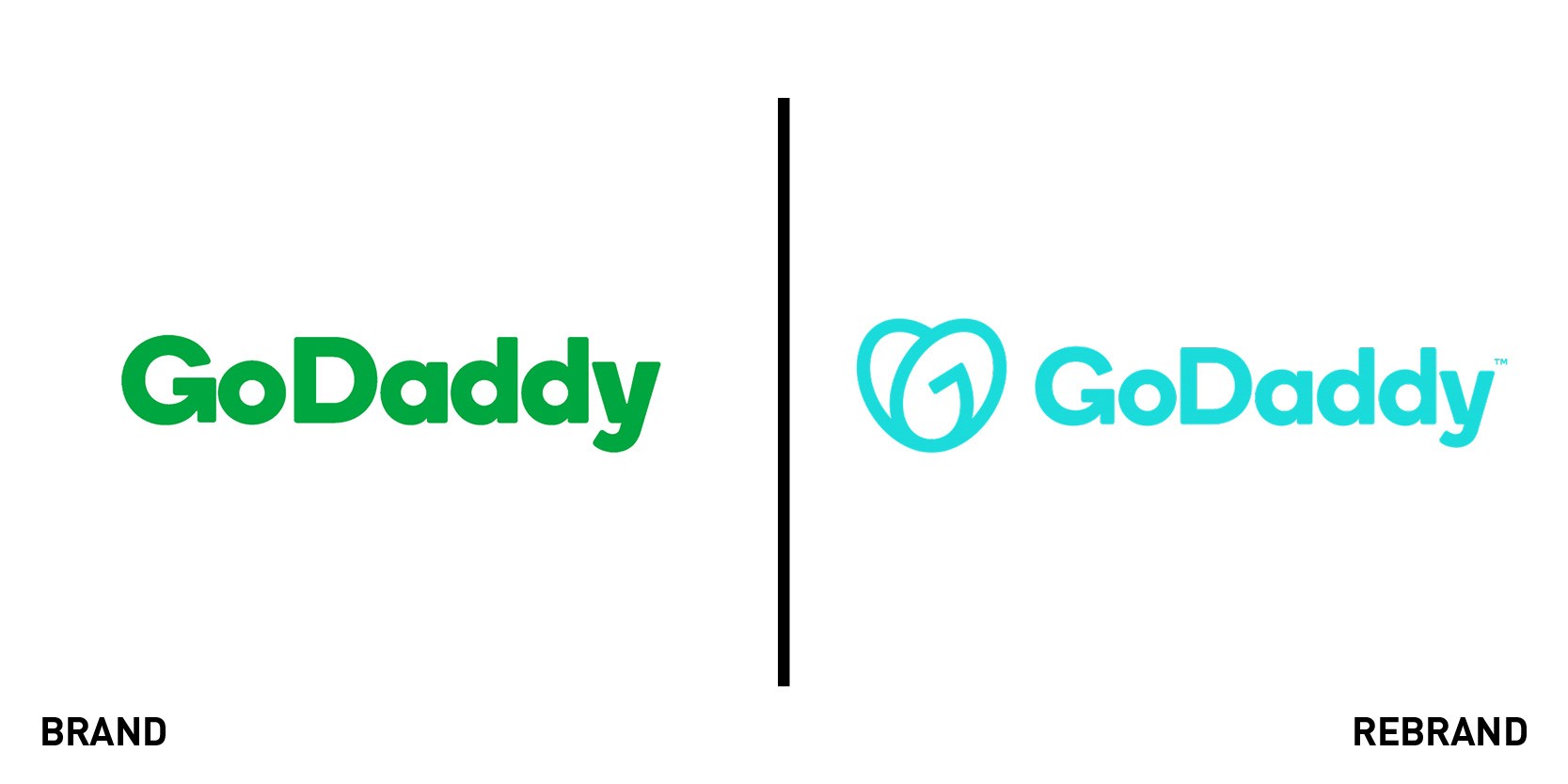
GoDaddy
GoDaddy is not alone in adopting a graphic device as part of its logo for ease of use across multiple touchpoints. Sears notably introduced one earlier in 2019 and Airbnb did to much acclaim in 2014. But the addition of the ‘Go’ symbol has also been complemented by a full-scale brand revamp. GoDaddy examined its photography, tone of voice, colour palette, typography, messaging and positioning in its rebrand, carried out in-house. The central brand colour of teal replaces the company’s traditional neon green and is joined by an understated, yet bright palette of supporting colours. “Our visual assets are created with an eye toward celebrating both the individual and the journey we all share,” the GoDaddy brand page says. The Go device, it says, “is a clear statement of advocacy for entrepreneurs everywhere – a symbol of empowerment that encourages them to stand on their own two feet.” In implementation, the new brand allows GoDaddy to explore a business ethos and embrace the entrepreneurial mindset; a step beyond simply offering domain and website services. The updated website is also cleaner, with a simple UX that clarifies the business’ three main areas of operation: domains, hosting and email.
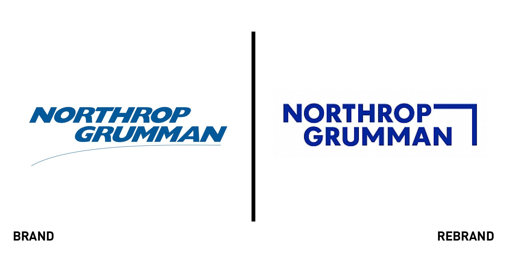
Northrup Grumman
Virginia-based defence and aerospace company Northrup Grumman was formed 26 years ago as a result of the merger between two companies that dated back to the 1930s. Since the 1994 merger, the company has used a dark blue, italicised wordmark with a aerospace swoosh device underlining the company’s name. It’s now moving the company forward with a device it calls the ‘forward mark.’ A sort of single corner of a square inspired by the shapes on the periodic table of elements. Focusing on the fundamentals of science grounds the company, while visually expanding the possibilities for its brand touchpoints. “Here at Northrop Grumman we’re used to change. Our customers’ needs are constantly evolving, we’re constantly adding exciting new capabilities, and our employees never stop finding new ways to solve the world’s toughest challenges. Around here, change is good. We’re excited to share our new brand with you. It was designed with the people of Northrop Grumman in mind. The people who push the boundaries of what’s known and who Define Possible every day. It reflects the pioneering spirit of our employees – a spirit that pushes us onward and upward in pursuit of what matters most,” says the brand page. The ‘define possible’ positioning is also woven throughout the website, linking varying business operations linguistically as the graphic device and new photography style unite the brand visually.
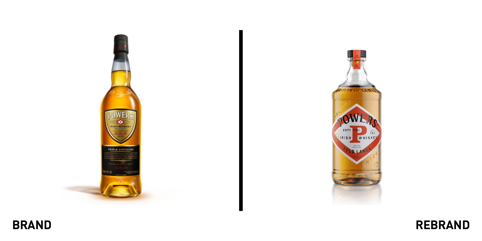
Powers Whiskey
The Powers Whiskey brand dates to 1877, when its diamond symbol was first trademarked. It was also Dublin’s first distiller to begin bottling its whiskey. Now owned by Irish Distillers – the brand behind the likes of the Jameson and Redbreast whiskies – Powers has unveiled a new brand set to bring its history to the forefront. With an existing pack that offered few points of differentiation – from a standard bottle design to an indistinct shield-shaped label – Irish Distillers says the “dynamic new look is set to attract a new generation of drinkers to one of Ireland’s most loved whiskey brands.” Its new bottle shape is inspired by the still at the original distillery and the diamond device unites each product with the Powers master brand. Carol Quinn, archivist at Irish Distillers says, “Powers sense of identity has always focused on the diamond P; that became very clear to me as I worked my way through the historical archive. The diamond P was everywhere; on the casks, stationary, on bills and receipts, emblazoned on everything that left the distillery, and notably on the wonderful Powers mirrors that still hang in Ireland’s pubs today.” The new brand will be rolling out from March.
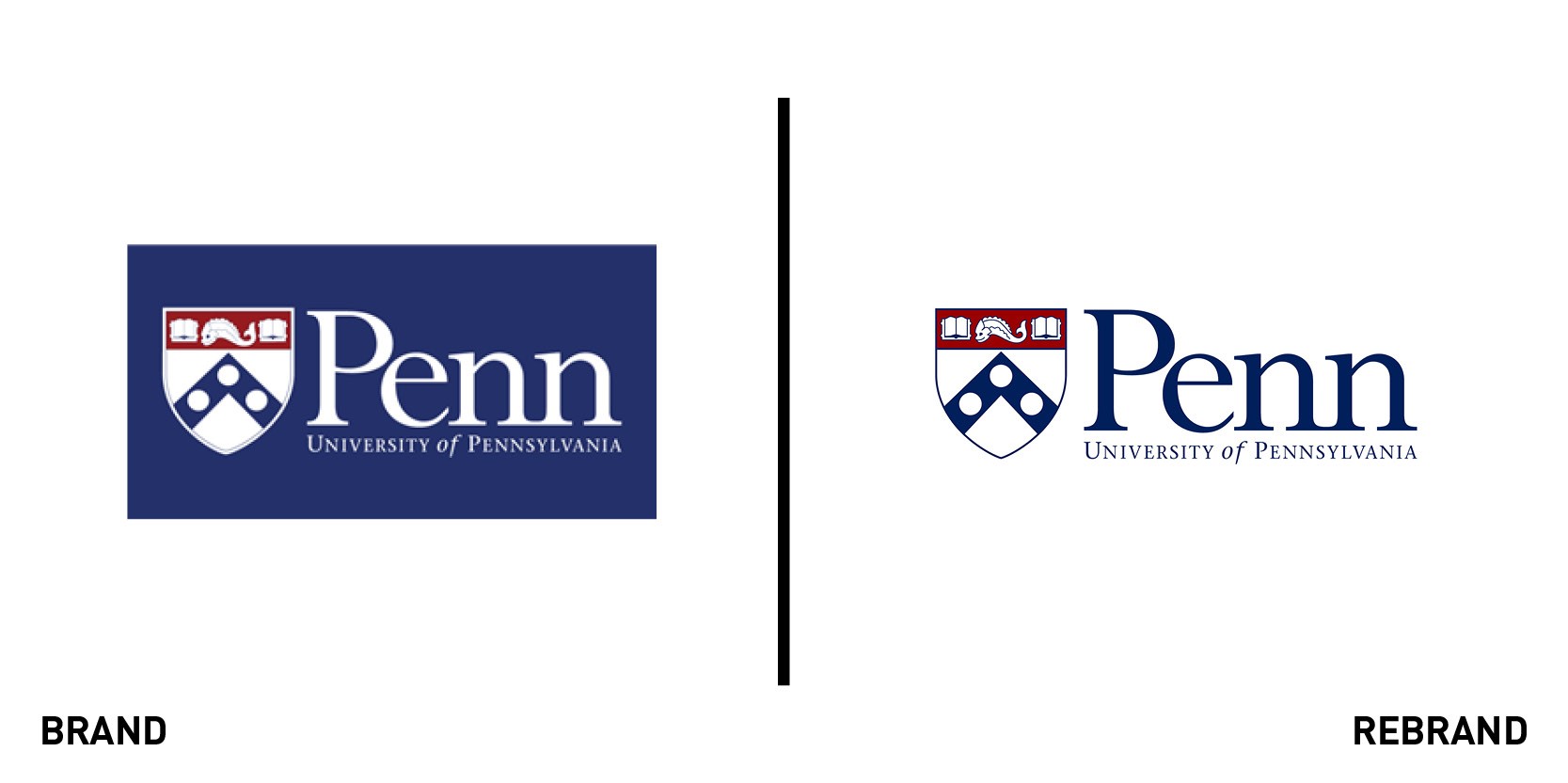
University of Pennsylvania
The University of Pennsylvania, the Ivy League institution in Philadelphia, released an updated logo and shield on 15 January. “With careful consideration, every school logo within the University underwent changes that better align them with the central Penn identity,” says the university about the brand update. It also launched new brand guidelines to support the implementation of the updated logo across brand touchpoints. Only slight changes have been made, largely to the shield and likely to ensure it is more digital-friendly and usable across smaller touchpoints. The change comes just months after another brand change at the university. The newly renamed University of Pennsylvania Carey Law School, or ‘Carey Law’ for short, responded to uproar from across the university community. Over 3,000 law students and alumni signed a petition to revert to the original moniker, citing its reputation and recognition as key advantages for students and graduates in the competitive legal job market. The university agreed to shift the short form of the name back to Penn Law until after the 2022 class has graduated. Students matriculating from 2023 will join Penn Carey Law.


