#TransformTuesday: 18 August

Here is this week's selection of rebrands from around the world. For more from #TransformTuesday, follow @Transformsays on Twitter.
John Horsfall
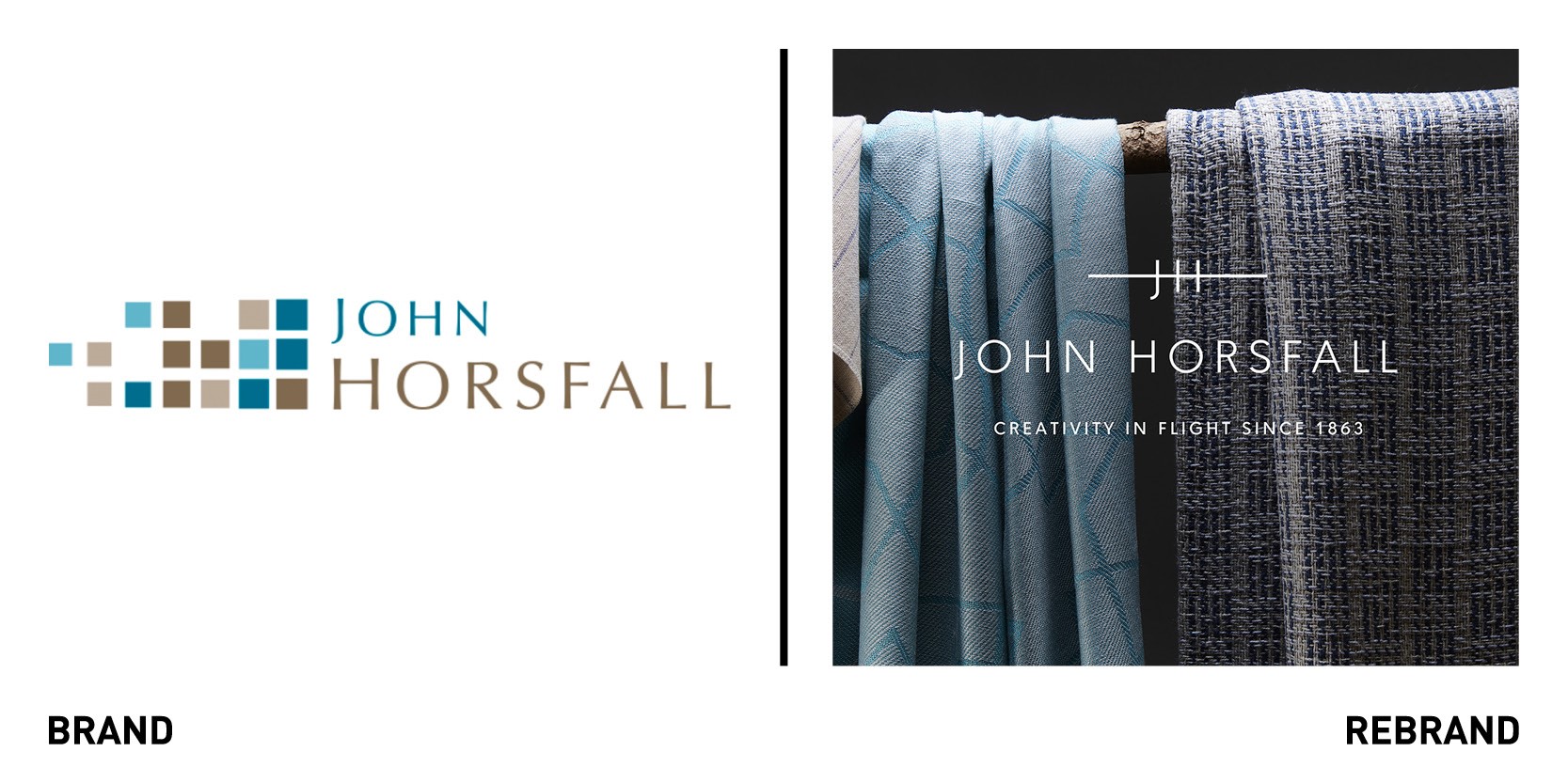
Long-established, Huddersfield-based supplier of textiles to the aviation industry worked with English design agency 10Associates to refresh its brand identity to express both its heritage and innovative 21st century creativity. Despite being well-know within the textile industry, the company felt its existing branding did not fully reflect its bold, creative thinking and ultra-modern production processes. To change this, 10Associates created a sleek, contemporary look for the company that reflects both its heritage while celebrating its high quality products that offer the best in passenger comfort. The signature of the new brand mark helps cement the founder’s story to the future of the business and creates a clean and contemporary brand feel. The new colour palette uses copper detailing to pick out the brand mark on printed collateral.
“John Horsfall was such a great project for us to work on. The business is doing fantastic work and has a long-standing reputation, they just needed a brand that celebrated that heritage and showcased its innovative working practices. We took the whole team on the journey to create a distinctive platform that was real and true to them as a business,” says Jane Darnell, account director at 10Associates.
Mount Juliet Estate
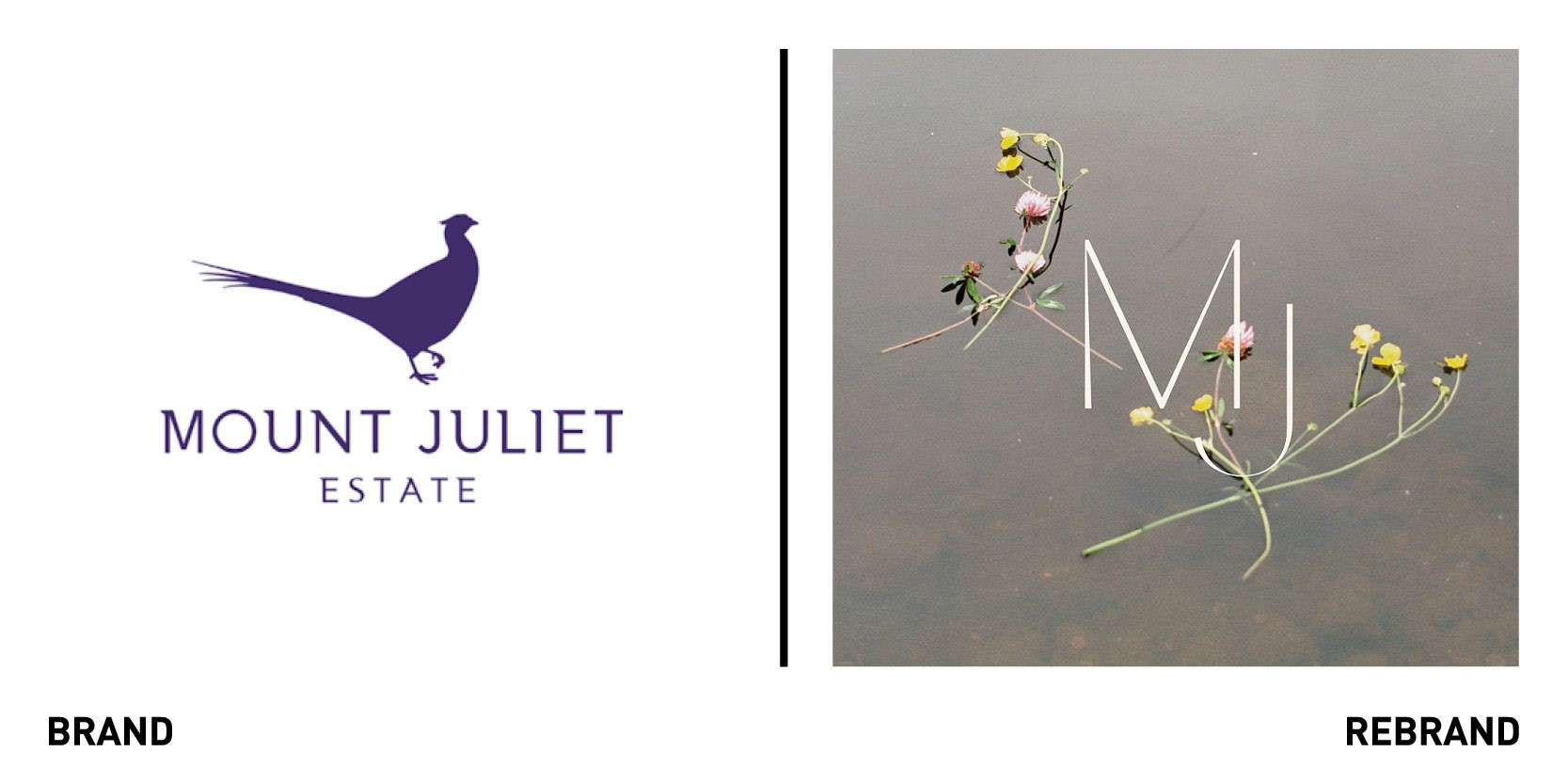
London-based creative agency 0120 (formerly Evolve) worked with Mount Juliet Estate, a 270-year-old Irish estate, residence to develop a delicate and nostalgia-evoking new brand identity. Today, the estate includes, among other things, stately Manor House and contemporary Hunter’s Yard residences, alongside Micheline start restaurant Lady Helen, and a golf course. The rebrand includes wistful romantic photography, which have a contemplative and ethereal feel, and a typography that evokes a feeling of being lost in time, as it draws inspiration from the estate’s two century history. The typography breaks away from generic ‘luxury’ sans-serifs that are devoid of character and personality and instead features an elegant typeface that helps build a dream-like narrative to capture visitor’s imagination.
The brand identity represents the past and present, reflecting both the original love story behind the estate (it was built for Juliet Butler as a gift from her husband) and the Irish tradition of and passion for being in the outdoors. Inspired by the colours found on the estate, the colour palette combines muted tones alongside bright, vibrant colours that add a sense of life and energy.
“Our brand identity seeks to challenge Mount Juliet’s guests and encourage them to look twice. Every single touchpoint should freeze its audience in a moment, slow them down and give them something to remember. We achieved this by ensuring that every minute detail was crafted and considered. Expressive typography, arresting imagery and addictive tactility ensure that the harder you look, the more you feel and the more rewarded you become,” says CEO of 0120 Jake Mason.
Tohum
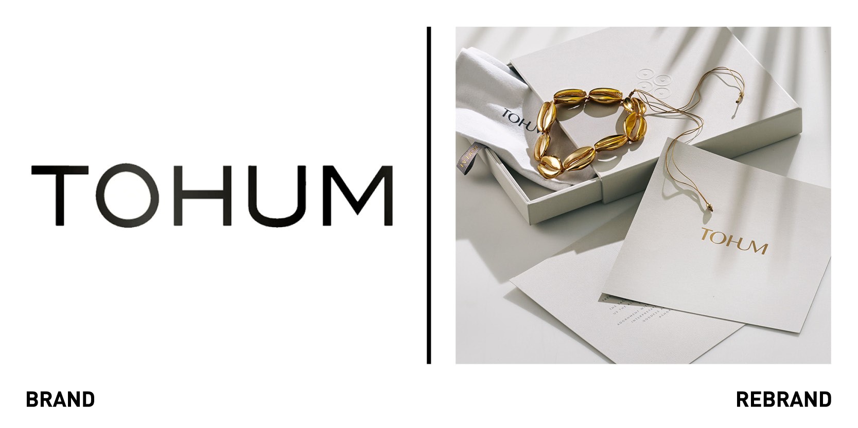
International creative agency Pearlfisher created a new brand identity, packaging design and luxury experience in partnership with jewellery design brand, Tohum to celebrate its tenth anniversary. The rebrand marks the brand’s incremental growth of the past decade, which has gone from its artisanal origins in Istanbul to a highly sought-after international fashion brand, reaching a platform of global fans, influencers and celebrities. Tohum’s timeless idea of connection and the desire to bring us closer to our origins and each other is reflected in the new strapline ‘To be Human,’ explains partner of vision and strategy at Pearlfisher Yeal Alaton.
“Working in harmony with the Tohum design philosophy, we created an intuitive brand experience that first connects with the elegant simplicity of Tohum and then opens up into an expressive world where its exciting story unfolds, and its bold collections come alive,” he says. The logotype, similarly to the intertwined lettering that connects the letter U to the ‘H’ and the ‘M’ creates a sense of form, fluidity and continuity, while the charcoal, white and gold palette evoke a sense of space, air and light. The new circle and dot logo, which is inspired by ancient cultures and primate African art forms, also represent connectivity, continuity and the circular nature of life.
“I imagine how pieces of design will live in the world as part of our lives, on our bodies, reflecting true emotions. Pearlfisher’s beautifully simple, subtle but strong, and interpretive new identity for Tohum captures these ideas whilst complementing our designs and welcoming everyone in,” says Verda Alaton, founder of Tohum.


