#TransformTuesday: 6 August
Every week, Transform examines recent rebrands and updated visual identities. This week's picks are below. For more from #TransformTuesday, follow @Transformsays
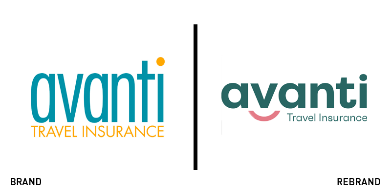
Avanti Travel Insurance
In Australia and New Zealand, the phrase, ‘I don’t know if I’m Arthur or Martha’ is slang for ‘confused.’ Avanti Travel Insurance has named its new brand characters Arthur and Martha as its new branding aims to clarify things for the UK travel market. Specialising in travel insurance for over 50s with preexisting conditions, Avanti has breathed new life into its brand and website with the introduction of the 3D animated characters, developed by Brazilian animation firm Estudio Icone. With a new strapline, ‘That’s travel reassurance,’ Avanti’s new brand communicates the brand’s positioning in terms of its specific demographic and its service geared toward that group. Brad May, CMO at Avanti says, “Our customers want reassurance from a travel insurance company when you need us, we’ll be in your corner. We hope our future customers will be as inspired by the adventures of Martha and Arthur as we are, and we genuinely look forward to helping more people with additional medical needs get out there and enjoy their golden years.” The new logo includes a smiling device that literally puts a face to the Avanti name.

Cloudreach
Global cloud computing consultancy Cloudreach had a bluish brand. In the land of digital brands, blue is uncommonly common. It also wasn’t finding the space within its existing visual identity to communicate its new positioning and growth. Thus, it turned to Siegel+Gale to craft a new approach. The strapline, ‘Elevate your future’ dictates the new positioning while the visual identity was updated to convey confidence and optimism. “Cloudreach has an innate understanding of what the future looks like, giving them the ability to help their customers stay one step ahead and successfully navigate their migration to the cloud,” says Deva Corriveau, design director at Siegel+Gale. “To suggest this predictive quality, the graphic style of the brand recalls isobar diagrams on a weather map, creating a visual language that subtly references ‘the cloud’ and, more importantly, the elevated perspective that customers of Cloudreach benefit from.” The updated brand is bold, gold and stormy, helping distinguish the brand from its competitors and allowing it to set its own path in cloud computing.
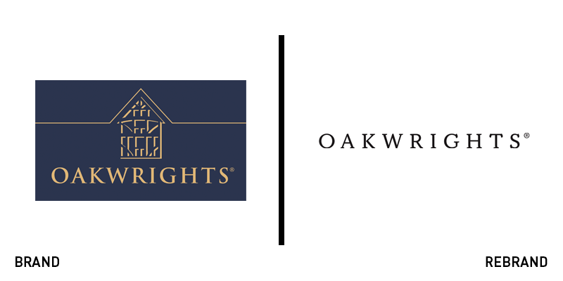
Oakwrights
British oak frame building company Oakwrights offered unique design strategies and modern building techniques to its clients, but was let down by its own outdated branding and web design. Its existing wordmark – featuring bronze on navy blue – worked well in physical applications, but was nearly illegible on digital touchpoints. It turned to communications consultancy DRPG for a refresh of the brand and its website. The result is a fresh aesthetic that communicate’s Oakrwights’ positioning as a modern, luxury brand, while still emphasising its family values. The website has been updated to offer a clearer user journey, easier navigation and a cleaner colour palette. The brand’s SEO was also optimised following research DRPG carried out into Oakwrights’ market.
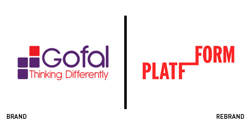
Platfform
Operating for decades under the name Gofal – the Welsh word for ‘care’ – the newly dubbed Platfform recognised the need for proactive change. Instead of relying on the traditional charity model, the mental health support organisation, decided to change the way it operated, moving from a fundraising model to spark a social movement. Working with Cardiff-based Clout Branding, the organisation introduced the new name, Platfform, and new visual identity. Ewan Hilton, chief executive of Platfform says, “We don’t need tinkering around the edges we need large scale whole system change – I want to lead an organisation that is part of a powerful social movement working tirelessly to see this change happen.” The new brand examines the nature of human connection and the current problematic social situation with regards to mental health and wellbeing. The brand needed to be flexible and work across multiple touchpoints for multiple audiences. however, it also needed to offer a call to action and provide ownable elements if the brand is to succeed at building a social movement. The resulting visual identity is a big step toward making this a reality.
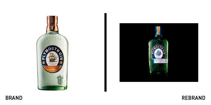
Plymouth Gin
The gin market has become squeezed by new distillers, craft distillers and alcohol brands from other categories – like Kopparberg – launching gin ranges. For heritage brand Plymouth Gin, its iconic name and renowned flavour profile are two of its biggest points of differentiation. But, to compete in this landscape, it turned to London-based B&B studio for the launch of a limited edition range. Retaining the gin’s recognisable bottle shape, B&B examined the logo, updating it for a modern audience by highlighting juniper berries, a reference to the gin’s flavour, rather than the more traditional ship icon, reminiscent of the brand’s namesake. This allows Plymouth to communicate its key point of differentiation through its most prominent brand touchpoint – its packaging. “Mr. King’s 1842 Recipe is a truly one-off craft gin that can never be recreated. The fact that Mr. King’s 1842 Recipe focuses on just two hyper-local ingredients is very special, especially when other brands are using many different botanicals. To have these ingredients at the heart of the design was crucial,” says Shaun Bowen, creative partner at B&B studio.
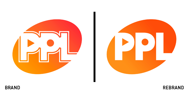
PPL
Music licensing organisation PPL is an important part of the modern music industry. But, with the whole industry shifting toward a streaming, reactive and digital-first model, PPL needed to change as well. It worked with London-based brand agency Bear to update its brand in time for its 85th anniversary. Though the logo has only changed subtly, the solution to modernising the organisation is elegant and lively. The visual identity deploys the ‘play’ and ‘record’ button icons recognisable across the music landscape deftly across the organisation's communications. That image is then placed across vibrant imagery, strong graphics and punchy straplines to communicate the PPL’s key message, ‘Play it right.’ Paul Leathem, CEO of the PPL, says, “The result was a more user-friendly web experience with engaging content and messaging that is aligned to our core values and mission, and a brand that is a positive reflection of the company we are, the important work we do and the creative members we represent. The end products have added to the positivity of our internal culture and has given our employees something of which they can be proud.”


