#TransformTuesday: 29 January

Every week, Transform examines recent rebrands and updated visual identities. This week's picks are below. For more from #TransformTuesday, follow @Transformsays
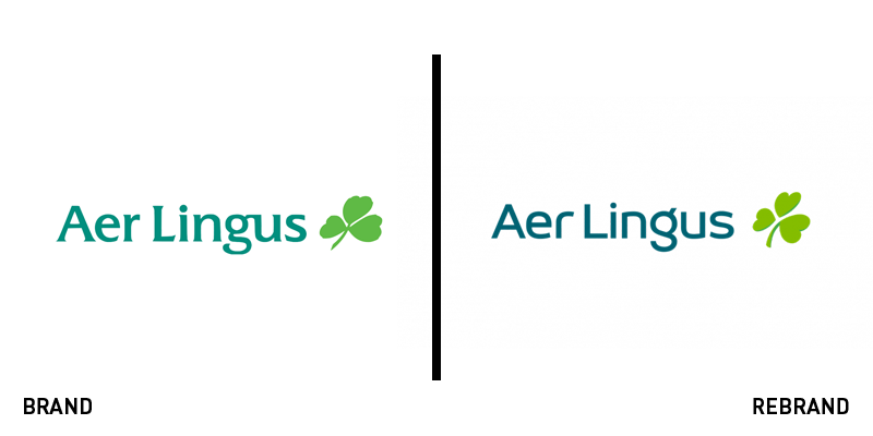
Aer Lingus
Aer Lingus has benefited greatly from its transatlantic service, offering budget-friendly flights between the US, UK and Ireland. But, with the aim of growing the north Atlantic fleet by 13 planes over the next four years, the carrier wanted to invest in its brand first and foremost. To do so it worked with Lippincott on a new logo and livery that retains its well-known shamrock icon, but evolves the brand for a more modern approach. “The refreshed brand reflects an airline that connects those living in Montreal to Marseilles; in Berlin to Boston; as well as those living in Cork to Croatia. The benefit for Ireland of being at the fulcrum of such connections is considerable and we in Aer Lingus are determined to realise this potential for Ireland,” says Sean Doyle, CEO of Are Lingus.
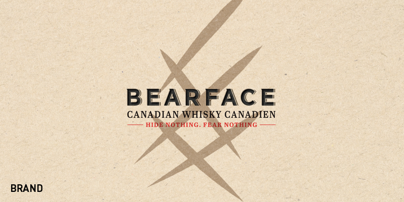
Bearface
Canadian whisky has always been well-revived by whisky connoisseurs worldwide. It is unusual in that it is also free of some of the strict regulations governing the spirit’s production in other countries, thus leading to progressive distilling ideas and brands. Bearface, a new launch by Mark Anthony Brands – owner of the Mike’s Hard Lemonade range – and brand consultancy Pearlfisher, definitely challenges the norm. The first release, Bearface Triple Oak, is unusually aged in three barrels – ex-bourbon barrels, former Bordeaux wine casks and virgin Hungarian oak barrels. From a brand perspective, the company uses a key visual asset of a claw mark as both part of the wordmark and to differentiate the bottle. The brand assets are punchy, more akin to craft brewing than the more traditional world of whisky distilling, with the strapline ‘Hide nothing, fear nothing,’ bearing the brunt of the communications.

Napier
John Napier was born in Edinburgh in 1550. The mathematician was one of the first to begin using the decimal point in arithmetic, but he is most renowned for his discovery of logarithms. The nearly magical functions now apply to countless areas of modern life. Embracing the concept of logarithms as ‘shortening the labours’ anti-money laundering company Fortytwo Data has renamed as Napier. The new logo is a bold one that makes a bigger impact than the wordy and complex previous one did. Julian Dixon, Napier’s CEO, says, “We are improving and growing all the time and it is fantastic to be able to start a new year with a new name and vision. John Napier revolutionised astronomy and Napier is shooting for the stars.”

Northern Monk Brew Co
The UK’s northern county of West Yorkshire has a number of spectacular ruins of historic abbeys located in urban and rural settings, alike. One of the most picturesque, Kirkstall Abbey, is just a four minute drive from the Northern Monk Brew Co. The craft brewery, founded in Leeds in 2013, has since grown into a successful brand with a popular core range and a project developing partnerships with local influencers to introduce bespoke brews. Now, after a crowdfunding campaign to increase its capacity, Northern Monk has worked with Leeds-based brand agency Robot Food on a brand refresh. Rich Robinson, senior designer at Robot Food says, “Northern Monk is a pillar of not just our community, but of northern brewing. Their beers are explosions of creativity that thrive around this. We wanted to better tell this story through each core range beer.” The new brand is more mysterious, simpler and uses a colour-coded system for its brand architecture.

Spare Snacks
As with many brands in the better-for-you snacking category, Spare Snacks has turned to a new brand to help support its growth. The company has an interesting point of differentiation – being comprised of unwanted fruit and vegetables. But, once called Spare Fruit, its offer of using ‘wonky’ veg wasn’t supported by its refined, clean-cut branding. The company turned to London-based creative agency the Clerkenwell Brothers on a new brand. “We needed to convey warmth, energy and increase the impact of flavour. At the same time, we highlighted Spare’s vision to move towards a more waste-free world,” says Alice Dobbie, design lead at the agency. The new brand, now called Spare Snacks, introduces fruit and vegetable characters, a much more colourful palette and a wonkier typeface. Its a brand more suited to the company’s offer and should help it expand beyond specialty food shops.
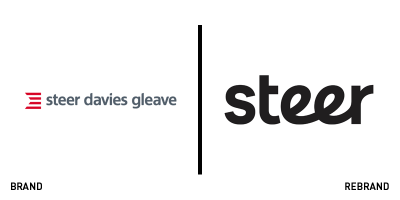
Steer
Steer Davies Gleave was in the enviable position of having a growing business, a 40-year foundation and a diverse offer. It also had a strong enough brand awareness to the point where its name was commonly abbreviated to the friendlier ‘Steer.’ Instead of fighting the trend, the transport consultancy leaned in and embraced the name. Now simply called Steer, the company worked with London-based brand agency OPX on a new brand supporting the name change. The new logo is a refreshing shift from a once-very corporate wordmark. It has more flexibility and is better prepared for digital use. The simplicity of the name and brand also ensure a better understanding by non-English speakers – an increasing audience for the consultancy. It doesn’t hurt that ‘steer’ also has meaning in regards to both transportation and consultancy.
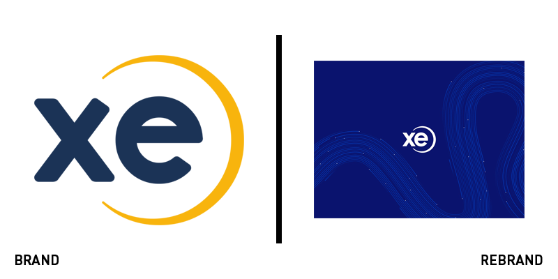
Xe Currency
One of the most valuable money tools available, XE Currency’s Universal Currency converter has helped facilitate the company’s growth since 1995. But the brand was static and needed to communicate more about XE’s operations than simply its currency converter. It turned to London-based agency SomeOne to develop a new narrative. Following the acquisition of XE by Euronet Worldwide, and the company’s merger with Euronet’s HiFX, the brand had to evolve to communicate with both companies’ audiences. The ‘Powering you’ strapline has helped the brand position itself at the intersection of the global flow of money, people and information. Because of the company’s loyal user-base, SomeOne has designed the brand to roll out unobtrusively over time. “Our task here is not a quick flirt – we don’t want to 'disrupt' customers – I hope they won’t even initially notice the improvements. The work undertaken has been significant and will be evidenced calmly and over time,” says SomeOne’s executive creative director David Law.


