#TransformTuesday: 28 May
Every week, Transform examines recent rebrands and updated visual identities. This week's picks are below. For more from #TransformTuesday, follow @Transformsays
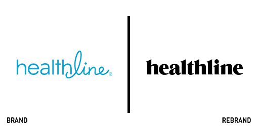
Healthline
A 20 year-old medical information website, Healthline has updated its identity to allow for a clearer user experience. Putting content and wellbeing news at the forefront of its platform, the company is promoting its content and has used an updated brand experience to support that shift. The new logo, a simple, black, slab serif was implemented “to be strong and prominent, with the confidence to stand alone.” The update also had to support the 76% of traffic heading to Healthline on mobile phones. Carried out in-house, the new logo is a clear departure from the more clichéd medical look of the past. The previous blue is updated to a punchy teal and used as an accent colour, while the cursive ‘line’ is done away with, leaving a simple, strong wordmark in its place. It’s a change that should help the company combat WebMD’s approach, which still uses strong cues from traditional pharma and health branding.
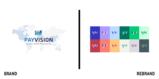
Payvision
Dutch payment processing firm Payvision lacked personality; its brand looked like a payment processing company’s brand is expected to look. But that approach didn’t allow for Payvision to communicate effectively with its many audiences, many of whom are startups. After its acquisition by ING in 2018, Payvision turned to Saffron to support a rebrand. The rebrand ensured the company’s culture was preserved and supported by the new brand toolbox. It also breathed life into the brand through bright colours, personable photography and a human tone of voice. According to Saffron, “The cornerstones of the design are simplicity and fluidity, to symbolise the value added by Payvision’s products.” The identity itself was designed with change in mind and numerous applications using different colours exist to tailor Payvision’s communications. Photography extends beyond people to quirky objects and fun elements of the brand’s implementation.

Savoir Beds
London-based brand agency Without worked with Savoir on a brand that would support the bedmaker’s brand as much as its mattresses support people’s backs. Established to supply London’s Savoy Hotel, Savoir has 114 years of experience crafting luxury mattresses. But, its brand couldn’t adequately communicate the bespoke nature of the process nor the brand’s characteristic craft and quality. Roly Grant, creative director of Without, says, “We visited the Savoir workshop and were impressed to find a place of focus and calm, where skilled craftspeople use traditional techniques and natural materials to create products that last a lifetime. We wanted to bring to the fore Savoir’s commitment to artisanal excellence by simplifying its offering and showing how a ‘slow’ world of traditional techniques and materials, one that values craft, comfort and luxury, is conducive to unparalleled sleep quality.” The new approach uses four easily navigable sections within the portfolio and a website that better describes the manufacturing process, making the whole experience more contemporary. Without also crafted a monogram for Savoir with its founding date of 1905 intertwined, lending it a useful icon for digital applications.
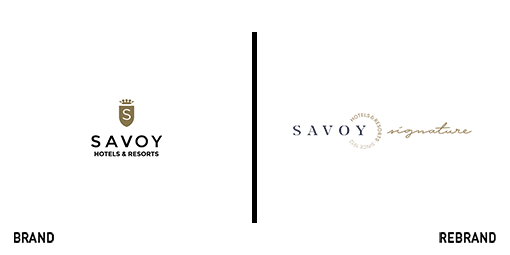
Savoy Signature
Not the same Savoy as the hotel in central London, the Savoy Hotels & Resorts collection has established a respected luxury brand with key sites across Madeira, Portugal. The group has recently announced a rebrand to Savoy Signature, a move that will help it reposition itself as a luxury hospitality group, in addition to promoting its individual hotel brands. Savoy Signature built in a strong personality, using a first-person narrative approach, to humanise the brand and engage with guests from the earliest point of contact. “Ahead of the opening of the highly anticipated Savoy Palace later this year, we felt it was necessary to launch the rebrand. Inspired by the unique attributes of each location in a united portfolio, this new umbrella is more authentic to the company’s vision and the service we want to offer to our guests,” says Ricardo Farinha, CCO of Savoy Signature. The new brand also features storybook illustrations associated with each hotel, lending a sense of personality to the different resorts and supporting the storytelling approach taken by the umbrella brand.
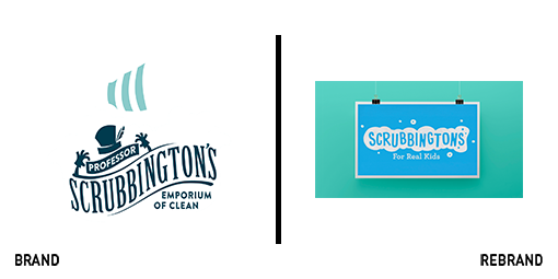
Scrubbington’s
Scrubbington’s has always been a little different. Designed to empower young children to self-clean, it merges fun and spirit to a relatively staid category. With the need to appeal to both kids and their parents, the brand worked with London’s OurDesignAgency to update its proposition. The heart of the rebrand and the new packaging system is a bespoke, bath time-inspired alphabet that infuses the letterforms with joy. It’s playful and young, but not inauthentic. Sarah Westwood, creative strategist at OurDesignAgency, says, “We knew the brand must feel completely authentic; there couldn’t be anything patronising or false about it. It had to communicate in the humorous, fun way that children do at bath time. Scrubbington’s also needed to reassure mums and dads looking for a natural and healthy way to keep their kids clean.” The logo evokes the sense of a sponge being wiped across the pack, scrubbing away dirt. The brand also retains its sense of playfulness and mischief across the new visual identity, while still communicating the benefits of the products and their ingredients. The bespoke alphabet also serves to distinguish Scrubbington’s online or on shelf without reliance on further icons or mascots.

Truespeed
There’s not a ton of love for broadband providers. Generally perceived as a utility, rather than a desired product, consumers interact with their providers only when necessary. Truespeed, a regional broadband provider operating in the UK’s southwest is trying to change that. Implementing fibre connectivity in rural areas without decent broadband, Truespeed is working with its consumers as its community model requires a number of people in an area to sign up in order for the connection to be installed. Its grassroots stakeholder engagement had to be supported by clear communications, understanding of the benefits offered by Truespeed and a visually arresting brand. It turned to Bristol-based Mr B & Friends to craft a new approach. Steve Richardson, executive creative director at Mr B & Friends, says, “Community engagement is very much at the heart of Truespeed’s proposition so it was important that this was brought to the fore of the brand. The new brand not only engages the community, but actually creates its own community.” Implementing a colourful, straightforward visual identity was, according to Truespeed’s marketing director, Bartholomew Day, replacing a disjointed customer experience that didn’t reflect the company’s personality.
For more from Transform magazine, sign up for the Transform newsletter here and follow us on Twitter @Transformsays.


