#TransformTuesday: 26 November
Here's our pick of the latest rebrands from gourmet burgers to an entertainment behemoth. For more from #TransformTuesday, follow @Transformsays
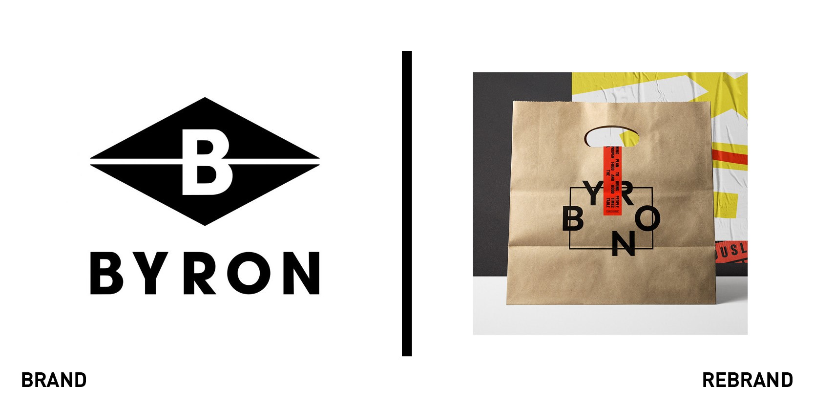
Byron
UK gourmet burger chain Byron has refreshed its brand identity and is rolling out new interiors developed by Checkland Kindleysides. The re-imagined space is designed to attract all types of diner, from solo workers to couples and large groups. The interiors will feature communal tables and social spaces for brunches, plus sofas where diners can work on their laptops or get together for working lunches. Exposed fixtures and abstract artworks add a modern twist, the agency said. As part of the redesign, the casual dining chain has also launched a new breakfast and brunch menu created by food and drink director Sophie Michell, which takes inspiration from the west coast of America. The changes follow Byron's new logo, which was launched in August and which represents diners seated around a table, with the aim of delivering the message of reconnecting people. The interior transformation programme was unveiled at Byron's High Street Kensington branch in London and will be rolled out across the rest of its 53 restaurants next year.
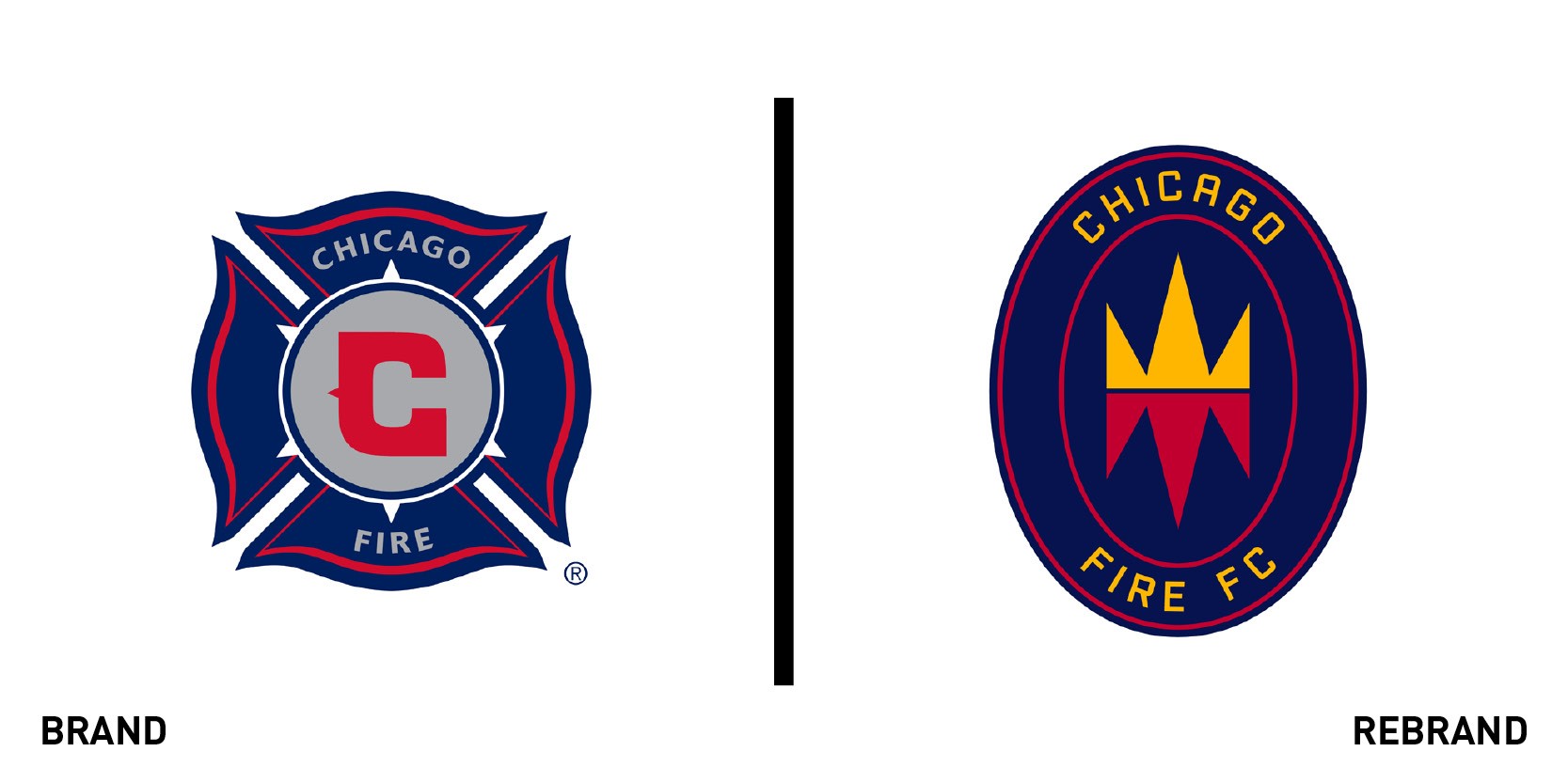
Chicago Fire Football Club
Major League Soccer club Chicago Fire has updated its logo and tweaked its name ahead of its 2020 move back to Soldier Field after a 13-year absence. The club, previously Chicago Fire Soccer Club, will now be known as Chicago Fire Football Club. Designed by creative agency Doubleday & Cartwright, the imagery on its new badge reflects a key moment in the city's history, the Great Chicago Fire of 1871. Chicago Fire said, “The mirrored icon – with flames inverted to become a crown, hence the Fire Crown – tells the story of a dramatic rebirth and a city’s triumph, while the change from ‘soccer’ to ‘football’ reflects a long-term vision for the club as Chicago’s global ambassador to the world’s game.”
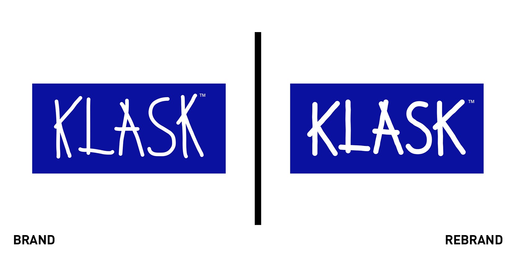
Klask
Cult Scandinavian board game Klask has been redesigned by Robot Food in an effort to extend its offering and expand the brand beyond the box. Created by Danish carpenter Mikkel Bertelsen, the magnetic two-player tabletop game, which is similar to table football, has been extended to a four-player version and been given a packaging update. The agency team sought to retain recognisability and employed subtle tweaks to the look and feel, using a hand-drawn logo to reflect the fun and energy of gameplay, the agency said. Robot Food introduced photography on the packaging to bring the game to life, and included fun, informative illustrations to help simplify instructions. Martin Widdowfield, creative director at Robot Food said, “I’ve always been a fan of Scandinavian design, so to be sought out for this opportunity is real honour for us. There was a disconnect between the hands-on fun of the game and the functional packaging and communication, so the team had a lot of fun in immersing themselves in the game and the world that surrounds it and bringing it to life.”
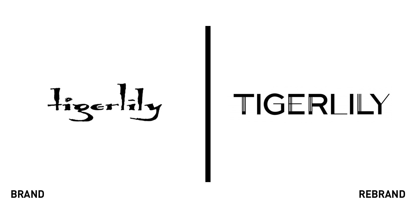
Tigerlily
Australian fashion brand Tigerlily is channelling 1960s Hawaii with its latest branding. Aiming to recreate the look and feel of a Hawaiian holiday, it says the branding “reflects the adventurous, globe-wandering spirit of the Tigerlily woman”. Design agency Three60 is behind the rebranding as well as Tigerlily’s Resort 2020 campaign, which was shot in Byron Bay, New South Wales. Tigerlily CEO Chris Buchanan said, “Tigerlily feels like it has travelled the world and it is inviting us to come along on holidays. And, as we expand into new markets and grow with our consumer, comes a refreshed look and perspective for the brand. Each collection we create is aspirational but accessible for women, who embrace curiosity for exploring the new things.” The new brand identity will roll out across Tigerlily’s retail and wholesale stores, online and social media.
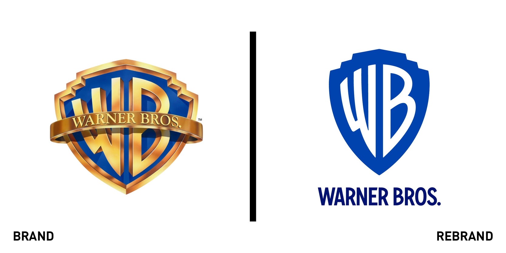
Warner Bros
Warner Bros has unveiled a new iteration of its iconic WB shield, in preparation for the company’s centenary in 2023. Research showed that the previous version, last updated in 1993, was not working digitally, especially at small scale, so the entertainment behemoth employed Pentagram to update the design. The updated logo sees the removal of the banner, with more prominence on the shield and monogram, and has been optimised for use across digital platforms. Pentagram has also created a custom typeface for the company: Warner Bros. Condensed Bold, which encompasses a full family of fonts. The typeface will be used across company assets and is designed to give “a sense of the company’s history” while being “clean, modern and timeless”.


