#TransformTuesday: 23 April
Every week, Transform examines recent rebrands and updated visual identities. This week's picks are below. For more from #TransformTuesday, follow @Transformsays
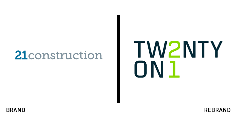
21 Construction
With the promise of custom, quality construction and contracting services, 21 Construction delivered on its promise in every way but its brand. With nothing more than a functional wordmark and signature colour, the company needed a more evolved brand in order to grow as a business. It turned to Brighton-based UnitedUs for a rebrand that communicates 21 Construction’s point of difference – its people. The company’s co-founder Keith Ashcroft says the new brand will help 21 continue to think differently and work differently for its employees and clients. “From the outset, Keith, Paul and the whole team at 21 have consistently shown their desire to positively differentiate the business in everything they do. The aim of the new identity is to capture that energy and foster an empowered team that will continually push the boundaries for the benefit of their employees and their clients alike,” says Luke Taylor, co-founder of UnitedUs.
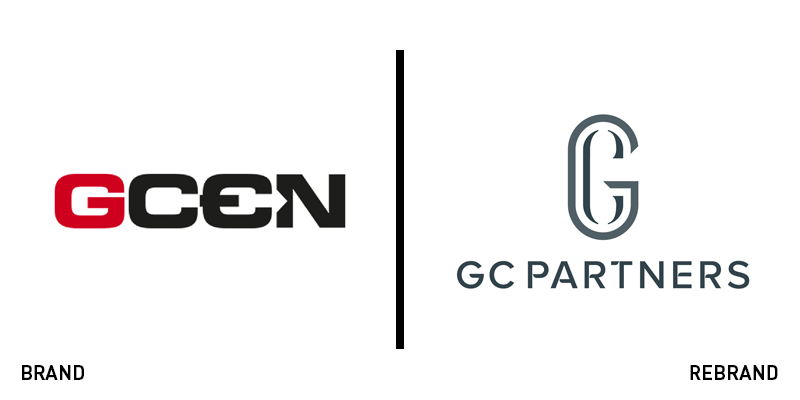
GC Partners
Financial services firm GC Partners formed from the merger of international currency broker and payment service agency GCEN and Global Custodial Services. The company worked with London-based consultancy Brandpie on its rebrand. The new name focuses on the value of personal service and relationship management in a financial industry largely governed by technological solutions. The updated logo is a refined watermark that lends a professional, human feeling to the brand. Its website carries this feel through with bespoke, high-quality partner photos, allowing each partner to show a hint of personality. Sophie Lutman, executive creative director at Brandpie says, “The aim of the rebrand was to convey the company’s unique client-centric approach, highlighting the team’s exceptional service, partnership culture and tailored client solutions.”
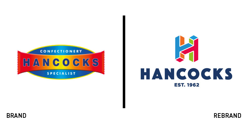
Hancocks
Cash and carry giant offering the the UK’s largest selection of sweets and confectionery to the wholesale market, Hancocks’ brand was stuck in the past. Relying on a gradient background for its wordmark, the logo didn’t reflect the joy of confectionery. Working with Manchester-based agency Brandon, its new approach is colourful, vibrant and young. The logo has been updated to use just the ‘H’ but the brand comes to life through the use of colourful imagery, fun photography and smile-inducing patterns. “The passion for fun and sweets that have always been at the core of our brand wasn’t being seen outside of our stores. Everyone at Hancocks loves the confectionery world and helping our customers to stock products they know will sell well for them, but this passion was getting lost in the brand activations,” says Helen Bradshaw, marketing director for Hancocks. The refreshed identity captures a childlike sense of joy and love for confectionery, Steve Conchie, creative director at Brandon, adds.
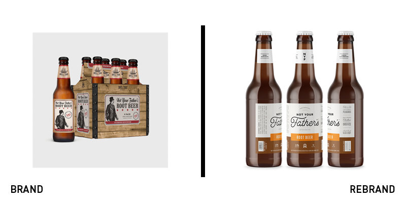
Not Your Father’s
In a story not unfamiliar to craft brewing aficionados, the hard soda Not Your Father’s brand, developed by Illinois-based Small Town Brewery was partially acquired by Pabst in 2015. Taking the brand national, the company has followed up the success of the range of hard root beer, Mountain Dew and ginger ale, among others, with a new brand. The St Petersburg, Fla.-based Hype Group worked with the brewery to reimagine the brand’s messaging, visual identity and tone of voice. Finding that 60% of customers were young women, but the brand image leaned toward masculine tropes, the agency worked on a new, gender-neutral brand. The resulting brand takes cues from fellow young brands and craft brewers but also evokes a sense of retro diners and pharmacy signage of the past. It also resulted in cleaner packaging with clearer visual cues and brand architecture devices.
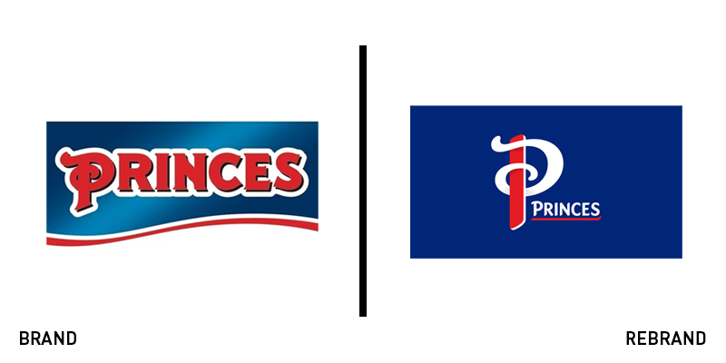
Princes Group
Canned foods is not necessarily the sexiest of categories in the food and drink sector. But, with a brand update, Princes Group, a Liverpool-based heritage brand owned by Mitsubishi, looks to change all that. Ellen Munro, creative director at BrandOpus, which worked on the rebrand, says, “The new revamped Princes visual identity style includes standout lettering and bold colour palette, which champions each product, while still maintaining important characteristics between each of Princes iconic staples. The newly flourished P prominently stands out on the shelf, reflecting and encompassing Princes pride, heritage and heart.” An updated colour palette and logo allows the packaging to compete against attention-grabbing startups and reinvigorate the canned goods category with colour, fun and liveliness. Illustrations of food items replace the more staid, old-fashioned photographs once adorning the packs.
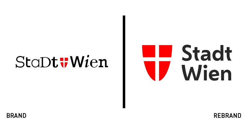
Vienna
One of the jewels of the European capitals, the namesake for such foods as the wiener schnitzel and one of the spiritual homes of the European café, Vienna has contributed to world culture in innumerable ways. It has also been named the world’s most liveable city for 10 years straight by Mercer consulting and the Economist. But, with a multicultural city and a storied heritage, its existing brand was trying too hard to be reflect these varied influences. The city turned to brand consultancy Saffron to develop a unified city brand that could represent all Vienna has to offer. The new logo is clear and straightforward, but it helped bring a stronger, more unified brand architecture to the more than 70 sub-brands under the city’s purview. Saffron also ensured that its visual identity included Vienna’s citizens and could be used in countless applications across the Austrian capital. The cleverly-designed shield helps reflect the city’s personality through overlaid imagery atop the simple graphic device.


