#TransformTuesday: 21May
Every week, Transform examines recent rebrands and updated visual identities. This week's picks are below. For more from #TransformTuesday, follow @Transformsays
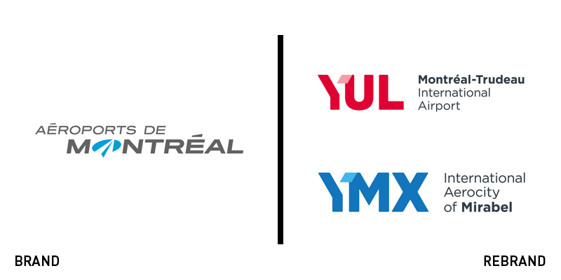
Aéroports de Montréal
To stay competitive in the modern market, Aeroports de Montreal (ADM) decided to pursue a rebrand of the parent brand and its two subsidiary airports. It introduced three new logos, uniting them behind a consistent brand, but including individual elements based around the call signs of each location. Previously, a single logo represented both the ADM corporate brand and the two subsidiaries – YUL and YMX – with a flat, bland brand. The new approach allows each airport its own identity with an infusion of fresh colours and vibrancy. The ADM logo cleverly takes a piece of each of its two subsidiary marks, adding a dose of personality – and consistency – to the brand architecture.
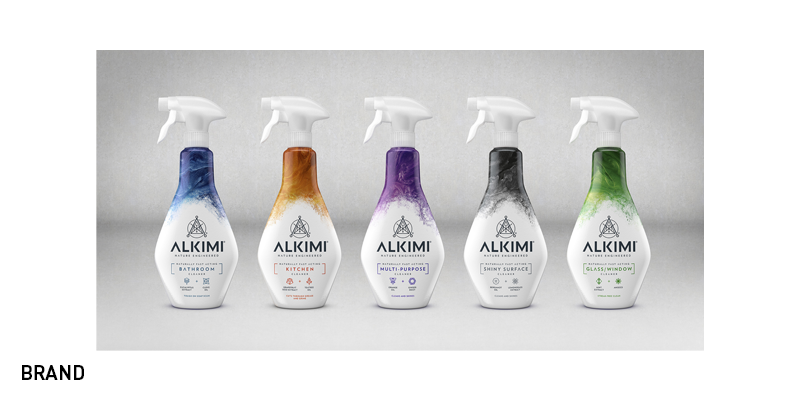
Alkimi
It’s no secret that many cleaning products contains dangerous chemicals, which can be damaging to people’s health, and just as harmful to the environment. Cleaning products manufacturer Challs International therefore collaborated with London-based brand design agency, Bulletproof, to launch a new non-toxic, line of cleaning products called Alkimi. The new cleaning products are safe for the user and the environment, and still work as efficient as non-eco friendly cleaning products. The packaging of Alkimi products contribute to this modern and slick approach the brand has brought to the market, with various dramatic surges of colours on the top of each product, alongside with its logo, which is inspired by alchemist symbology; the synthesis of science and nature. Stephanie Ward, brand manager at Challs International, saysm “Alkimi has been brought to life with an intricate and sophisticated design that perfectly captures the science behind its efficacy.”
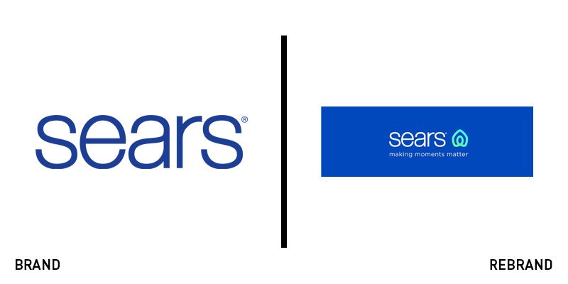
Sears
Sears department stores have been around since 1893 and has survived both declining sales and bankruptcy. Nevertheless, after having won its bankruptcy auction in the beginning of 2019, the brand came to terms with the need of a fresh start and rebranded earlier this month.. The new rebrand revealed a compelling new wordmark in a new font and an updated tagline, ‘making moments matter.’ On its Facebook page, Sears writes that the logo is designed to represent the home and people’s hearts through an infinity shape. However, Sears new logo also somewhat resembles the logo of the world’s biggest accommodation-sharing site Airbnb, possibly presenting brand confusion.
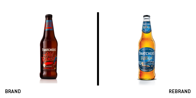
Thatchers Rascal
With the support of brand agency Bluemarlin, cider maker Thatchers Cider rebranded its Old Rascal range to embrace a new identity more relatable for its target audience, whilst still communicating its values and credibility as a brand. The rebrand also presented a new name for Thatchers Rascal in the simplified Thatchers Rascal which reflects this new strategy. In addition to this, the new packaging also suggests this updated approach through a the playful, colourful cross between blue and copper. Dave Hodgson, creative director at Bluemarlin says, “We gave Thatchers Rascal a brand rejuvenation that is contemporary and captivating without being radical and over-the-top. The new design is both enchanting and sophisticated, sparking the imagination whilst also communicating the authenticity of its craft, flavour and quality.” The brand uses characters and storytelling cues to compete in the crowded cider market, similar to the approach taken by Badger Brewery last year.
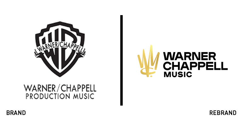
Warner Chappell music
A new era has begun for American music publishing company Warner Chappell Music after appointing a new co-chair and CEO Guy Moot and co-chair and COO Carianne Marshall. To honour the new faces of Warner Chappell music, the brand decided it was time for a refresh, since its last one was in 1987. Besides a new dynamic logo and brand identity, the company modernised its name from Warner/Chappell to Warner Chappell Music. The addition of ‘music’ was with the purpose of clarifying the company’s purpose. The new logo, designed by Pentagram, features a style of both graffiti and calligraphy, representing the diversity of the different musical genres, in the form of a crown monogram. It moves away from the standard WB shield lock up to embrace its own identity. Moot and Marshall say, “We’re thrilled to be opening this new era with a new look that reflects both our heritage and our future. We love our new logo, which is a tribute to our songwriters and the power, emotion, and timelessness of their craft.”


