Badger brewer brings in new brand
The badger has featured in stories, poems, films and fiction for centuries. Not least of which, the badger is the house symbol of Hogwarts’ Hufflepuff. It is also the mascot for the University of Wisconsin-Madison and plays hero roles in the Chronicles of Narnia and The Wind in the Willows.
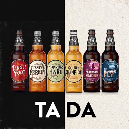
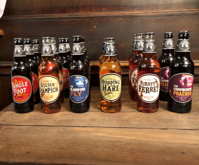
For Dorset brewery Hall & Woodhouse, the badger is also the brand name and identifying icon of the 240 year-old, family-owned business. Since 2012, the brewery has used a leaping rendering of the woodland creature across packaging and touchpoints, until now. The brewery has unveiled a rebrand, updating the badger, the packaging, logo and imagery to make the brand more competitive in a craft-dominated market.
Anthony Woodhouse, managing director, and seventh-generation brewer at Hall & Woodhouse says the brand has always been adaptable, allowing it to survive for over two centuries. Now, it has to “evolve and adapt to take account of trends in the market.” Part of that adaptation has required an examination of purchasing behaviour, the brand’s positioning and customers’ perceptions of it. Gwen Ridsdale, head of sales and marketing, says that research unveiled a strength of the brand’s heritage and its quality products, but the need to respond to pressure from craft brewers.
“The brand has been operating in a no-man’s land,” she says. “Consumers didn’t have a clear picture of what Badger is in their minds. From a brand point of view, the previous visual identity looked too corporate and left no room for the individual ales’ names and personalities to shine through. Ridsdale says one of the findings from the research was that Badger was “a passive brand in a very active market.”
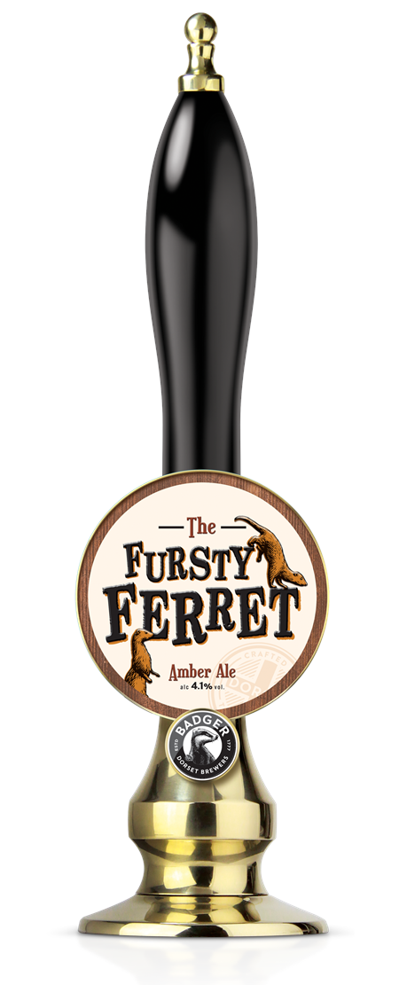
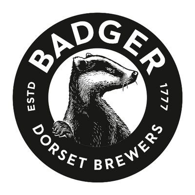
The brewery teamed up with London-based food and drink branding specialist BrandOpus to develop a new brand. The first change was to promote Tangle Foot ale as the new hero beer of the brewery. After that, the logo required attention. Ridsdale says, “Ale drinkers take the category very seriously,” but that the existing badger logo was somewhat cartoon-like. The badger was thus made more life like and hand-drawn. The new logo highlights the brewery’s Dorset heritage and longevity and introduces a new monochrome circular lockup.
Across the new packaging and on-trade touchpoints, the brand has tried to “behave as a family brewer,” as indeed it is. With a reduced and clarified range, the beers have been treated to a storybook makeover. New packaging features whimsical animals, clear and bold beer names and the use of ‘the’ in front of each name as a means of imbuing it with storytelling provenance. “Consumers see the badger as being the storyteller in the category,” says Ridsdale. Thus, its beers inspired by Dorset’s wildlife tell a story of their own through the new packaging, helping to differentiate them from each other and from competitors in the market.
Rounding out the brand is the introduction of all new brand touchpoints across points of sale, merchandise, web and social, advertising and brand imagery. Brand manager Sarah Pace asks, “How do you take a 240 year-old brand and make it contemporary and relevant?” The answer lay in real and rugged imagery, a cheerful, humorous tone of voice and a loud campaign across all media.
For more from Transform magazine, follow us on Twitter @Transformsays